Stagecoach: Ticket Buying
Using behavioural design to convert app users into paying customers
Client
Stagecoach
Year
2024
Discipline
UX Design & Behavioural Strategy
Platform
iOS & Android
Timeline
8 weeks
My Role
Product Designer

THE TEAM
Product Designer (Me)
Strategist
Account Director
Project Manager
Client stakeholder
WHAT I OWNED
Co-led customer discovery (6/12 interviews)
UX audit & competitor analysis
User journey mapping & fixes
Led all design decisions, pre and post testing
UI design via design system
Usability testing
THE PROBLEM
Stagecoach had 3 million monthly active users but there was a problem with conversion. The majority of people opening the app were checking times, tracking buses, and leaving without buying a ticket.
The brief was to improve the ticket purchase flow. But the real question was why users weren't converting in the first place and whether a redesigned flow was even the right answer to that question.
The framing shift that shaped everything: Research surfaced that most non-purchasing users were defaulting to contactless out of habit as it was the same way they'd always paid. That changed how we approached the whole problem. The design challenge was to reach people at the moment they were already thinking about their journey and make buying in-app feel like the natural next step.
DISCOVERY: UNDERSTANDING BUS TRAVEL
We ran 12 moderated interviews across Stagecoach and non-Stagecoach users, covering a 50/50 split between app buyers and contactless payers. The main goal was to understand why, and specifically what would need to change for them to shift their behaviour.
Habit drives behaviour
Most non-purchasing users were on autopilot. They'd always paid a certain way and had no particular reason to change. Contactless worked well enough, so they kept using it. The design needed to create a moment of interception, a point in the journey where trying something different felt low-effort and obviously worthwhile.
Control motivates pre-purchase
Among users who did buy in-app, the appeal was about having the ticket ready before boarding. No fumbling at the stop, no social pressure, no relying on the driver being in a good mood. For the right users, that sense of control and preparation was a strong enough reason to change how they paid. The design needed to activate it.

DISCOVERY: UX AUDIT
A UX audit of the existing flow ran alongside research, mapping every screen across the four main use cases; planning, tracking, buying, and account management and annotating pain points, friction, and opportunity areas. This fed directly into the ideation phase.
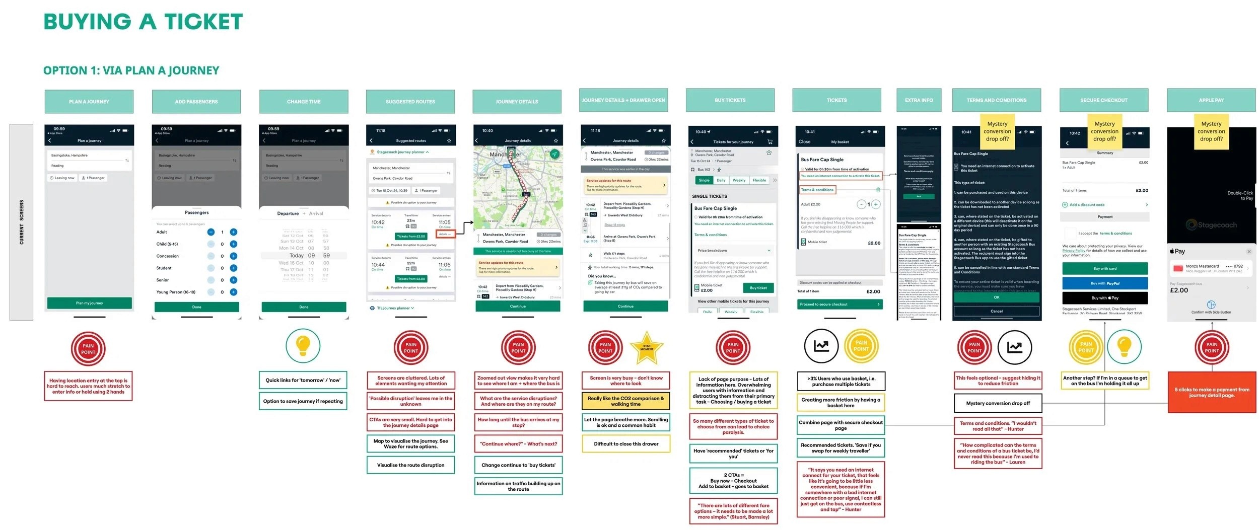
App Audit: A UX audit evaluated the existing app journey by journey, flagging cluttered pages, missing white space, and unnecessary steps. Every finding fed into the redesign and was validated through testing.

Summary boards: The working base for each journey; pain points, context, and inspiration in one place, used as a quick reference throughout the project.
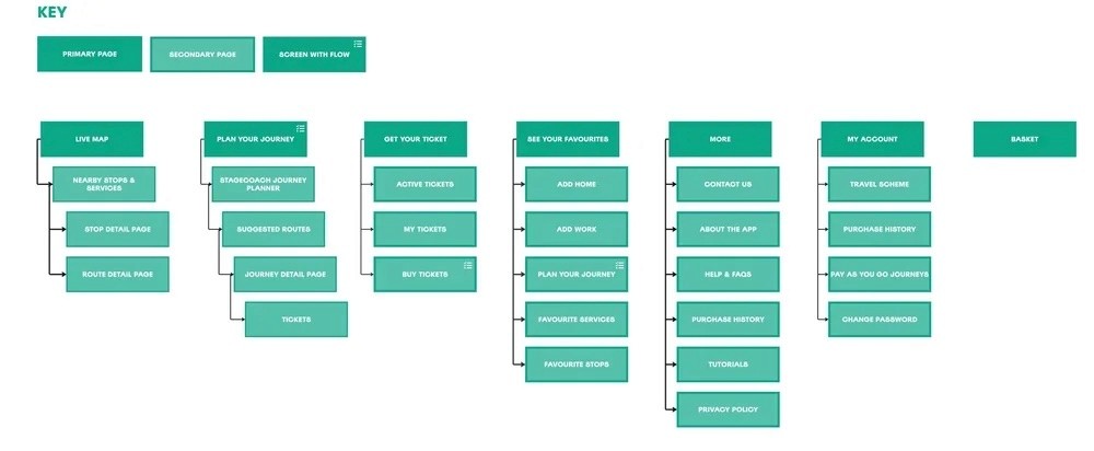
App map: I mapped the entire existing app to see the full experience in one view and identify where to simplify.
MINDSPACE: OUR STRATEGIC FRAMEWORK
With research synthesised, we used MINDSPACE a behavioural framework developed by the UK Government's Behavioural Insights Team to map which psychological levers were most relevant to our conversion problem and to evaluate ideas against them. Three levers did the most work across the final designs:
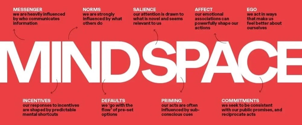
Defaults
People go with the flow of pre-set options. Making Apple Pay the default payment method and pre-selecting common ticket choices reduced the number of active decisions at the point of purchase.
Priming
Introducing the idea of buying earlier in the journey, while a user was planning their route, seeded the intent before they reached the ticket flow.
Norms
Positioning pre-purchase as the expected behaviour shifted how users thought about their options. Buying on the app became the norm as opposed to the alternative.
IDEATION
STEP 1
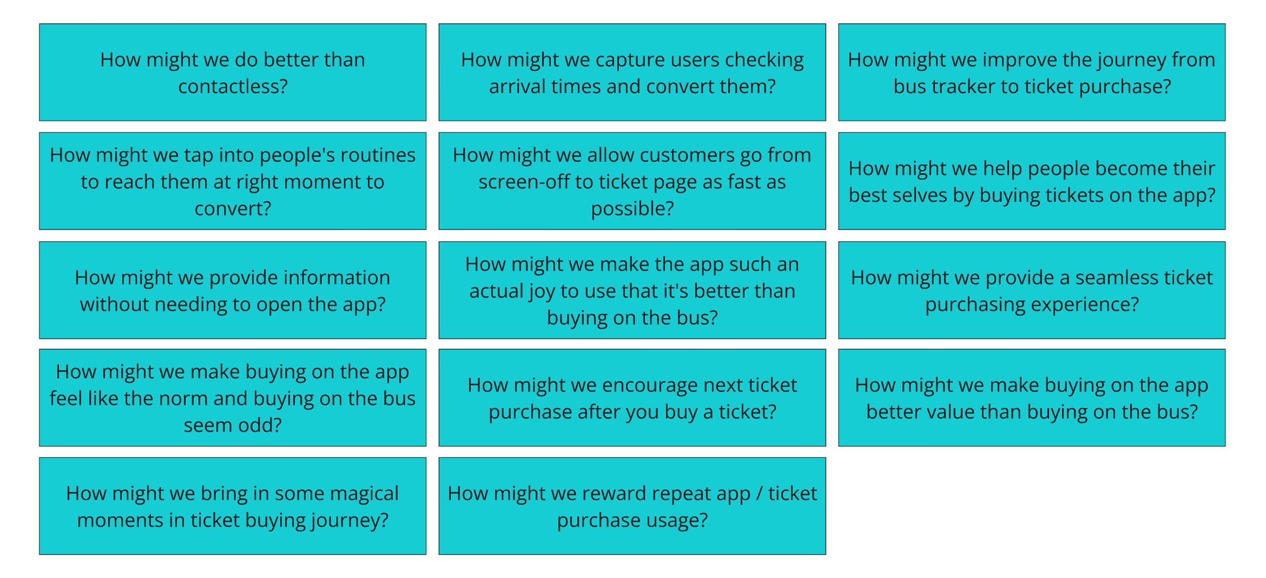
How Might We questions reframed each research insight as a design opportunity and gave the team a shared problem space to ideate against rather than jumping straight to solutions.
STEP 2
Nearly 190 ideas generated across three opportunity areas, then clustered into nine parent themes. Speed and breadth first, structure second.

STEP 3
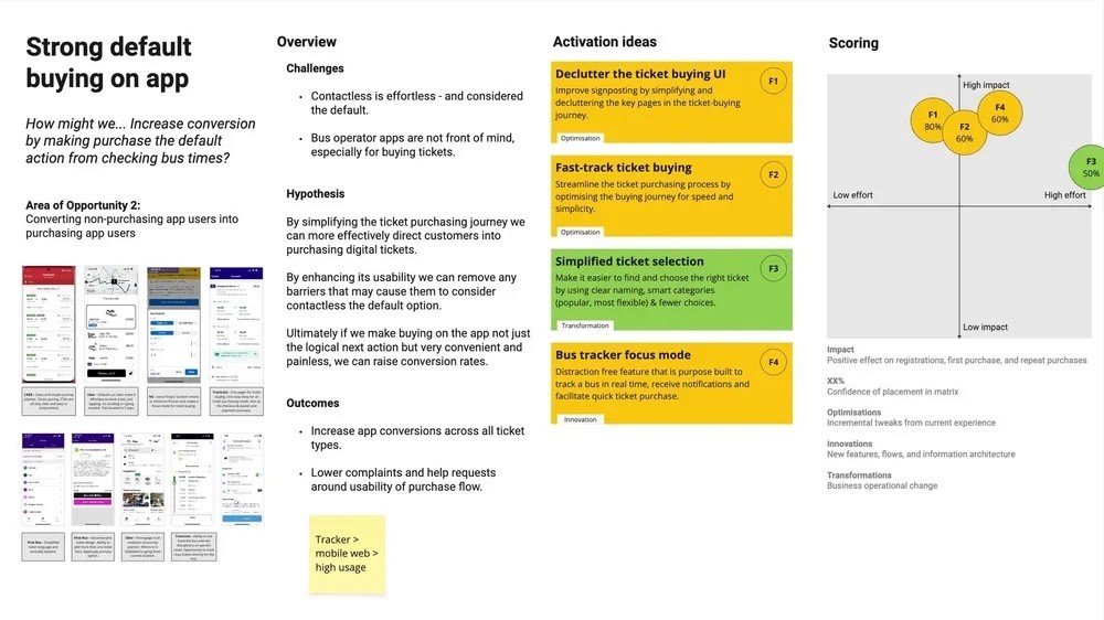
A prioritisation workshop with the Stagecoach team using an impact/effort matrix. Two themes came out as the clear focus: strong default buying in-app and app purchasing as a social norm.
DESIGN DECISIONS
My first task was to tidy up the ticket buying journey. Four decisions are worth singling out; each grounded in research, data, or testing rather than design instinct alone.

Merging basket and checkout
Usage data showed less than 3% of users purchased multiple tickets in a single session. A standalone basket screen was adding a step to 97% of journeys for a use case that barely existed. I merged them.
Apple Pay as the default
Making the fastest payment method the pre-selected option reduced decision fatigue at the moment most likely to cause abandonment. Other methods stayed available, the ordering did the work.
Removing the mandatory ticket info page
Terms and conditions were sitting in the path of every user, regardless of whether they wanted to read them. Moving this behind an info icon cleared a step from the flow without removing access to the information.
Contextual CTA copy
Testing revealed that copy needed to match how defined the journey was. "Buy Before You Board" worked when the user was still planning. "Buy Tickets from £2.00" worked when they had a specific route in mind. One CTA across both contexts would have underperformed.
DESIGN EXPLORATION: BUY BEFORE YOU BOARD
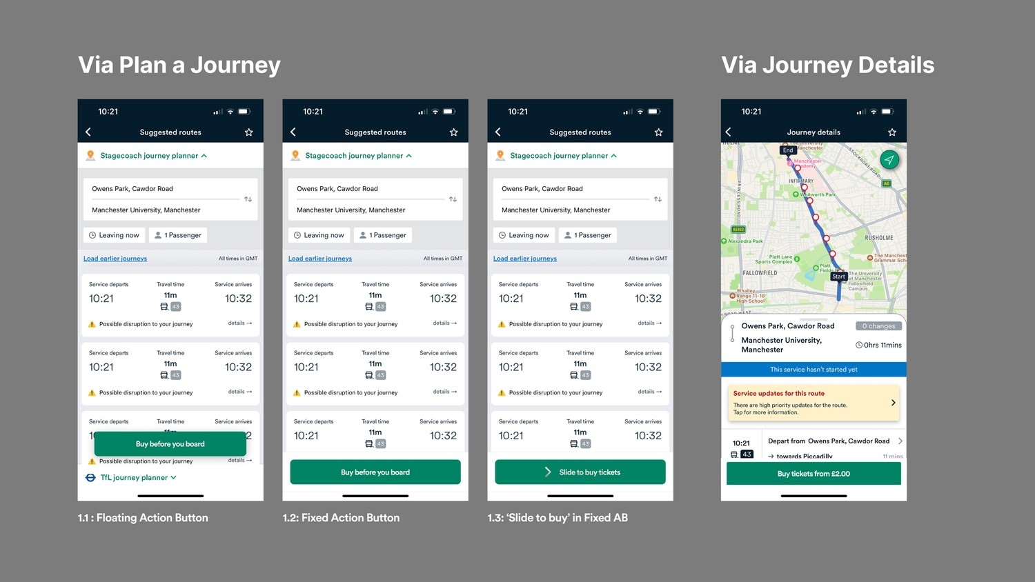
The key change I made was a persistent purchase CTA placed into the journey planning and live map flows. The goal was to put the option to buy in front of users while they were already thinking about their trip.
I tested three CTA placements and interaction patterns to understand which felt most natural without getting in the way of the primary task:
OPTION 1
Floating action button
High visibility, reads as a primary action, but risks competing with the map interaction.
OPTION 2
Fixed action button
Sits at the bottom of the screen, consistently visible without disrupting the user's primary task. Testing confirmed it was noticed without needing to be pointed out.
OPTION 3
Slide to buy
More engaging interaction but introduced novelty in a context where users wanted speed and familiarity.

DESIGN EXPLORATION: TICKET LISTING
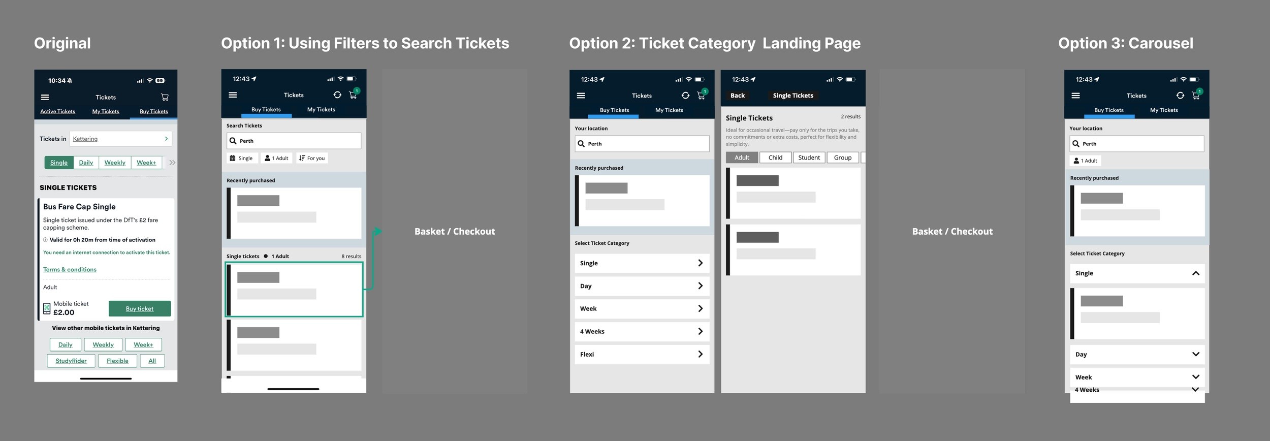
The existing ticket listing buried the most relevant options behind tabs and overcrowded cards. Research had shown that most users buy the same ticket repeatedly, so the bigger opportunity was surfacing recently purchased tickets quickly rather than improving browsability for users who already knew what they wanted.
I explored three alternative approaches and tested two in moderated sessions:
OPTION 1
Filters
Prioritises recently purchased tickets at the top, adds filters for refinement. Supports both habitual buyers and users searching for something new.
OPTION 2
Category landing page
Start with ticket type, then narrow results. More structured, but added a step for users who already knew what they wanted.
OPTION 3
Accordion view
Expand/collapse by category. Compact but unfamiliar, it introduced a pattern users hadn't seen in comparable apps.
Testing confirmed that routine dominated purchasing behaviour; most participants went straight for their most recent ticket. Option 1's "recently purchased" prominence matched that directly, while the filters gave occasional buyers a route to something different without adding steps for everyone else.
OUTCOME
SHIPPED - LIVE IN THE STAGECOACH APP
The redesigned ticket flow shipped on iOS and Android. I didn't stay on the project post-handover, so rather than speculate on impact, here's what I'd track to properly evaluate it:
Steps to purchase
Average taps from intent to confirmation. The flow changes should reduce this measurably against the baseline.
Ticket purchase conversion rate
The percentage of app sessions resulting in a purchase. The most direct measure of whether the nudges worked.
Repeat purchase rate
Habit formation was the underlying hypothesis. Repeat purchasing over 30 and 90 days is the longer-term signal of whether the nudges created lasting behaviour change.
Apple Pay adoption rate
A direct signal of the default nudge working. An increase here validates the behavioural approach to payment selection.
WHAT I LEARNED
Optimisation projects are often underestimated relative to redesigns or new features but the conversion impact of removing a step, defaulting to the right payment method, or surfacing a CTA at the right moment can outperform a full product overhaul. The key is grounding every decision in behaviour, not assumption.
Applying MINDSPACE changed how I think about design problems more broadly. Starting with which psychological lever is relevant to a given behaviour produces more targeted interventions and a clearer rationale for every decision made.