August - October 2024
Benenden Health: Reimagining Healthcare Moments
Type
2 month client project
Role
Product Strategy, Service Blueprint, Generative Research, Competitor Analysis, UX Audit
Platform
iOS & Web
Tools
Miro, Lookback, Askable, ChatGPT, Perplexity, Figma
Project
A 2-month vision strategy to redefine the future of Benenden’s digital member experience.
Problem
With 227,500 healthcare apps flooding the market by late 2022, user trust in digital healthcare was low. Benenden tasked us with reimagining a unified, human-centred digital service to stand apart.
Who are Benenden?
Benenden Health is a UK mutual healthcare society, operating on a not-for-profit basis. Established in 1905, they provide affordable, accessible healthcare and wellbeing support to their large membership. Unlike traditional insurance, they emphasise community and offer a range of services, aiming to bridge gaps in traditional healthcare access. Their focus is on preventative care and supporting members' overall health.
Challenge
Healthcare apps are everywhere, but stickiness and trust are rare. 'App-athy' has become a growing issue in the category, second-rate, outsourced apps failing to support users at critical moments.
Benenden tasked us with redefining their digital service to drive brand fame, long-term engagement, and member retention.
Solution
We created a vision strategy, culminating in a detailed service blueprint that mapped the entire member journey; from first sign-up and activation to long-term engagement across key milestones over 6–12 months.
My role
As the sole product designer on the project I worked closely with the lead strategist and the project manager to deliver this project. I focussed on 4 key areas:
Collaborating on customer research by creating interview scripts, conducting interviews, synthesising user research using thematic analysis and creating insights and findings.
Leading the UX Audit of the existing experience, identifying pain points, star moments and ideation into the existing experience.
Leading the Service Blueprint by creating the artifact in Figma, identifying the core moments in the experience that would eventually become the final deliverable.
Bridging design craft with product thinking. Being at the intersection of design and strategy to deliver a conceptual vision into reality through a service blueprint.
What I learnt
This was my first introduction into service design and a chance to explore how digital experiences fit into the broader lifecycle of a customer. Here’s what I took away:
Thinking beyond screens – This project pushed me to consider how digital products fit within a broader, connected service. As interfaces become more ambient through AI, the service blueprint became a powerful tool to communicate the full customer experience, not just the UI.
Designing for moments, not features – Moment Design helped us focus on what truly matters: emotion, timing, and relevance. It gave shape to the strategy and made the vision feel human and actionable.
Collaborating across disciplines – Working closely with strategy taught me how essential alignment is. We challenged and complemented each other to turn an abstract vision into a compelling, experience-led story.
The Final Deliverable
Interested in the Service Blueprint?
Due to confidentiality, I’m unable to share the full blueprint publicly.
However, I’d be happy to walk you through it, just get in touch at:
nicowiggin@gmail.com
If you want to read more, check out the full story below…
Context & Opportunity
Healthcare apps are everywhere, but stickiness and trust are rare.
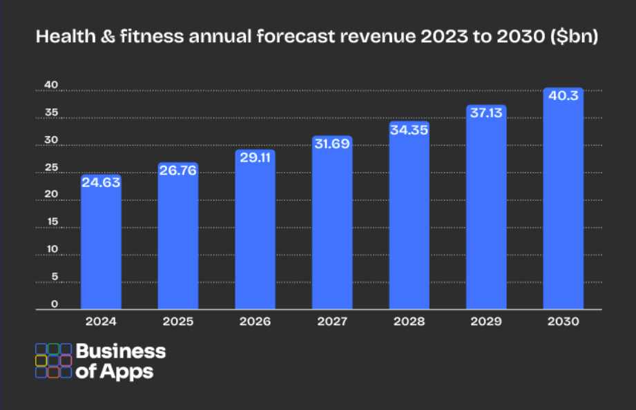
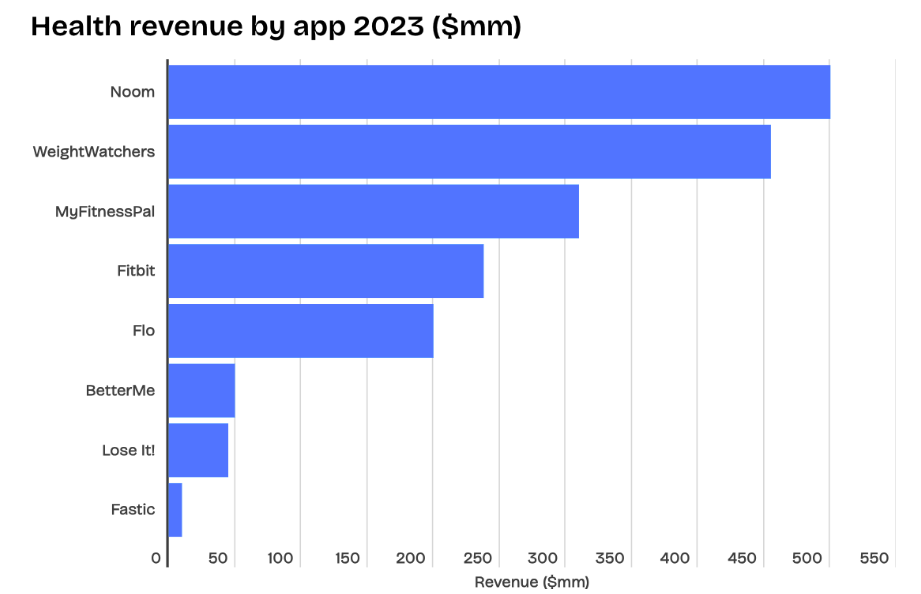
227,500 healthcare apps were available in the market as of late 2022. With just 85% of those downloaded have less than 5,000 downloads in total. Just 84 individual apps have been downloaded more than 10m times.
The term ‘App-athy’ has become a problem in category, second-rate, outsourced and disconnected with critical moments underserved. The journeys are often complex, disconnected and cold. Not what you expect from a healthcare service.
This results in a graveyard of apps that run the risk of being sidelined and overlooked.
“Why 3 apps though Bupa? No idea, but to over complicate the simplest things in life! ”
“I’d hope you can do the same things you can on the [AXA] website on the app but it’s like they’re two separate services”
How might we…
… deliver a world class healthcare experience that makes Benenden famous?
Discovery & Research
Understanding the health and wellness space
Research Areas
Attitudes and behaviours towards health and wellness
Experiences with their health provider’s app and other health apps
Experiences with and opinions of their healthcare providers
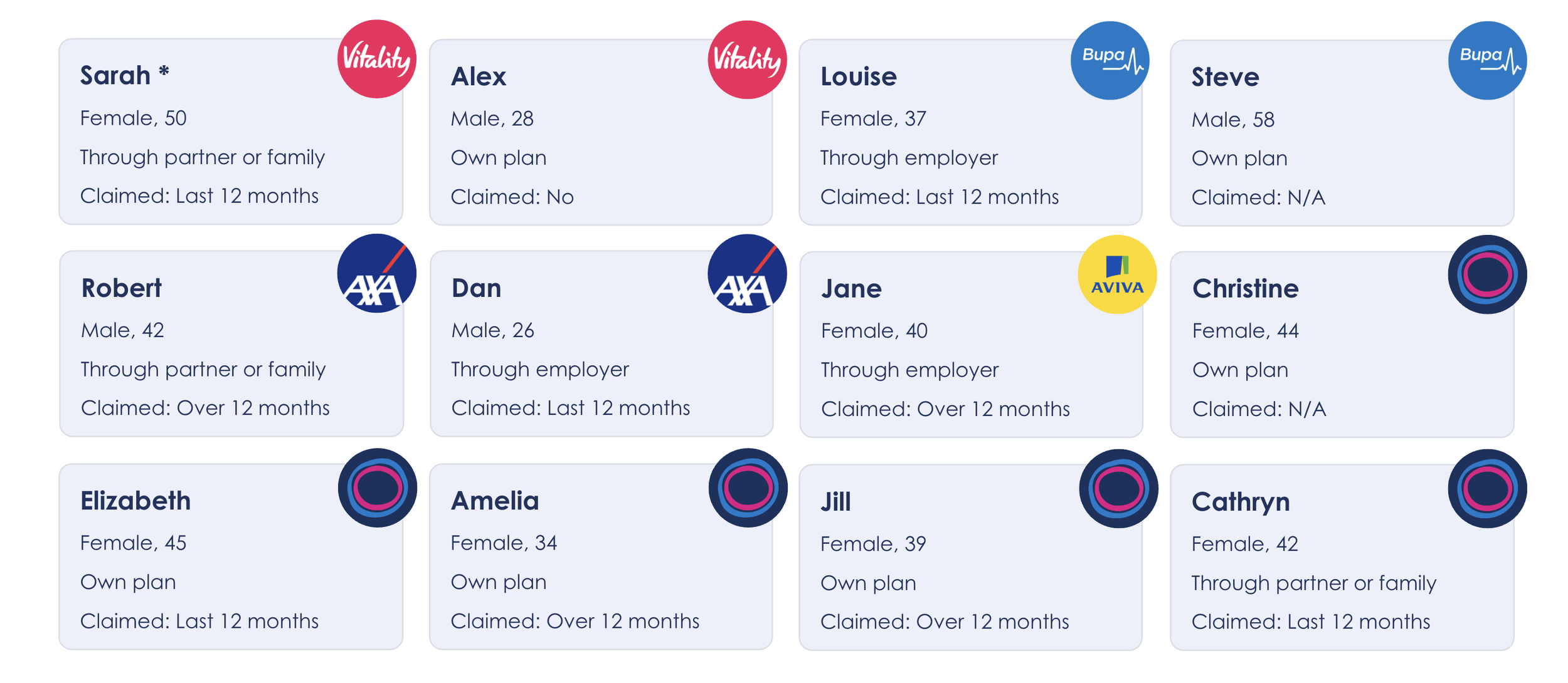
Who we spoke to
We had 12 x 60 minute, semi-structured ethnographic interviews. Video calls using Lookback platform via participant’s mobile.
Our Primary aim for recruitment was to get a split between both Benenden and non-Benenden customers. Secondary aims were to get a range of ages and locations, whether or not people had healthcare via their companies and also whether they had claimed in the last 12 months or not.
Insights
1. There’s no one size fits all to living a healthy life
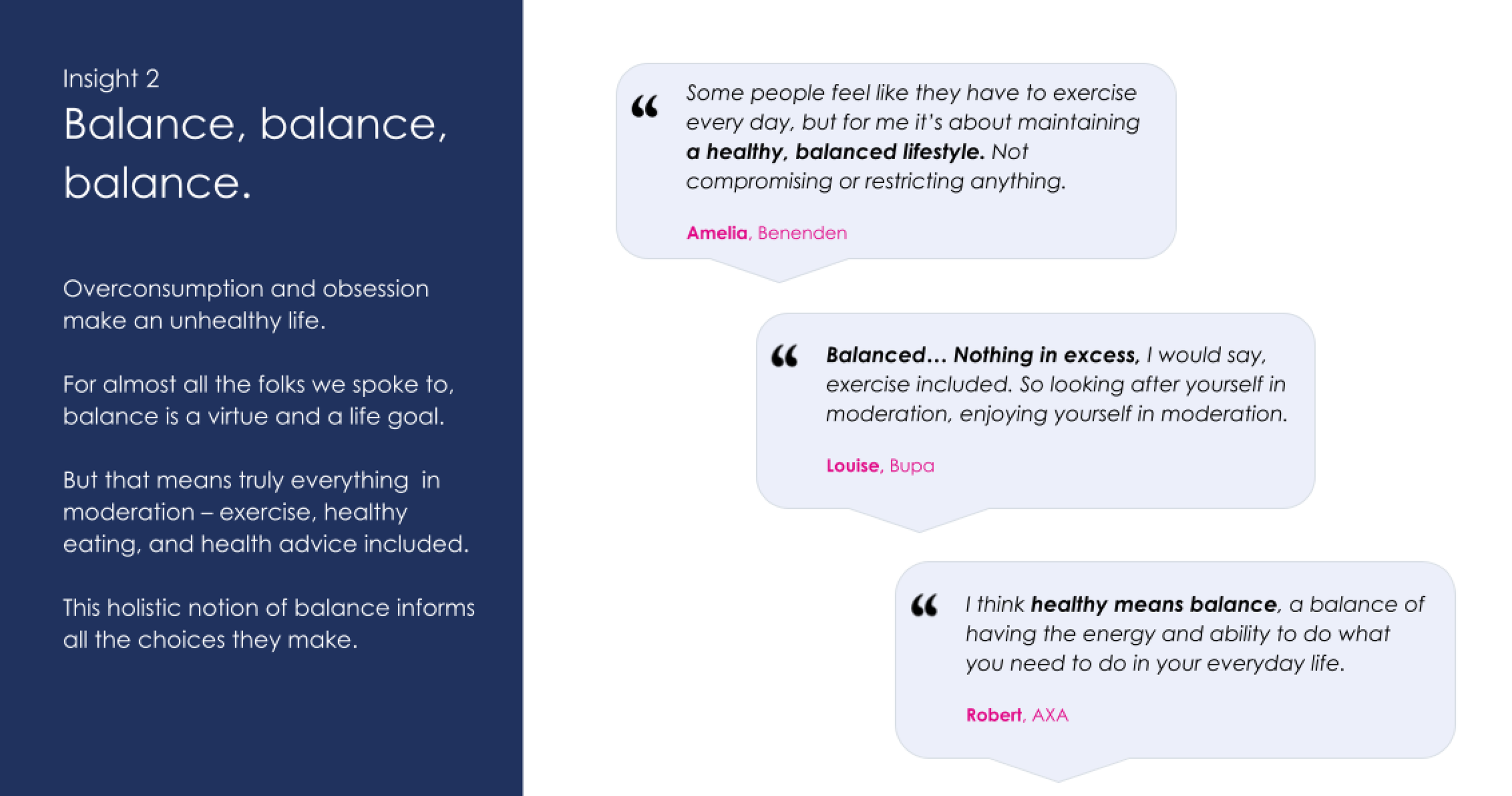
2. Balance, balance, balance
3. Healthy activity is successful when its meaningful.
4. Nudges must inspire.
5. A healthy life needs a healthy information diet.
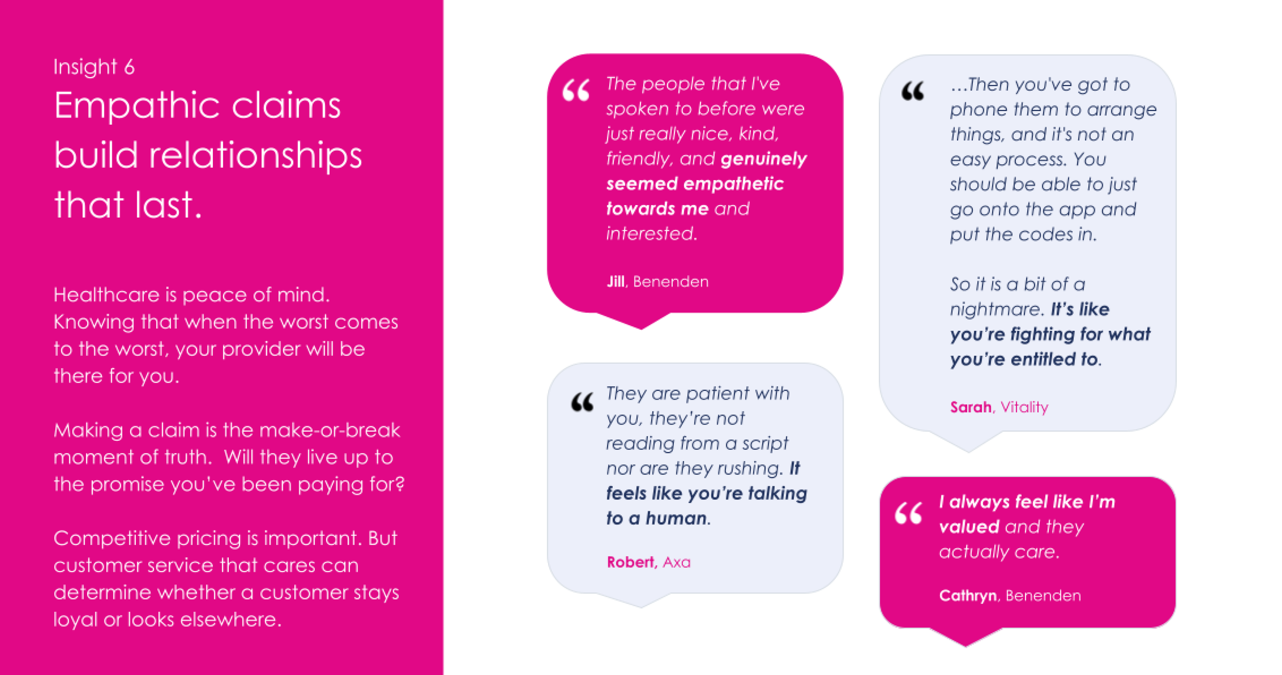
6. Empathetic claims build relationships that last.
7. Data is mundane.
8. Folks want to see ‘people like me’.
9. Everyone’s healthcare app underwhelms.
Zooming in on a couple of our insights…
Why was this important for the service?
People told us they wanted health to feel integrated, not obsessive. This directly informed how we wanted to approach digital engagement. We didn’t want to create an extractive product that demanded constant attention. Instead, we designed for digital balance: a service that’s there when you need it, and quiet when you don’t. Nudges, content, and features were intentionally shaped to support healthy habits without overwhelming users.
Why was this important for the service?
Claims are emotional moments, often when customers feel vulnerable or uncertain. Empathy came through loud and clear in the research, so we made it foundational to the proposition. Whether through tone of voice, UI clarity, or reducing friction, every interaction was designed to help members feel seen, supported, and reassured. In a category often lacking human warmth, empathy became a key differentiator.
UX Audit
No onboarding = Cold start
The absence of onboarding and a lack of educational content during account creation creates friction for new users. There’s a clear opportunity to better communicate the app’s value upfront and create a more confident, engaging entry into the experience.
Content often lacked relevance
Given the abundance of content, it felt impersonal or irrelevant for many users (e.g. menopause content shown to male users), pointing to the need for dynamic, personalised experiences that adapt to user profiles and needs.
IA & UI inconsistent across platforms
The IA and UI between the app, desktop portal, and public website were inconsistent, leading to cognitive dissonance and a disconnected user experience. This negatively impacts brand trust and usability.
Low Emotional Engagement
This is a healthcare app, however the tone of voice throughout the experience lacked empathy, particularly in sensitive areas like GP booking or diagnostics. A warmer, more reassuring content strategy could vastly improve emotional engagement.
Too much manual effort
Many processes required excessive manual input (e.g. medical details, addresses, preferences), creating avoidable friction. Smart defaults, predictive tools, and UX best practices could streamline these journeys.
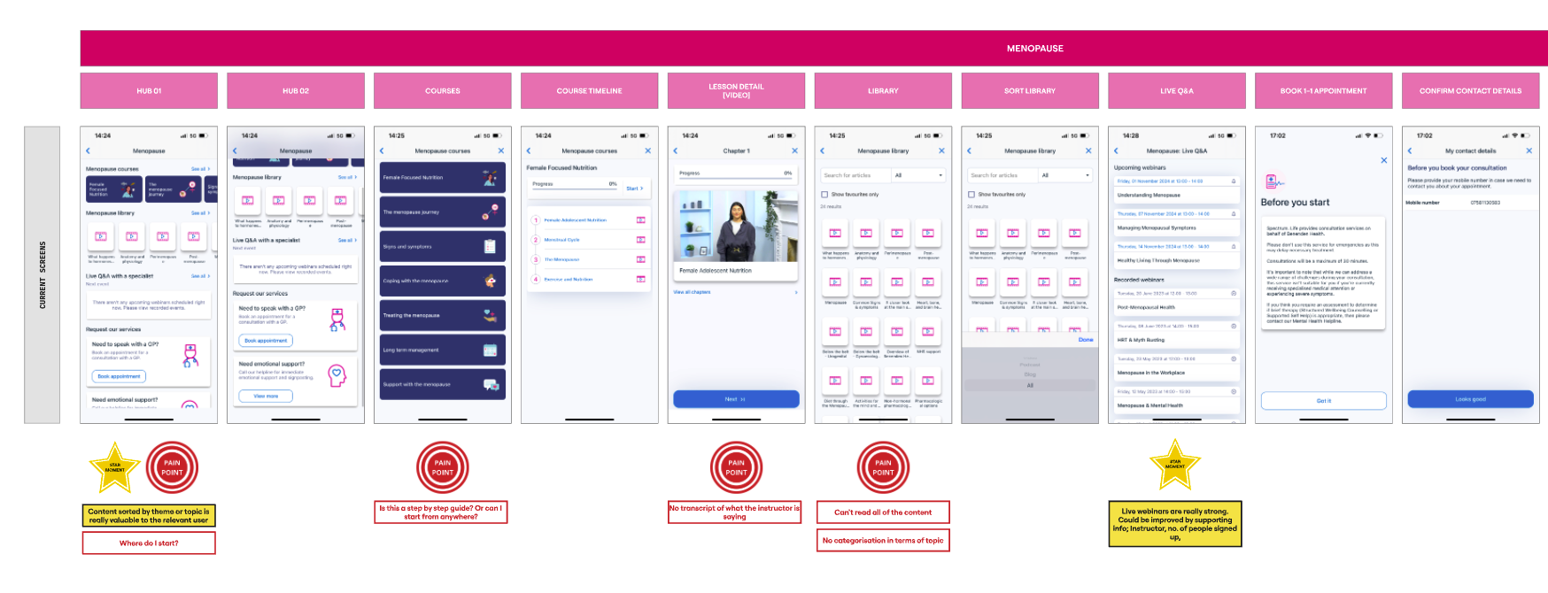
Journey Flows: Screenshot of UX Audit conducted in Miro. Pages organised depending on app location, content theme, and place in the journey
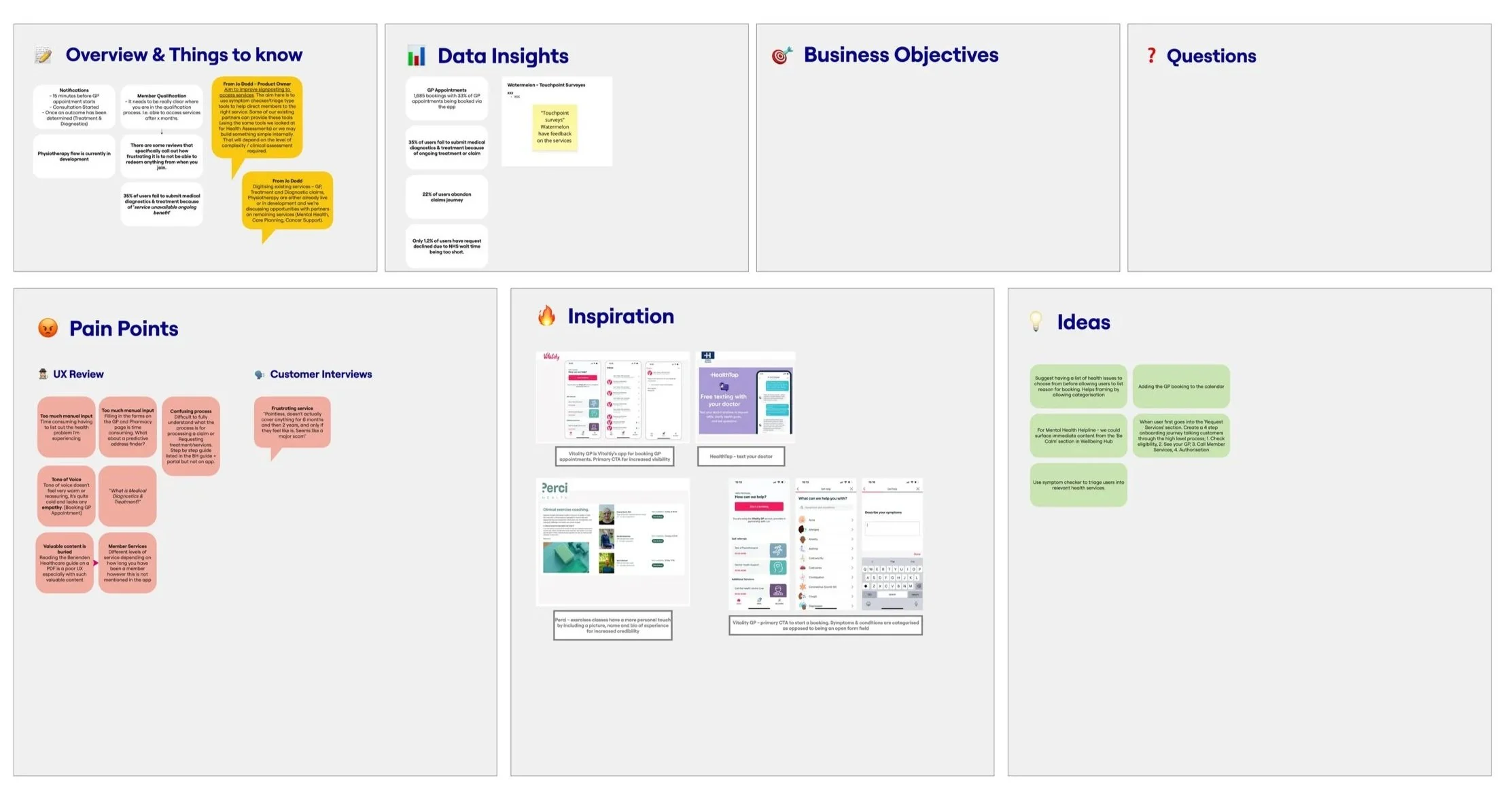
Summary Findings: After reviewing each of the individual flows, I created a section at the end that had summary findings. It allowed me to drop any ideas, learnings from client meetings, pain points from both the UX audit and customer research, sources of inspiration, any initial ideas, data insights that were gleaned from app data
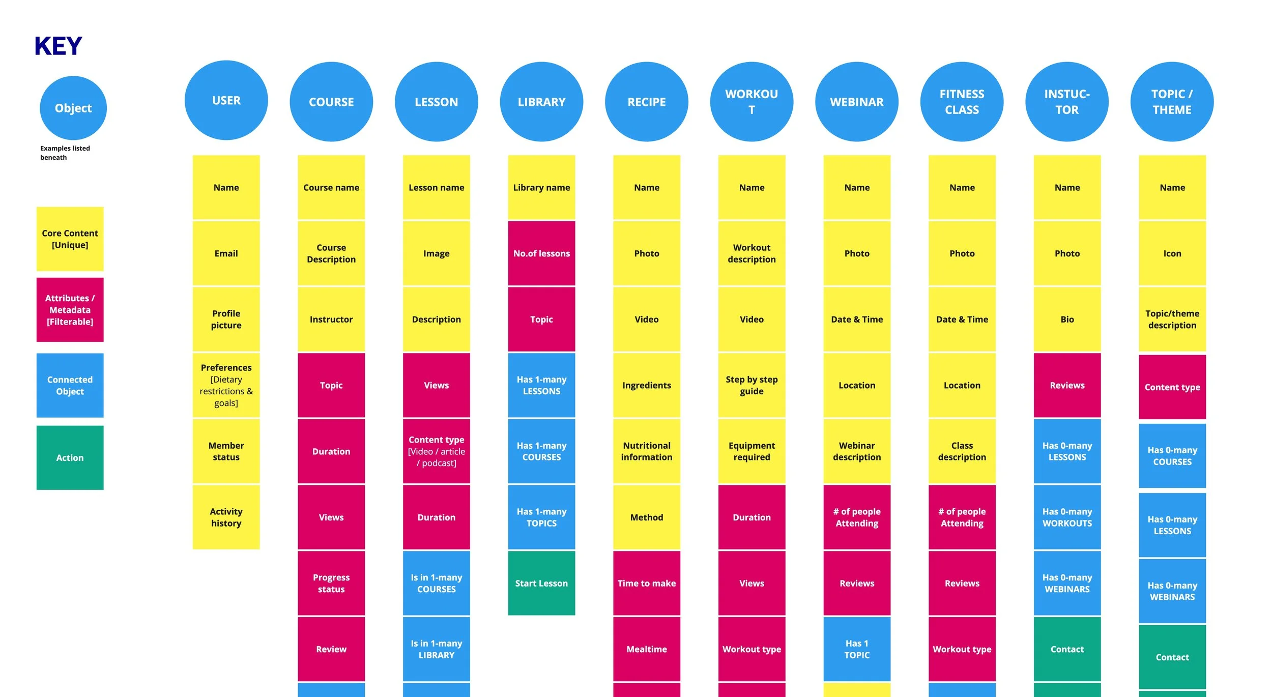
Object Oriented UX
Conducted OOUX on the existing site to understand relationships and patterns in the existing experience.
Defining the Service Proposition
Translating our findings into opportunity areas
We took the insights learned from the customer research and paired them with the findings of the UX audit to create an understanding of how customer’s were using their healthcare service and how they might expect a healthcare service to operate.
To illustrate this, we had to bridge the gap between the research and the strategy we had to demonstrate the From → To of how we could transform the experience.
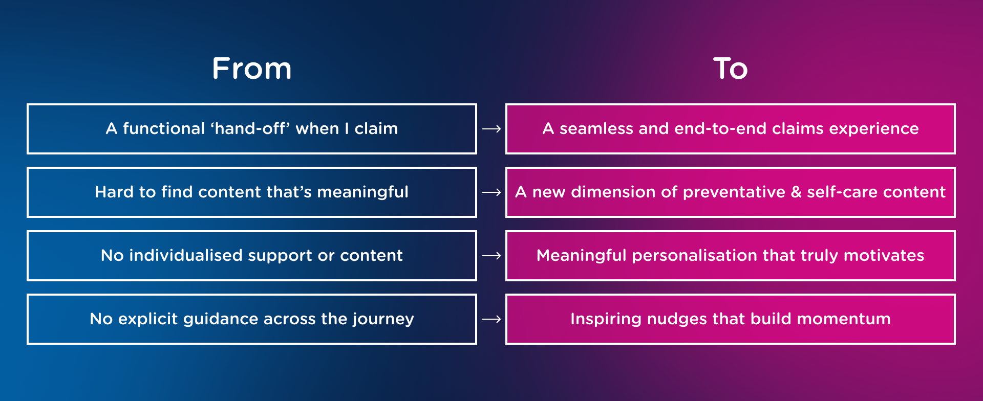
The 4 Big ‘Moves’ to position the experience
We came up with 4 key ‘moves’ to transform the existing Benenden experience and create a unified service to deliver results for both the business and its members.
1
A seamless and end-to-end claims experience
2
Meaningful personalisation that truly motivates
3
A new dimension of preventative & self-care content
4
Inspiring nudges that build momentum
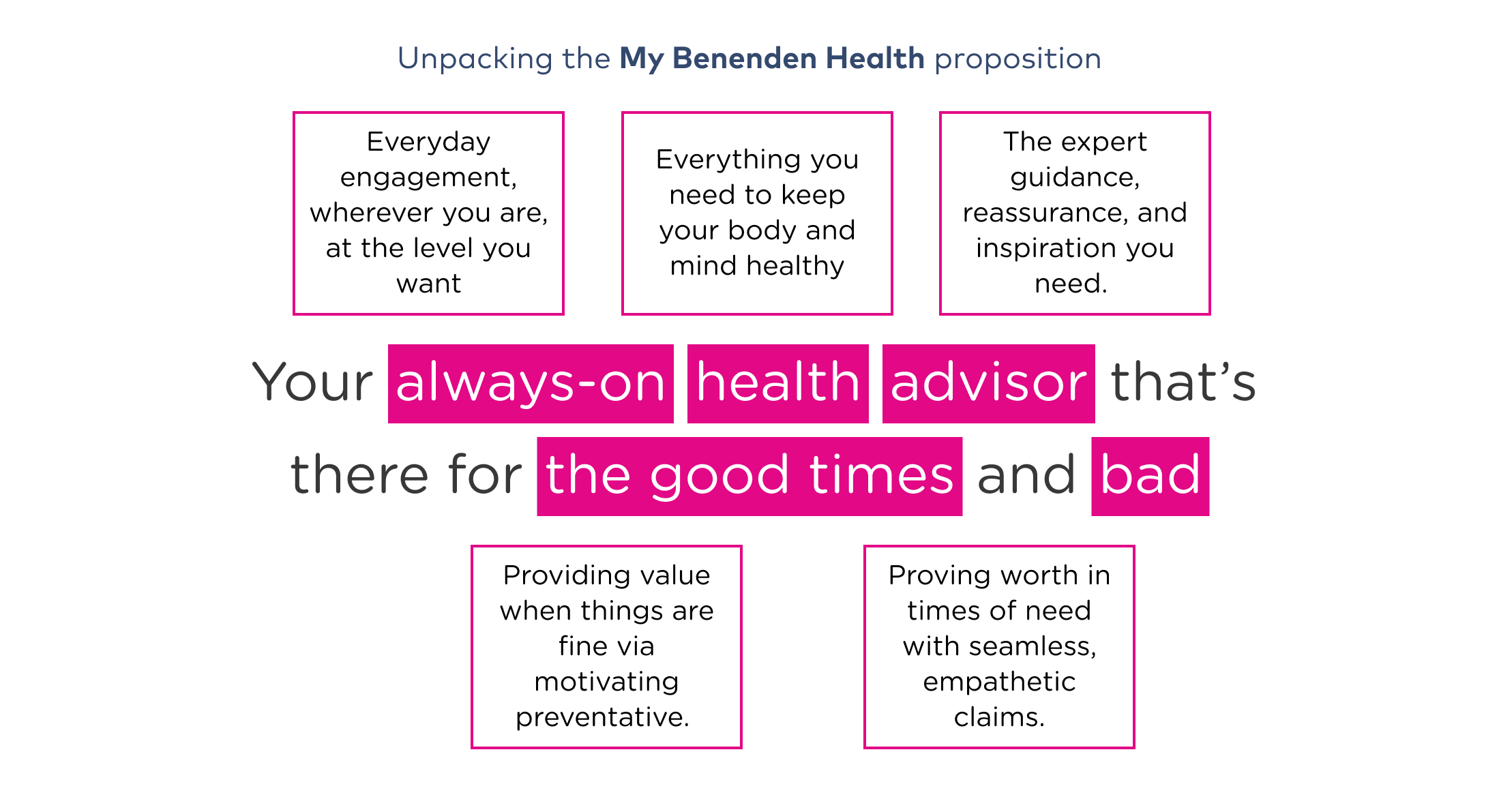
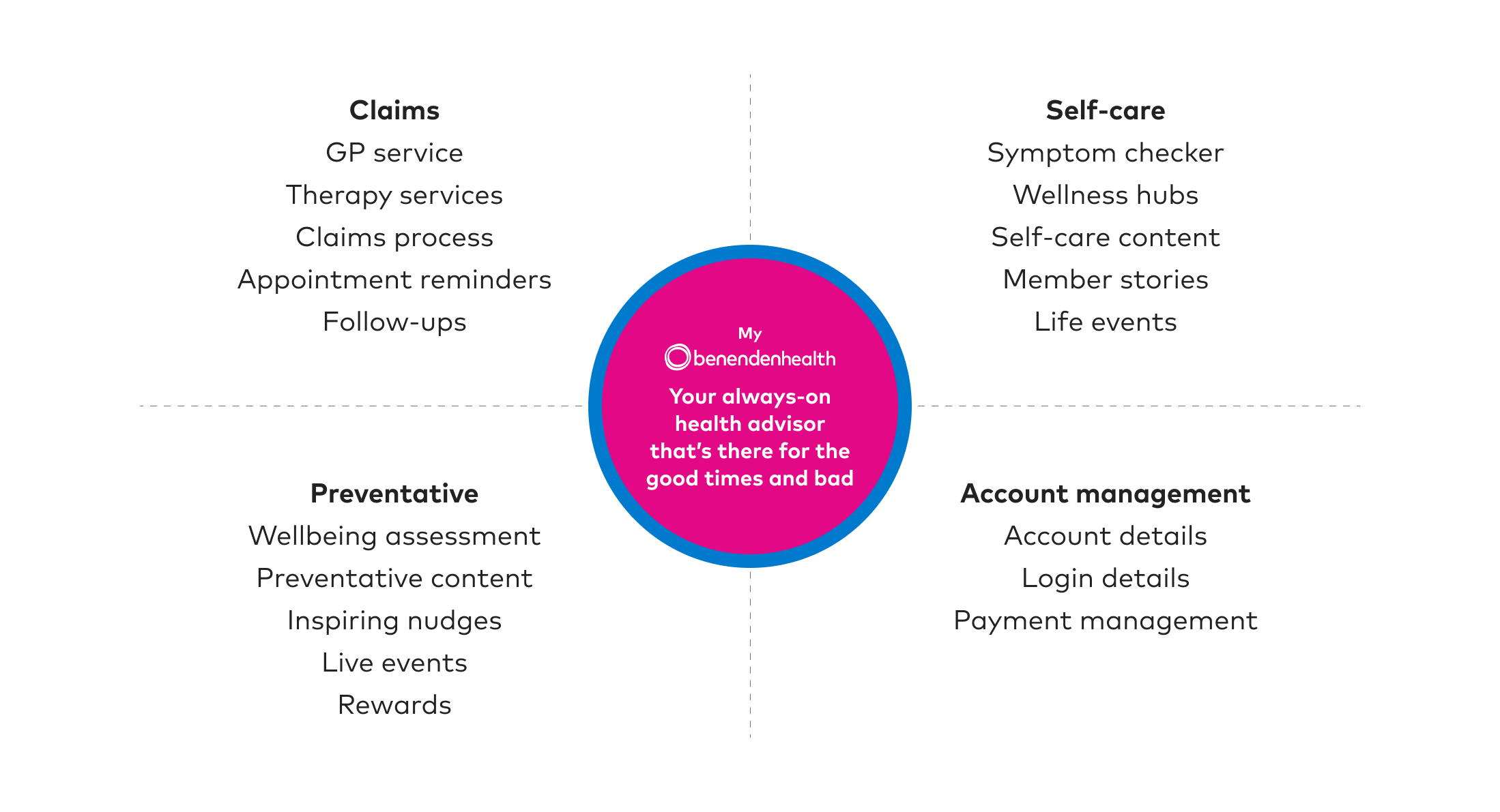
So how would this look as a unified service?
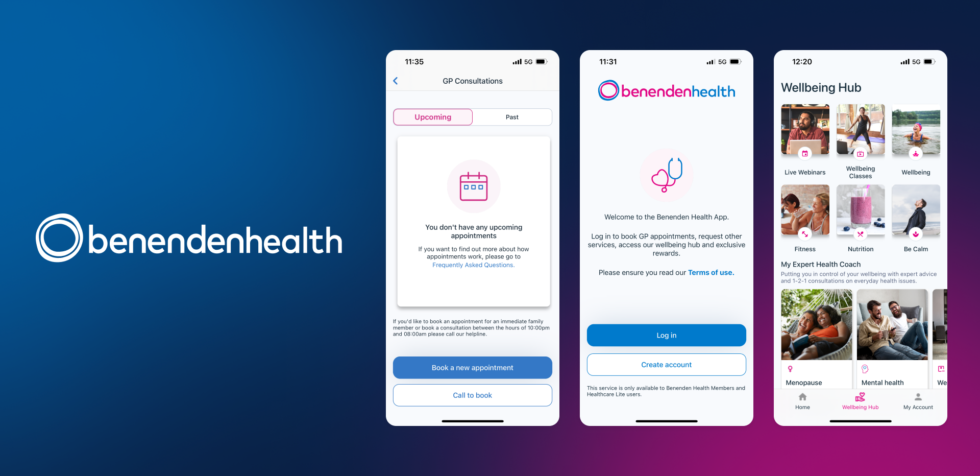
Introducing…
My Benenden Health: Your Always-On-Health Advisor
Moment Design: Bridging the gap between strategy and experience design.
Vision and strategy are powerful, but without tangible experiences, they risk staying too abstract. While the client aligned with our direction, we needed a way to bring it to life in a way that felt real, human, and actionable.
That’s where Moment Design came in.
By shifting the focus from features to meaningful moments, we created a framework that translated the strategic proposition into lived experiences. It helped us demonstrate how MyBenenden could support members through both the highs and lows, from receiving a diagnosis to staying motivated during periods of good health.
Moment Design allowed us to ground the service vision in empathy, timing, and emotional impact, turning a strategy deck into a service people could actually feel.
What is Moment Design?
Designing for moments that matter
In healthcare, apps aren’t used daily, they're called upon at critical life moments. Recognising this, we adopted a Moment Design approach: not designing features, but shaping meaningful moments between the user and the service.
What is a Moment?
A moment is when a customer meets the brand — a bundle of feelings, thoughts, and actions — forming the building blocks of human experience.
Why Moment Design?
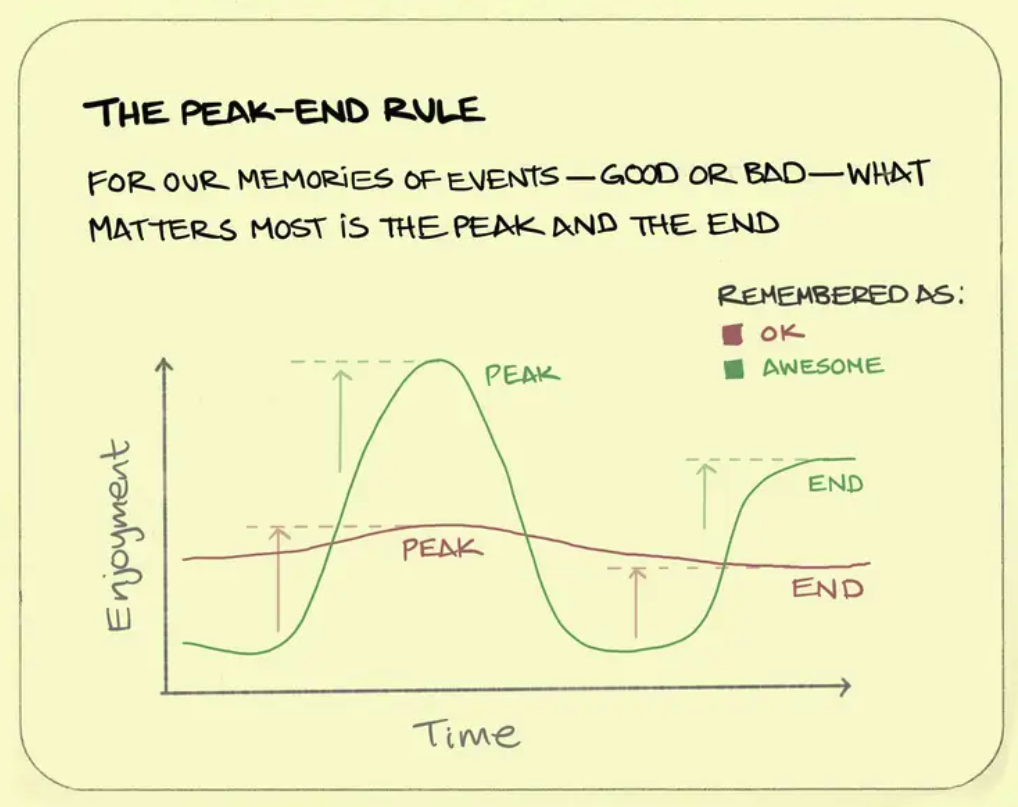
It centres the person, not the technology. It challenges teams to think holistically, aspire to real-life greatness, and design for emotional peaks — following the Peak-End Rule, where people remember the highs and the ending most.
Given the app’s low-frequency nature, we focused on making every critical moment count — designing with empathy to drive long-term trust and retention.
Moment design makes you move away from thinking in features and instead thinking in moments. Moments where the human is interacting with the brand or service. It’s human-centric by design and has been instrumental in understanding what the service might look like.
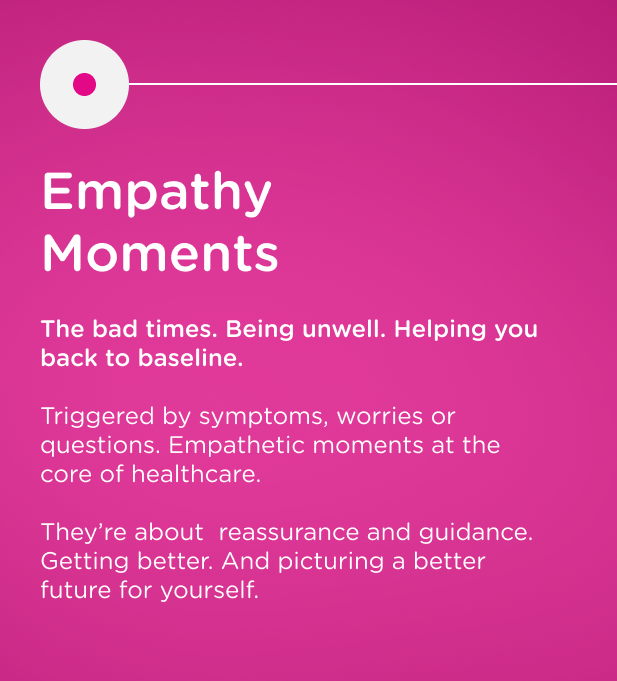
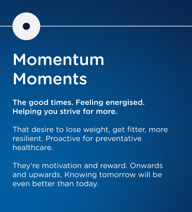
Our 3 Types of Moments
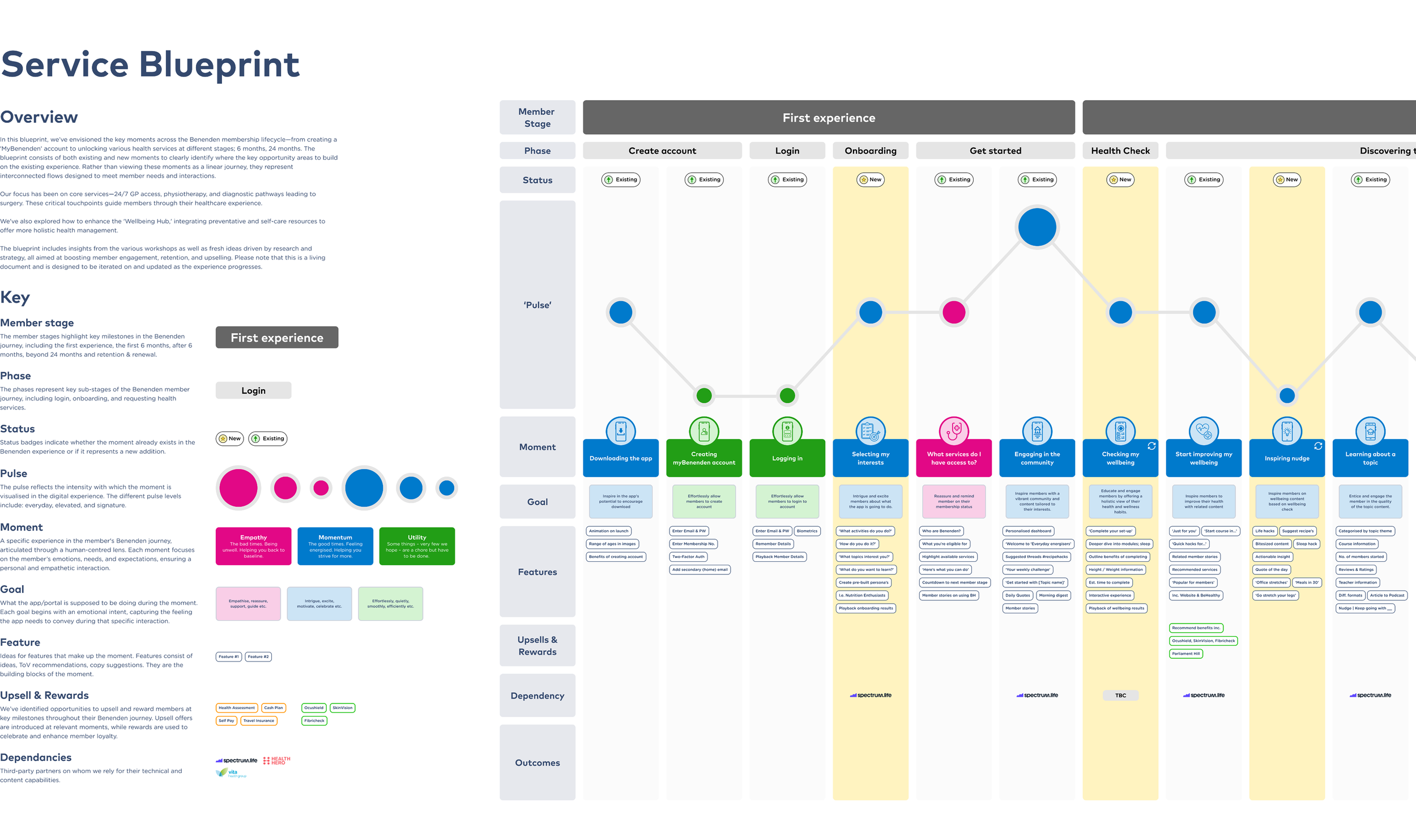
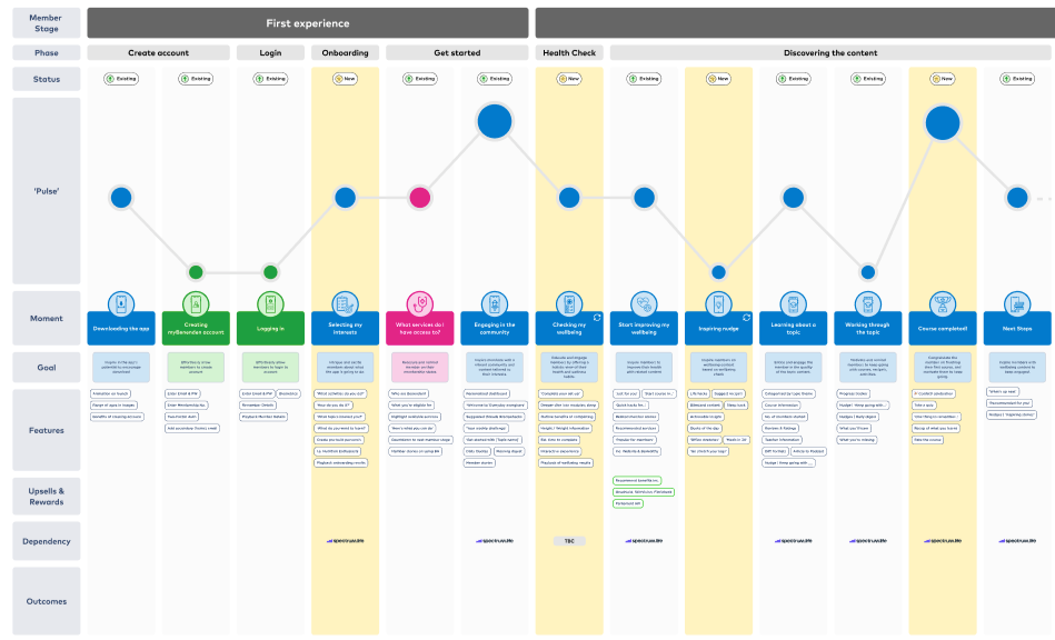
Designing the Future Experience - The Service Blueprint
To bring the new MyBenenden proposition to life, we created a service blueprint that structured the experience around four key member lifestages. These lifestages reflect the phased nature of Benenden’s healthcare offering, what members are eligible to access and when, based on their tenure.
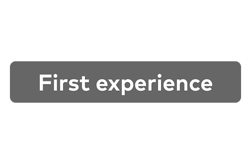
The Four Lifestages
First Experience
App download, profile setup and service discovery
0-6 Months
Access to GP services and foundational wellbeing content
6-24 months
Eligibility expands to physiotherapy, mental health support and self-care tools
24+ Months
Access to diagnostics, treatment and surgery requests
This phased approach mirrors how Benenden members progress through their membership, we used it as the structural foundation for the blueprint.
A closer look into the different rows of the blueprint
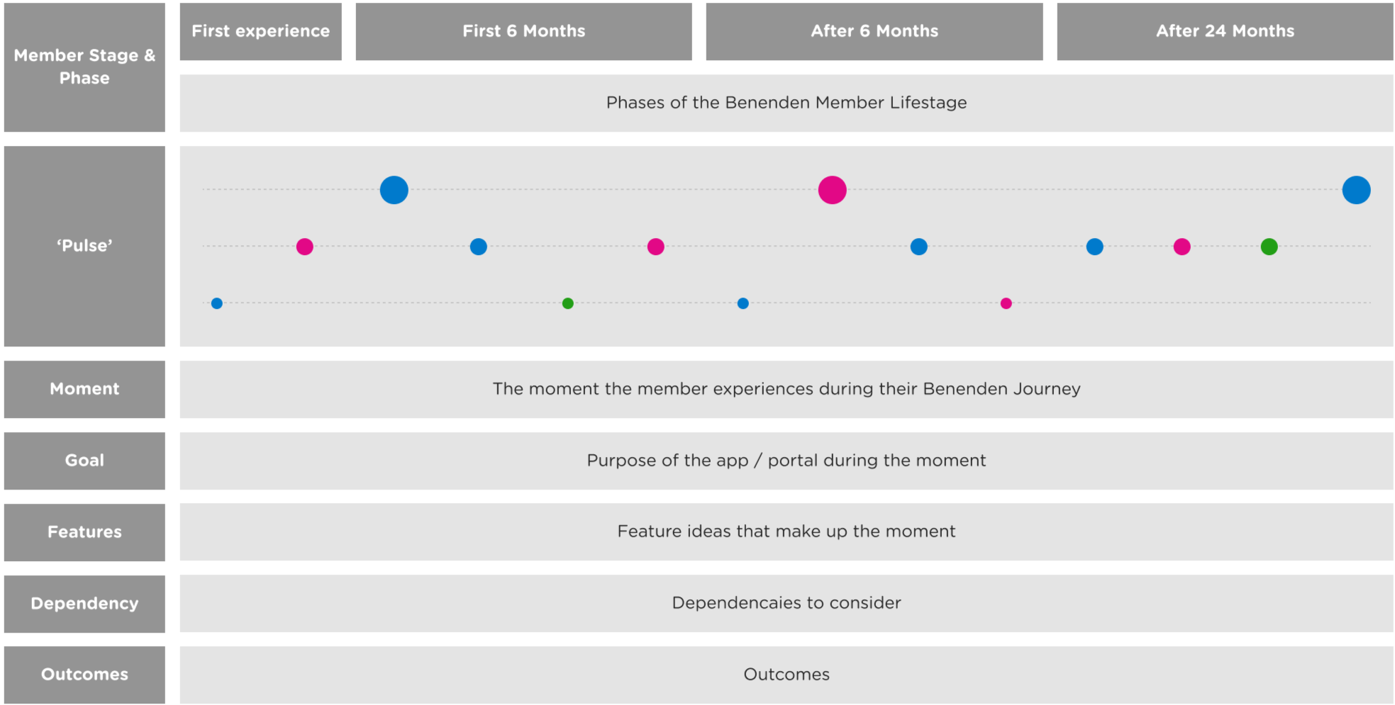
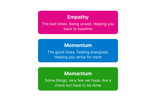
The ‘Pulse’
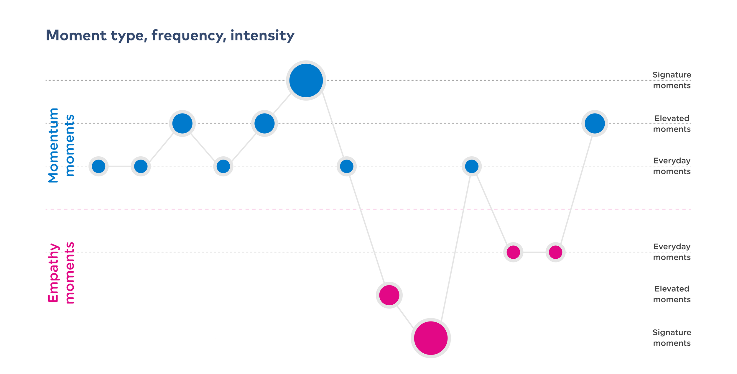
The ‘Pulse’ refers to how the app responds depending on the moment that a customer is going through in their healthcare journey. Below we have some examples of the three different moments and what types of experiences the customer might be going through.
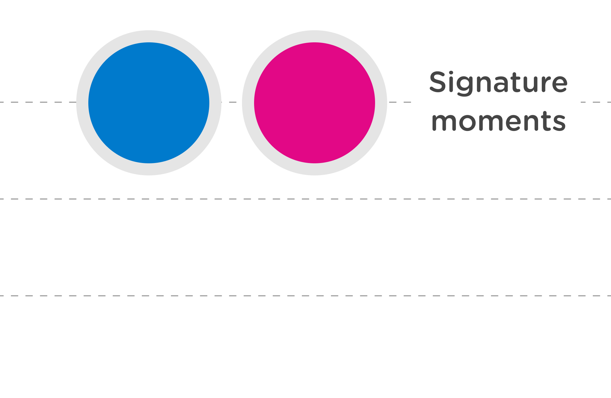
Signature Moments
These are the high-impact, emotionally charged moments, like attending a GP consultation, joining a live event, or receiving diagnostic results. They require empathy, clarity, and strong support to help customers feel cared for and motivated.
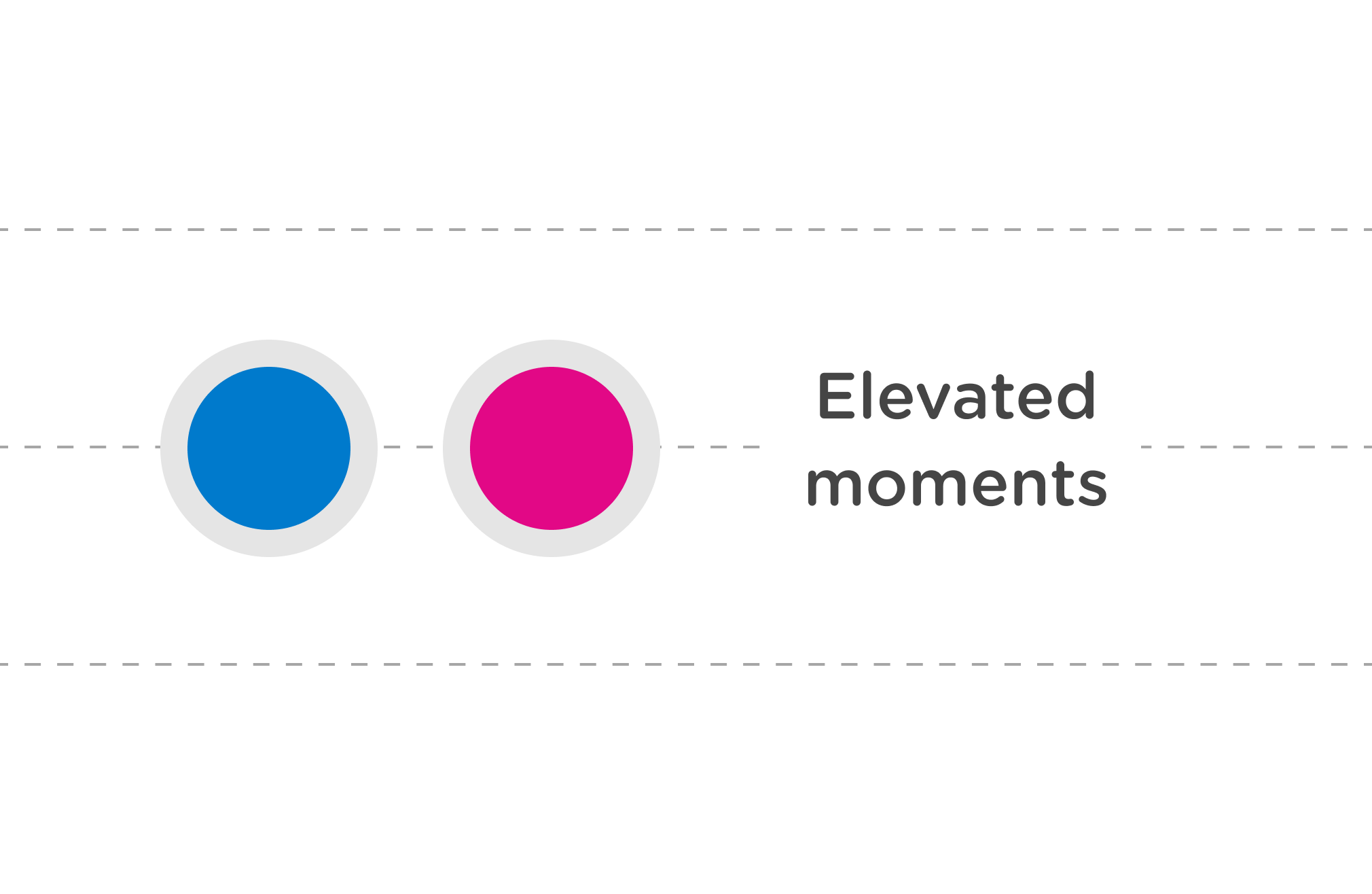
Elevated Moments
These are mid-level moments, such as getting a claim approved, receiving next steps, or signing up for a wellbeing event. They need thoughtful guidance and timely nudges to keep customers moving forward.
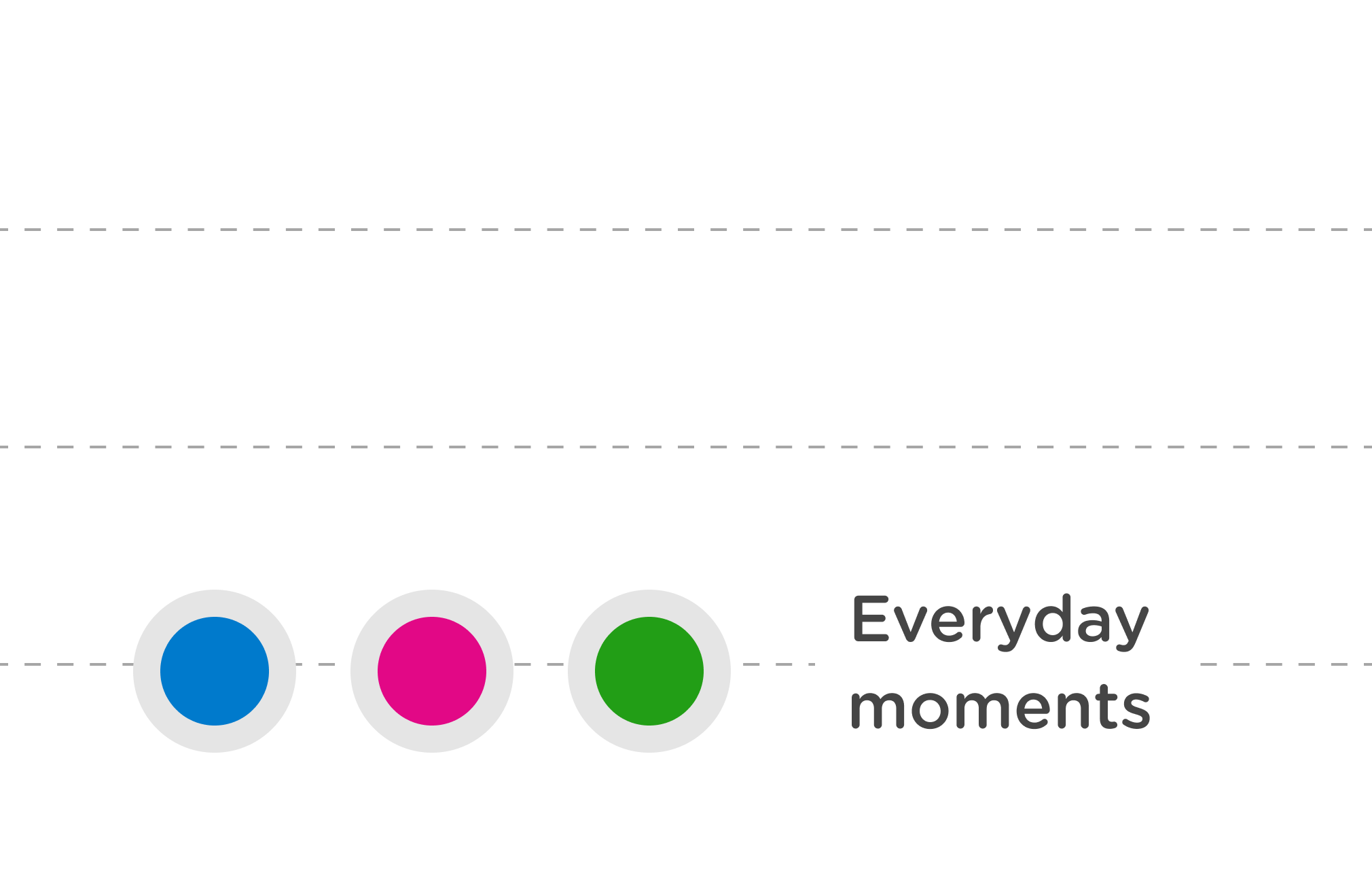
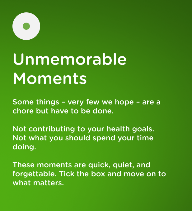
Everyday Moments
These are routine, utility-driven tasks, like logging in, updating details, or exploring content. The goal is speed and simplicity: get in, get out, and get where you need to go without friction.
Key
Member Stage
The member stages highlight key milestones in the Benenden journey, including the first experience, the first 6 months, after 6 months, beyond 24 months and retention & renewal.
Phase
The phases represent key sub-stages of the Benenden member journey, including login, onboarding, and requesting health services.
Status
Status badges indicate whether the moment already exists in the Benenden experience or if it represents a new addition.
Pulse
The pulse reflects the intensity with which the moment is visualised in the digital experience. The different pulse levels include: everyday, elevated, and signature.
Moment
A specific experience in the member's Benenden journey, articulated through a human-centred lens. Each moment focuses on the member’s emotions, needs, and expectations, ensuring a personal and empathetic interaction.
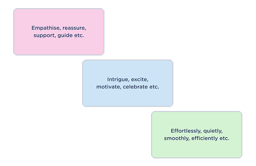
Goal
What the app/portal is supposed to be doing during the moment. Each goal begins with an emotional intent, capturing the feeling the app needs to convey during that specific interaction.
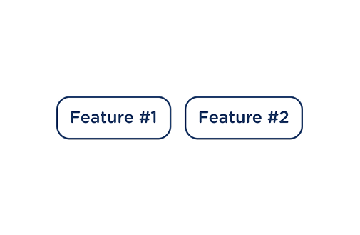
Feature
Ideas for features that make up the moment. Features consist of ideas, ToV recommendations, copy suggestions. They are the building blocks of the moment.
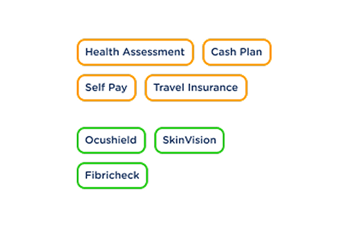
Upsells & Rewards
We identified opportunities to upsell and reward members at key milestones throughout their Benenden journey. Upsell offers are introduced at relevant moments, while rewards are used to celebrate and enhance member loyalty.
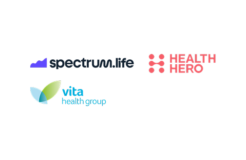
Dependancies
Third-party partners on whom we rely for their technical and content capabilities.