Stagecoach
Using Behavioural Nudges to Convert App Users into Paying Customers
A 2-month project to improve Stagecoach’s ticket purchase flow and increase conversions through behavioural design.
Date
Oct-Dec 2024
Type
2 month client project
Role
Generative Research, Product Design, Journey Mapping, Usability Testing,
Platform
iOS & Android
Tools
Lookback, Askable, Figma, Miro, ChatGPT, Perplexity
Problem
With 3 million monthly active users, Stagecoach had a massive audience, yet the Stagecoach team were strugging to convert these users into paying customers.
The app felt clunky, outdated, and was losing ground to smoother, faster competitors like Google Maps and Citymapper especially for the core use case of checking bus times.
Task
Understand the behavioural patterns of bus travellers and figure out how to nudge non-paying users into buying tickets through the app.
Solution
While our research explored the full end-to-end bus travel experience, this project focused on a more targeted challenge:
How might we use behavioural nudges to encourage non-purchasing users to buy tickets, while improving the overall ticket-buying experience?
That meant narrowing in on one key part of the journey: ticket purchasing.
We weren’t just trying to make things more usable, we were designing for conversion. The aim wasn’t just to help users complete a task, but to nudge them into a commercial action that aligned with Stagecoach’s business goals.
To do that, we turned to behavioural science. Specifically, the MINDSPACE theory.
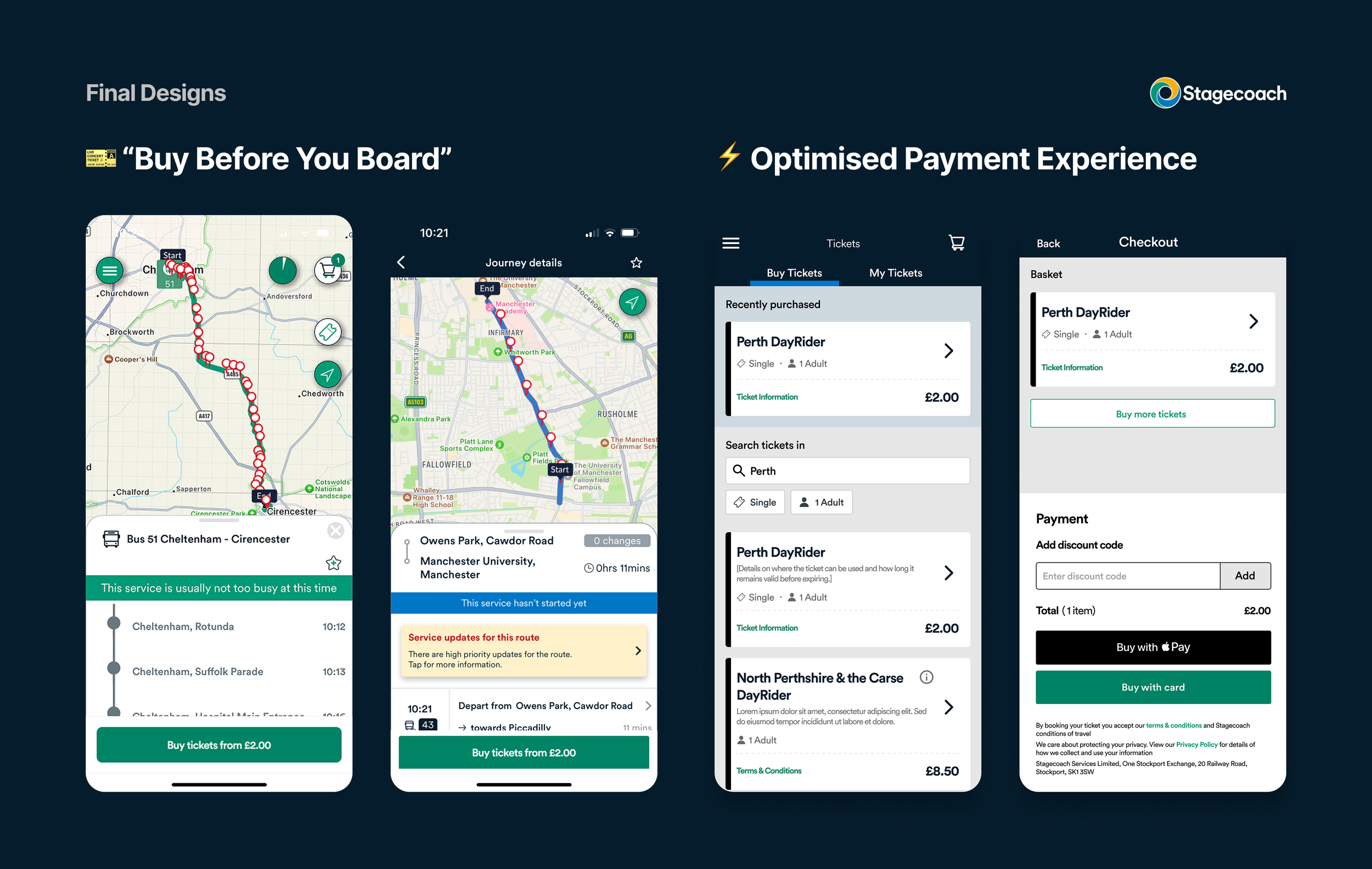
Optimised Payment Experience
The existing flow was long, clunky, and full of unnecessary steps. We redesigned it to feel seamless:
Removed redundant screens (like a standalone basket or ticket info page)
Made Apple Pay the default to reduce decision-making effort
Ensured users could complete a purchase in just a few taps
🧠 Nudges used:
Defaults – Preselected the most common choices
Norms – Aligned with typical travel behaviours
Affect – Created a calmer, stress-free checkout
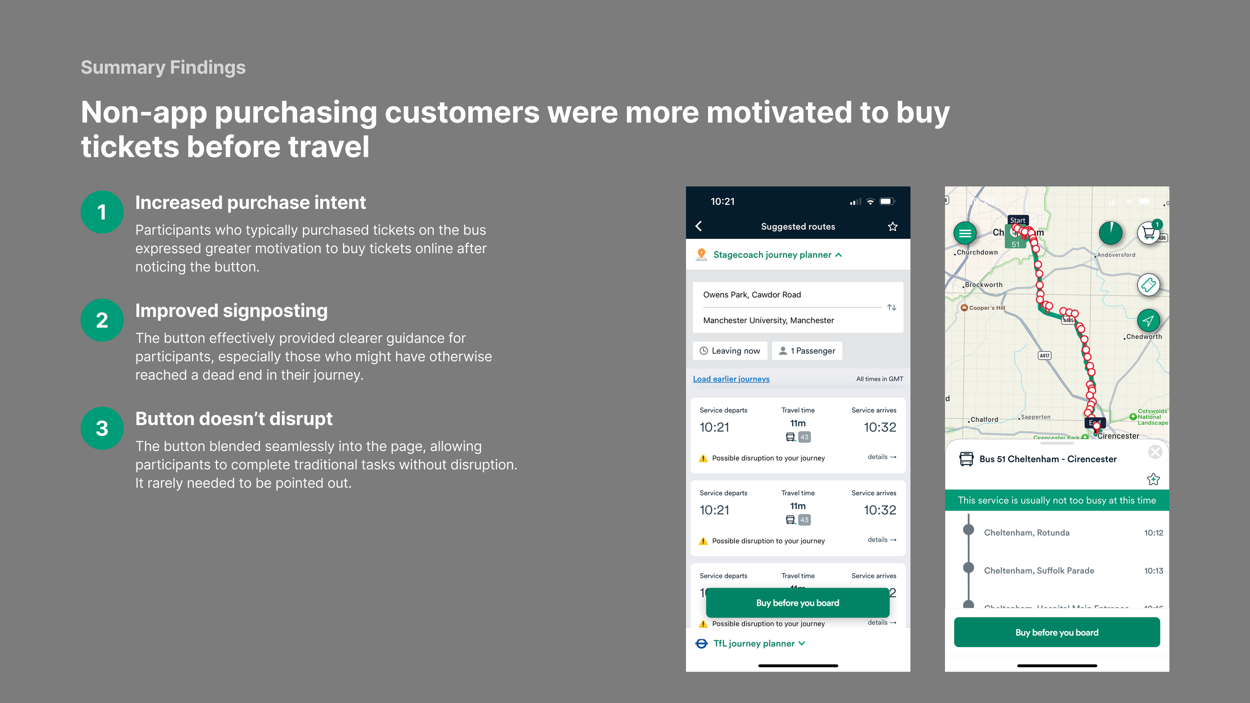
Buy Before You Board
We introduced a fixed-action button within the journey-planning flow to prompt users to buy tickets in advance. It was all about timing, surfacing the option when users were already thinking about their journey.
🧠 Nudges used:
Priming – Introduced the idea of pre-purchase earlier in the flow
Norms – Framed advance buying as the expected behaviour
Salience – Made the action more visible and timely
My Role
I was the day-to-day Product Designer on the project, working with a PM and Senior Strategist, and supported by a Lead UX Designer.
I led:
A UX audit of the existing app
The UI design phase using the Stagecoach design system
Usability testing to validate and refine the experience
I also collaborated on:
Generative research (planning and conducting interviews)
Research synthesis and opportunity mapping
Creating an experience map to visualise the customer journey
Ideation workshops and concept development
What I Learned
The difference between a finding and an insight – Insights are those neat phrases that capture the essence of human behaviour. The one’s that make the room go ‘Ahhhh’ when presenting them back. If you haven’t got that, then it’s likely to be a finding.
The value of a structured research process
No shortcuts. We followed a rigorous eight-step process for conducting generative research, from planning and recruitment through to synthesis and insight generation. It made the outputs stronger and the design direction clearer.Designing for business, not just users
This wasn’t about delight, it was about conversion. I had to balance user needs with commercial outcomes, and make peace with the fact that sometimes, business comes first. That shaped how I approached both design and prioritisation.Behavioural theory is a superpower
This project taught me how small nudges can drive big behavioural shifts. Learning to apply the MINDSPACE framework has changed how I think about influencing action through design.
If you want to read more and see my process, check out the full story below…
Who are Stagecoach?
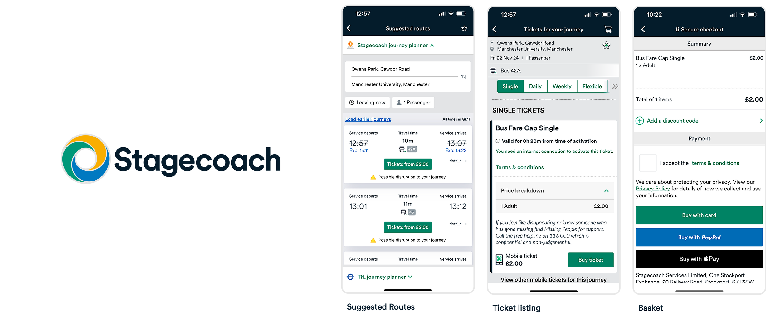
The existing Stagecoach experience
Stagecoach do busses. If you’re reading this in the UK and walk into your local high street you might just find one. They’re the the UK’s largest bus operator. They operate local and express bus services across major cities in the UK. The Stagecoach app allows customers to plan bus travel by allowing them to see bus times, tracking bus locations and to buy tickets in advance before boarding the bus.
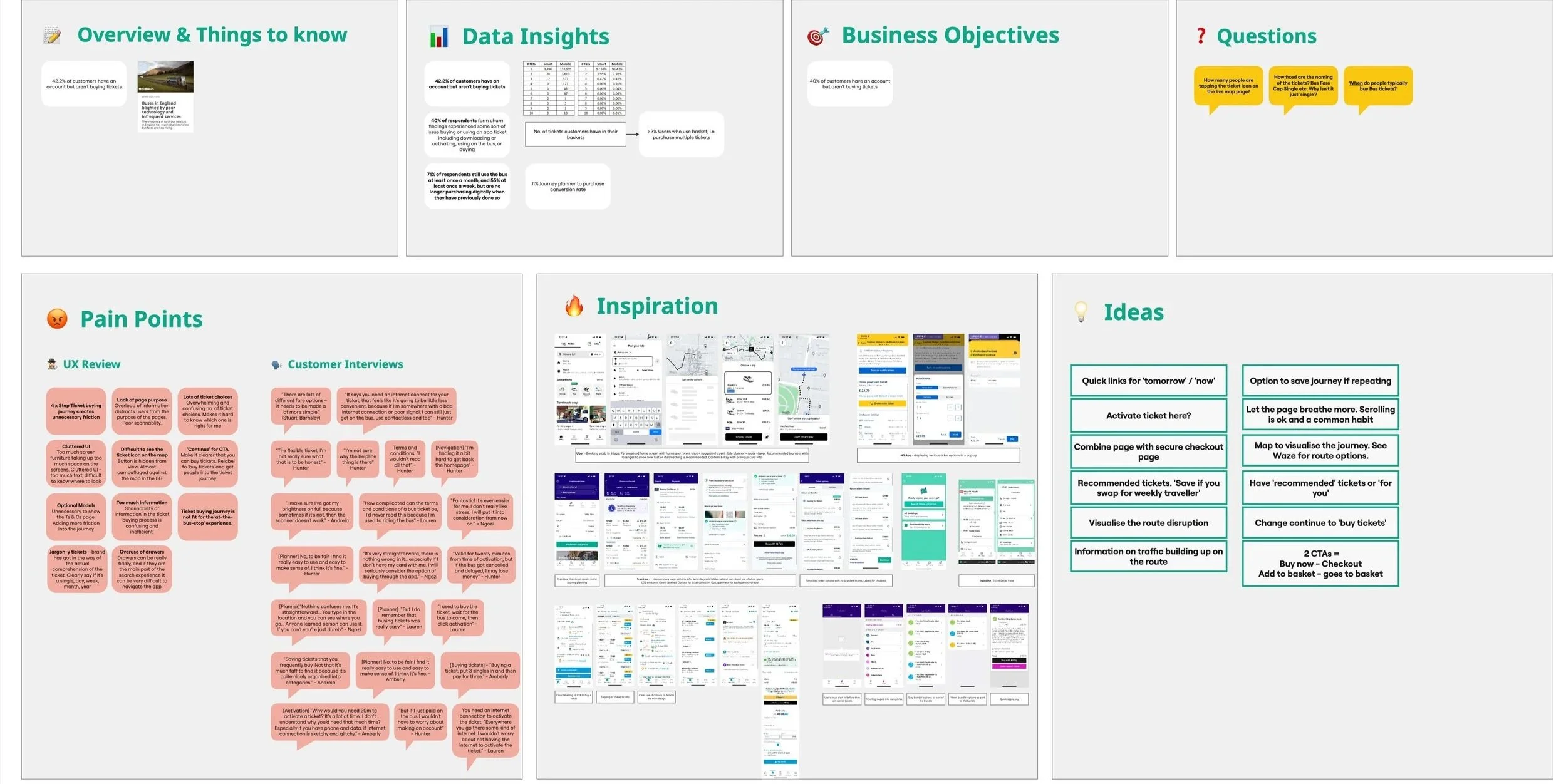
Discovery Research
UX Audit
To kick things off, I did a deep dive into the current Stagecoach app and ran a heuristic audit of the experience. I screengrabbed every screen and sorted them into use cases; planning journeys, tracking buses, buying tickets, and more.
From there, I annotated the journeys by colour-coding pain points, comments, standout moments, and opportunities. This formed the foundation for what we needed to dig into during user interviews.
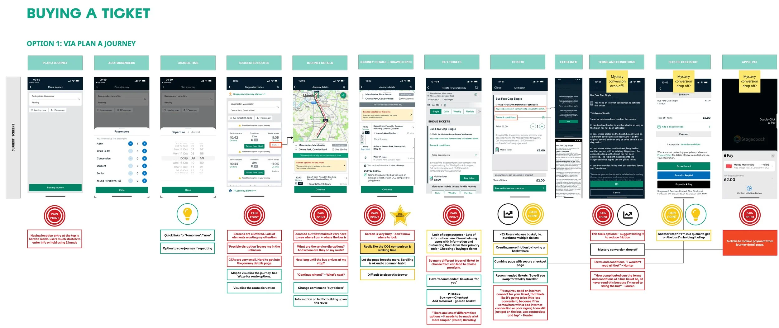
Identifying pain points, stand out moments and data hotspots
Summarising findings per journey
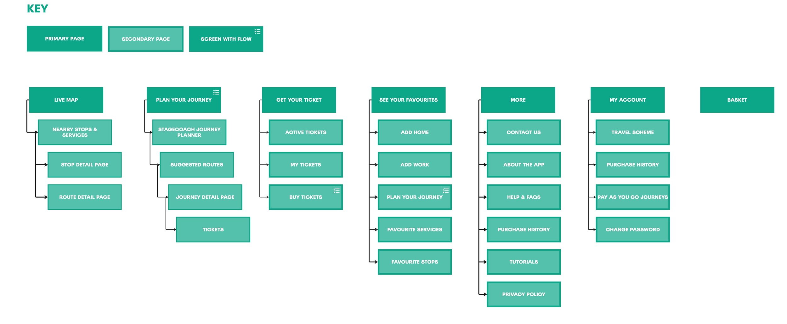
App Map
Key findings
Friction and complexity in the ticket buying journey
The 4-step process was too long and not optimised for quick, on-the-go use, especially at the bus stop. Optional modals, hidden CTAs, and drawer overuse add unnecessary friction.
Unclear UI and Weak Visual Signposting
Cluttered layouts, small or hidden buttons (like the ticket icon on the map), and vague labels (e.g. "Continue" instead of "Buy Ticket") confuse users and reduce task completion confidence.
Overwhelming Information and Poor Clarity
Too many ticket options, overloaded screens, and jargon-heavy language make it hard for users to understand what ticket to buy. The interface lacks clear hierarchy and scannability.
Customer Interviews
We wanted to go beyond the interface and understand how people actually approach bus travel—when they plan, what stresses them out, and what role the app plays in their routine.
Key Outputs
Insight into how customers think and feel about using the bus
Specific patterns in how, when, and why people buy tickets
Opportunity areas to feed directly into ideation and prioritisation
Research Areas
Mindsets and behaviours around travel, planning, and timing
Attitudes towards bus travel—including ticketing and real-world journeys
Experience with the Stagecoach app and other travel apps (e.g. Citymapper, Google Maps)
Who we spoke to
We ran 12 semi-structured, 60-minute interviews over video using Lookback. We aimed for a 50/50 split between Stagecoach and non-Stagecoach users, with a mix of ages, travel habits, and payment methods (contactless, mobile app, and cash).

Some Feedback from our Participants
“It was really enjoyable, Nico was a great guy to talk to and asked a lot of interesting questions.”
“I was very pleased with the outcome of the session. The interaction with Nico was a pleasant experience, very polite with a great personality! It was a topic relevant to me as I do rely on Stagecoach for almost all of my travel needs. Thank you Nico for giving the opportunity to voice my opinions.”
Research Process

It’s just the bus.
Late buses are just a fact of life.
Reassurance is key.
Data sources compete for trust.
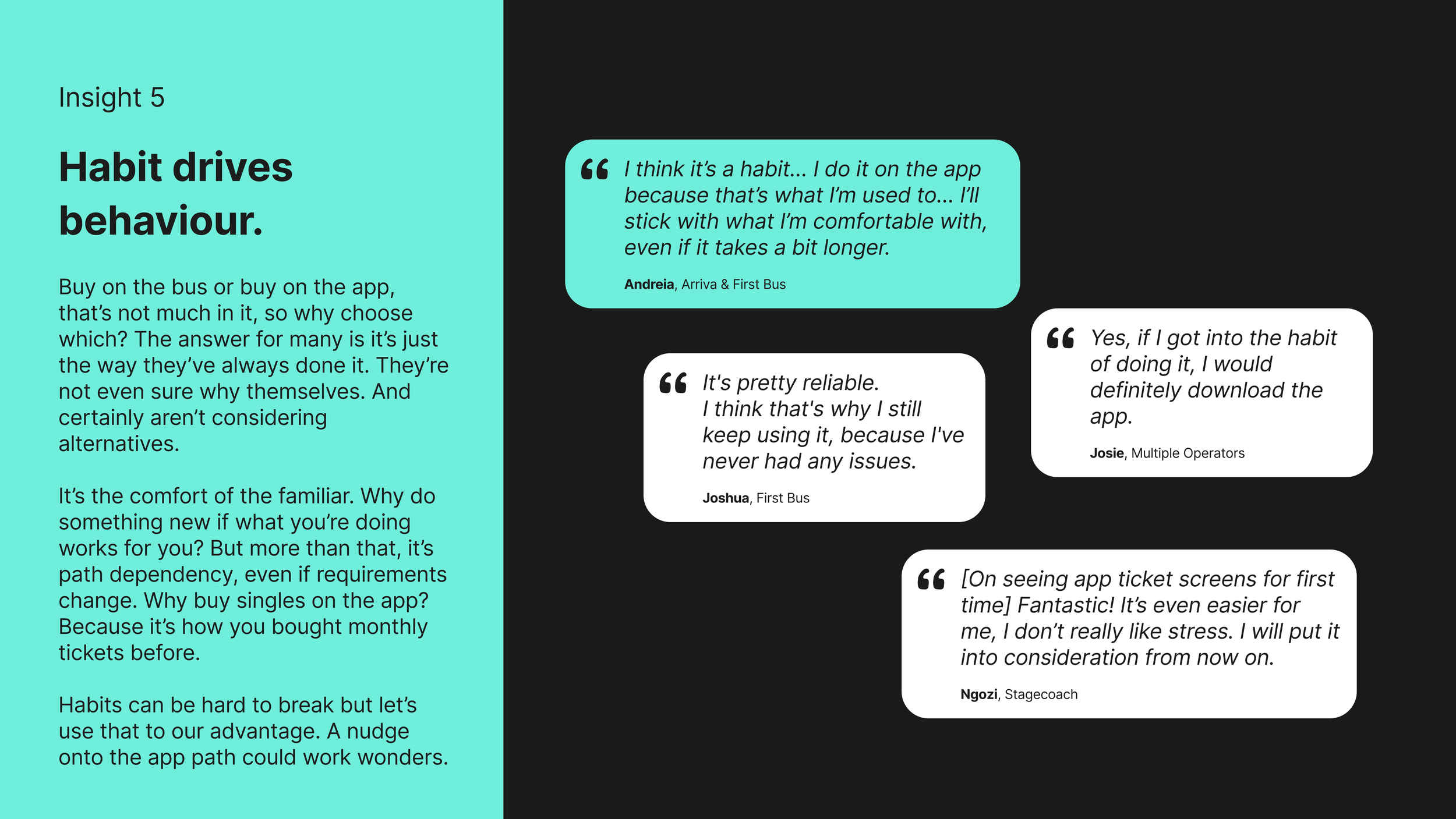
Habit drives behaviour.
Routine, routine, routine.
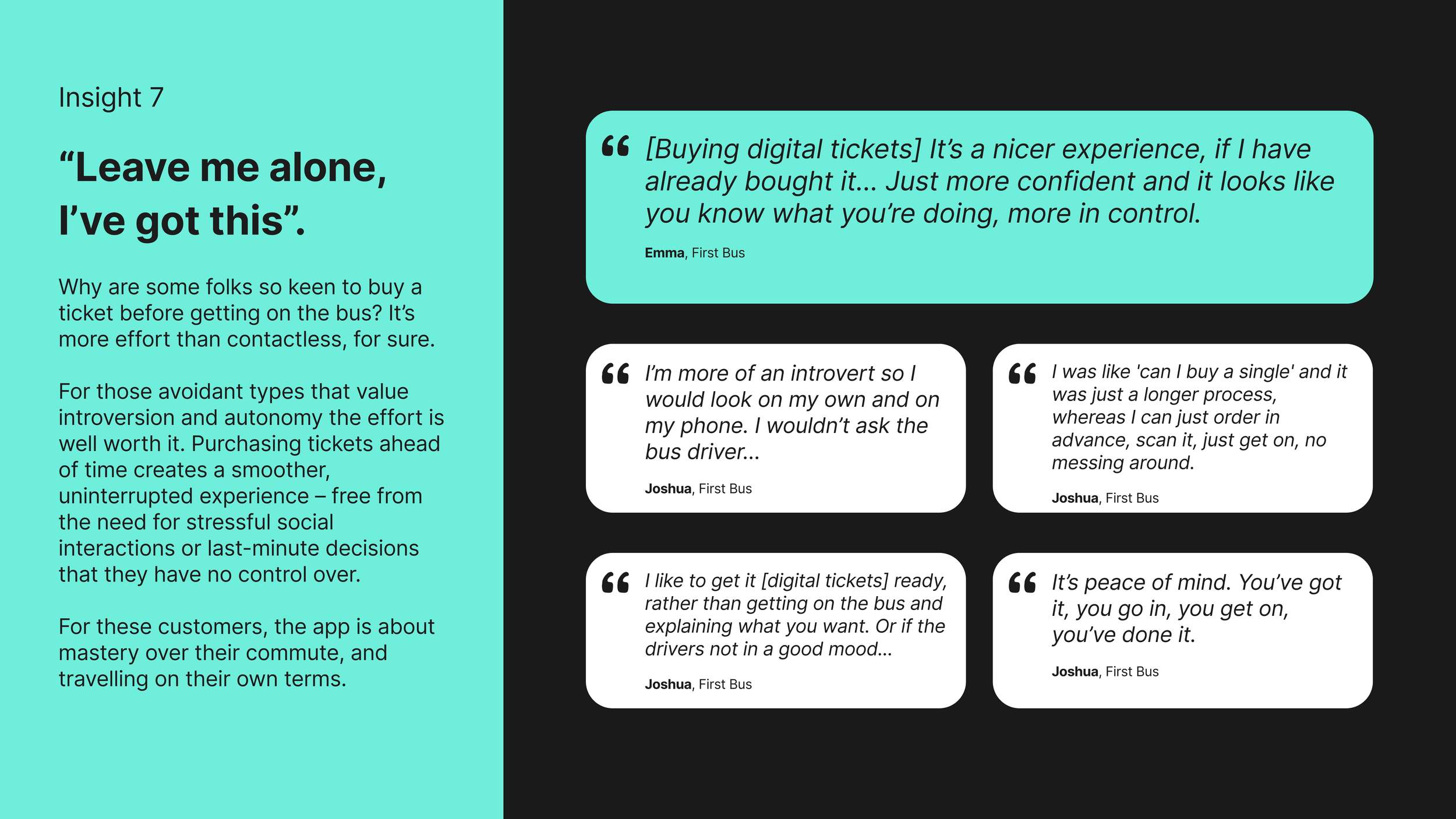
“Leave me alone, I’ve got this”
Folks follow the crowd.
What makes a good bus person?
The Insights
Zooming in on a couple of insights
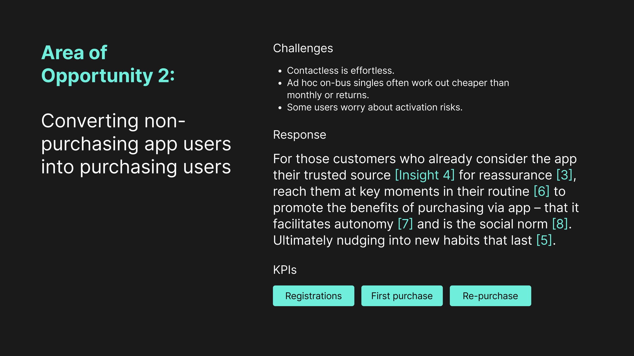
I’ve pulled out a couple of core insights that had real weight behind them, especially in the context of ticket buying. These were backed by multiple users and shaped the direction of our opportunity areas.
Opportunity Framing
From what we learnt, there was no one-stop-shop magic bullet to improve app adoption and increase ticket sales.
So the challenge that lay ahead was not solved by building big things but nudging behaviour changes and encouraging new habits.

Ideation & Prioritisation
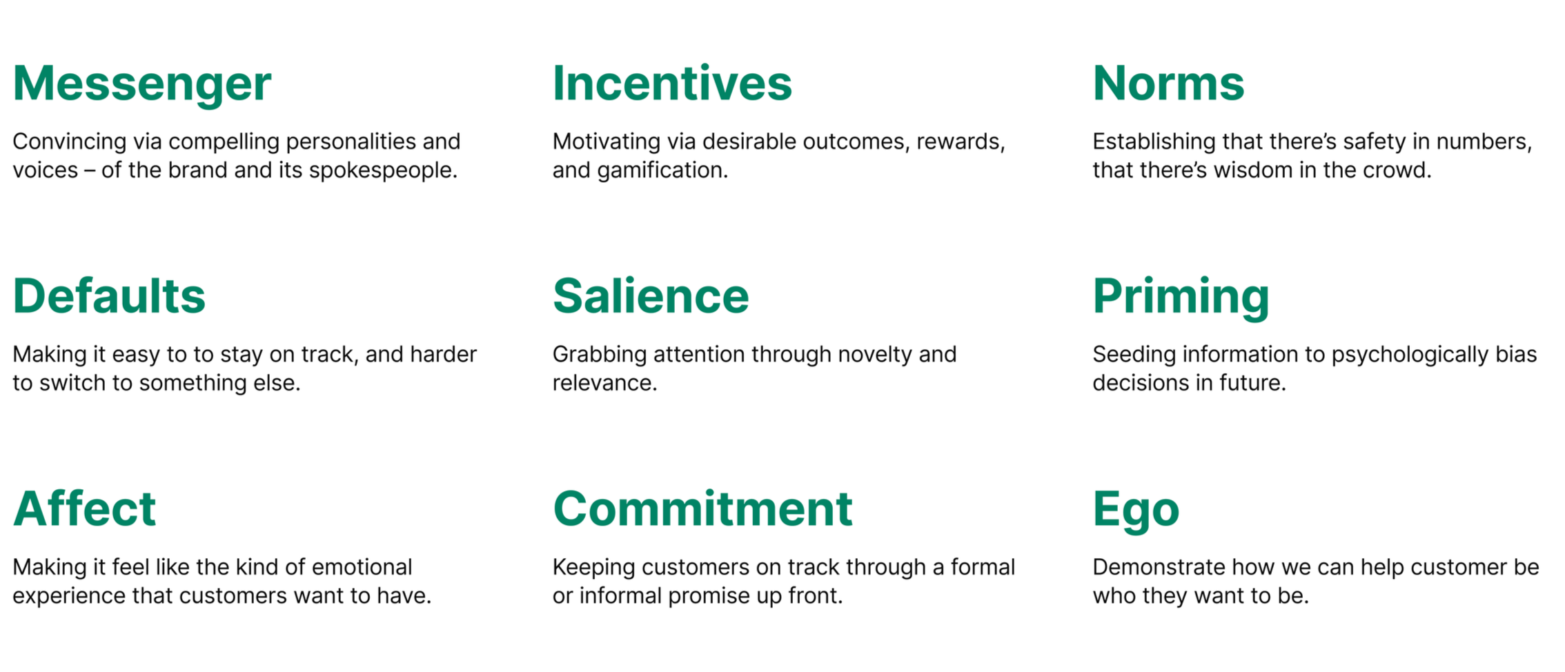
Introducing: MINDSPACE
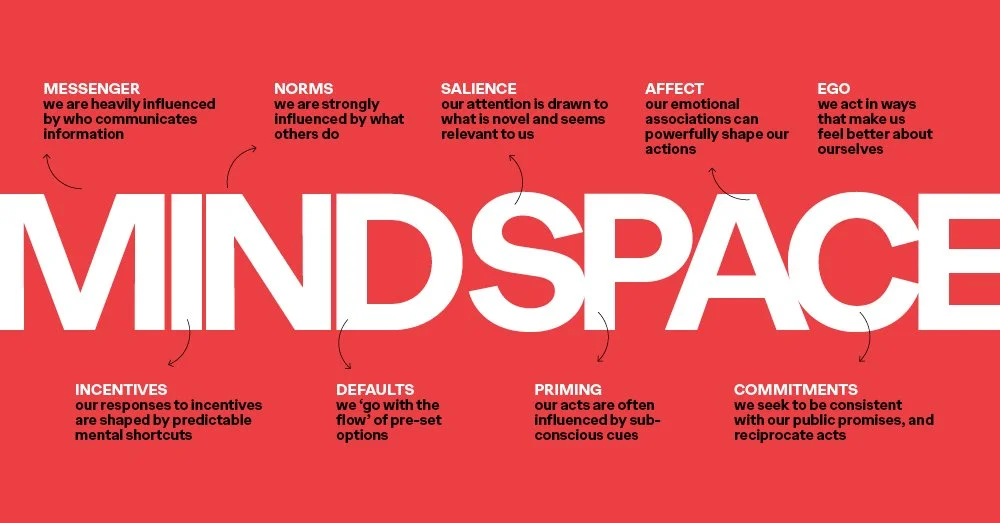
MINDSPACE is a behavioural framework created by the UK Government’s Behavioural Insights Team. It's essentially a cheat sheet for understanding what actually influences people’s decisions beyond what they say they’ll do.
It’s a helpful lens for nudging behaviour in a way that feels natural, not forced. It’s especially useful when you're designing something where habit or hesitation gets in the way of action, like getting people to buy a ticket before boarding a bus.
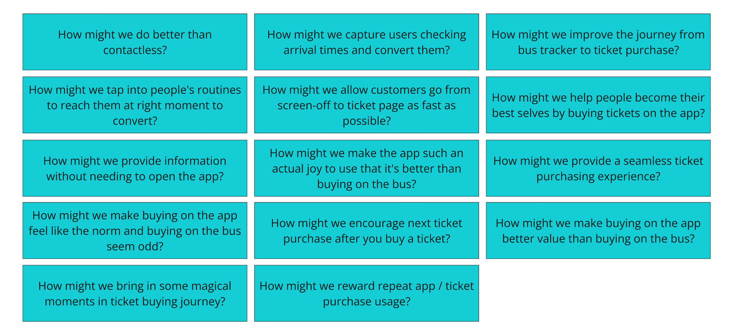
Creating How Might We’s from Opportunity Areas
We used the insights from research to shape a set of How Might We (HMW) questions. These helped us reframe problems and guide ideation.
Rapid Ideation Sprint
We set a timer for an hour and each stuck our headphones on and ideated solutions against the How Might We’s. The aim was speed, and breadth as opposed to coming up with 5-10 ideas. We wanted a whole load of ideas we could then recluster to create parent themes.

Thematic Clustering
After generating nearly 190 ideas, we started to see patterns. We grouped similar concepts into themes and began to identify overlaps in thinking.
From this, nine unique ideas emerged, each with a clear parent theme and supporting ‘child’ activations. These child ideas represented specific ways we could bring the themes to life in the app.

Prioritisation Workshop
We ran a workshop with the Stagecoach team to decide which ideas to move forward with. Using an impact/effort matrix, we prioritised ideas that would make the biggest difference with the least friction to build.
The two themes that stood out to the client were:
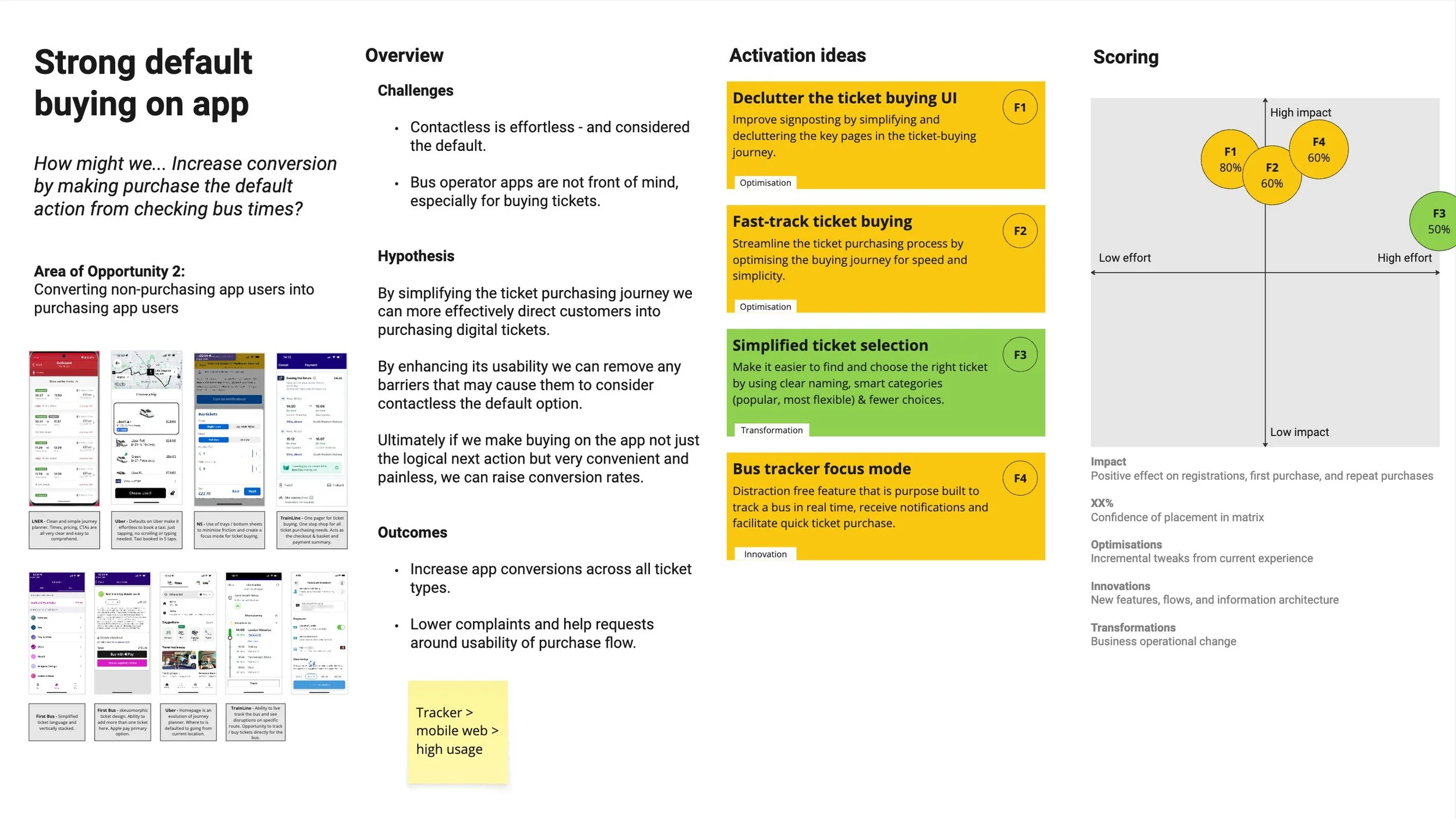
Strong default buying in-app
App purchasing as a social norm

The 3 Activation Ideas We Took Forward
We couldn’t take everything forward, some ideas drifted out of scope or required too much build effort. But we landed on three activations that scored highest on impact and feasibility:
They smoothed out the path to purchase
Nudged users at the right time
Removed friction from checkout
Together, these felt like the clearest path to improving the ticket-buying journey without needing to redesign everything from scratch.
Hold on, let’s zoom out for a second…
With nearly 200 ideas on the table and a clearer sense of our design priorities, we needed a way to zoom out and bring everything together. We wanted to understand not just what people were doing, but when, where, and why problems and opportunities were emerging.
That’s where the experience map came in.
Experience Map
With discovery complete and ideas now prioritised, we created an experience map to tie everything together; insights, opportunities, HMWs, and early concepts.
It helped us visualise the real world journey people take when using the bus and gave us a clear sense of where we were seeing clusters of friction, behaviour patterns, and opportunities to act.
💡We saw the highest density of insights and ideas across three key moments:
Planning & Assessing the Journey at Home
Checking Times & Going to the Bus Stop
Waiting at the Bus stop
The map became a central alignment tool for both our team and the client, helping us stay anchored to real user needs while moving into design.
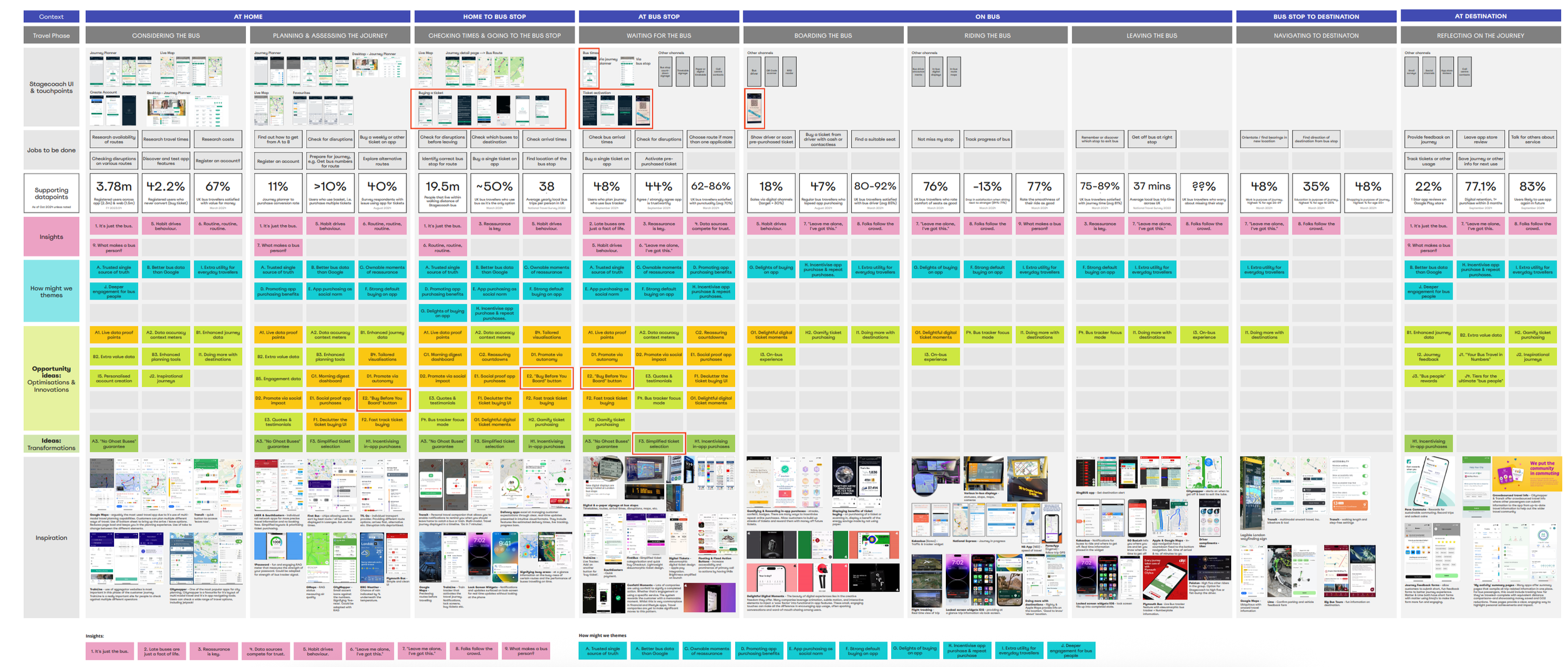
What the Map Captured
🗺️ Travel Context & Phases - We mapped the journey across key travel moments; from the kitchen table to the bus stop.
📌 Jobs To Be Done - We outlined the core jobs users were trying to complete at each stage, like “Check bus arrival time” or “Buy a ticket while waiting.”
📊 Supporting Data - We pulled in relevant data points from Stagecoach (quant and qual) to validate where user needs and business goals intersected.
💬 Insights - Key behavioural patterns (like “Habit drives Behaviour” or “Leave me alone I’ve got this”) were mapped against specific journey phases.
❓ How Might We - We plotted our HMW questions directly onto the journey map to frame solution thinking at the most relevant pain points.
💡 Ideas - We dropped our prioritised ideas onto the map to see where we had coverage and where gaps still existed.
🌎 Inspiration - To stretch thinking, we brought in reference points from competitors and global UX patterns (e.g. bus signage in Singapore, First Bus, and Citymapper flows).
Design
After our prioritisation workshops, three strong ideas emerged. For me, they naturally grouped into two key design directions:
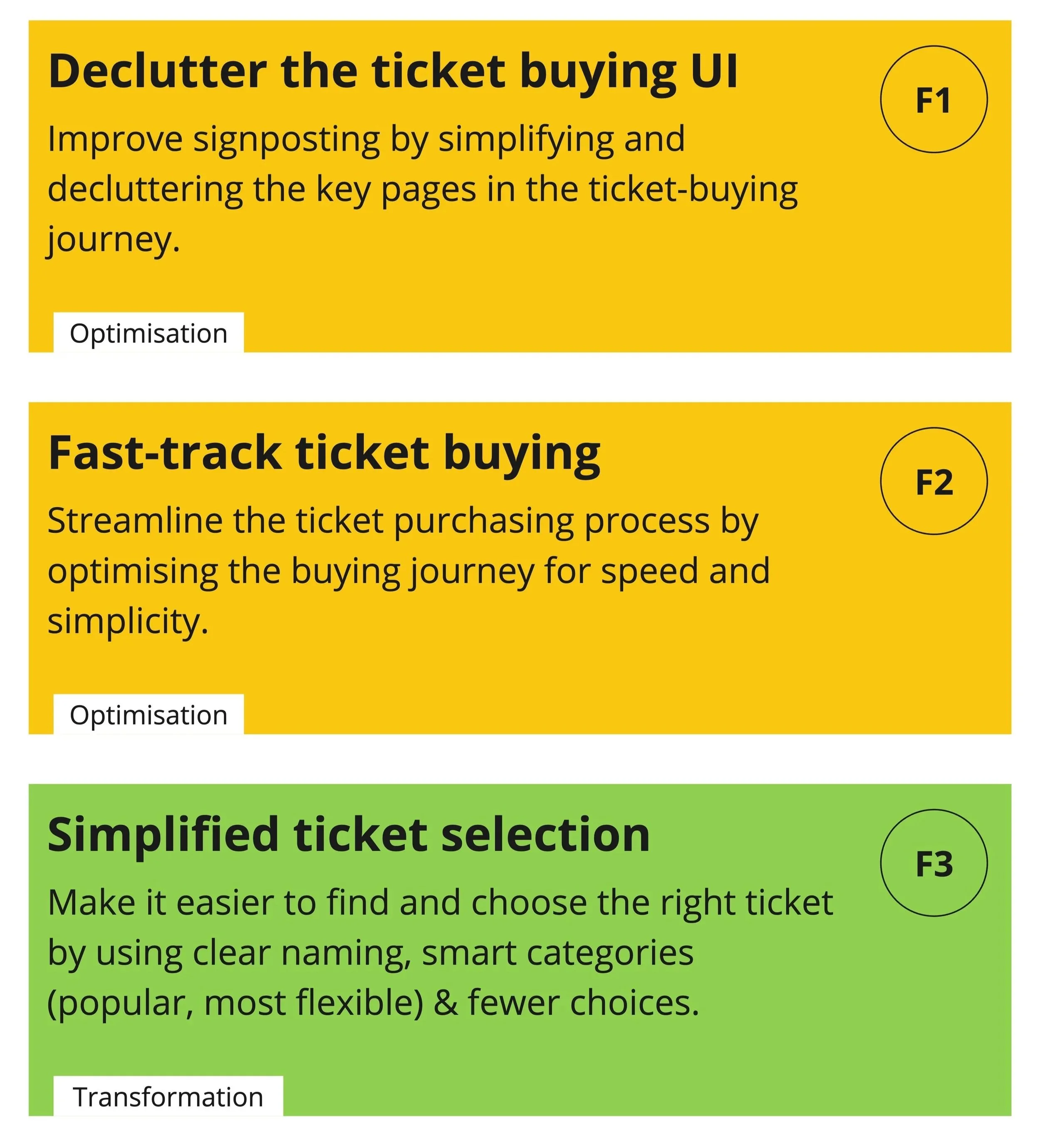
Optimised Ticket Buying Journey
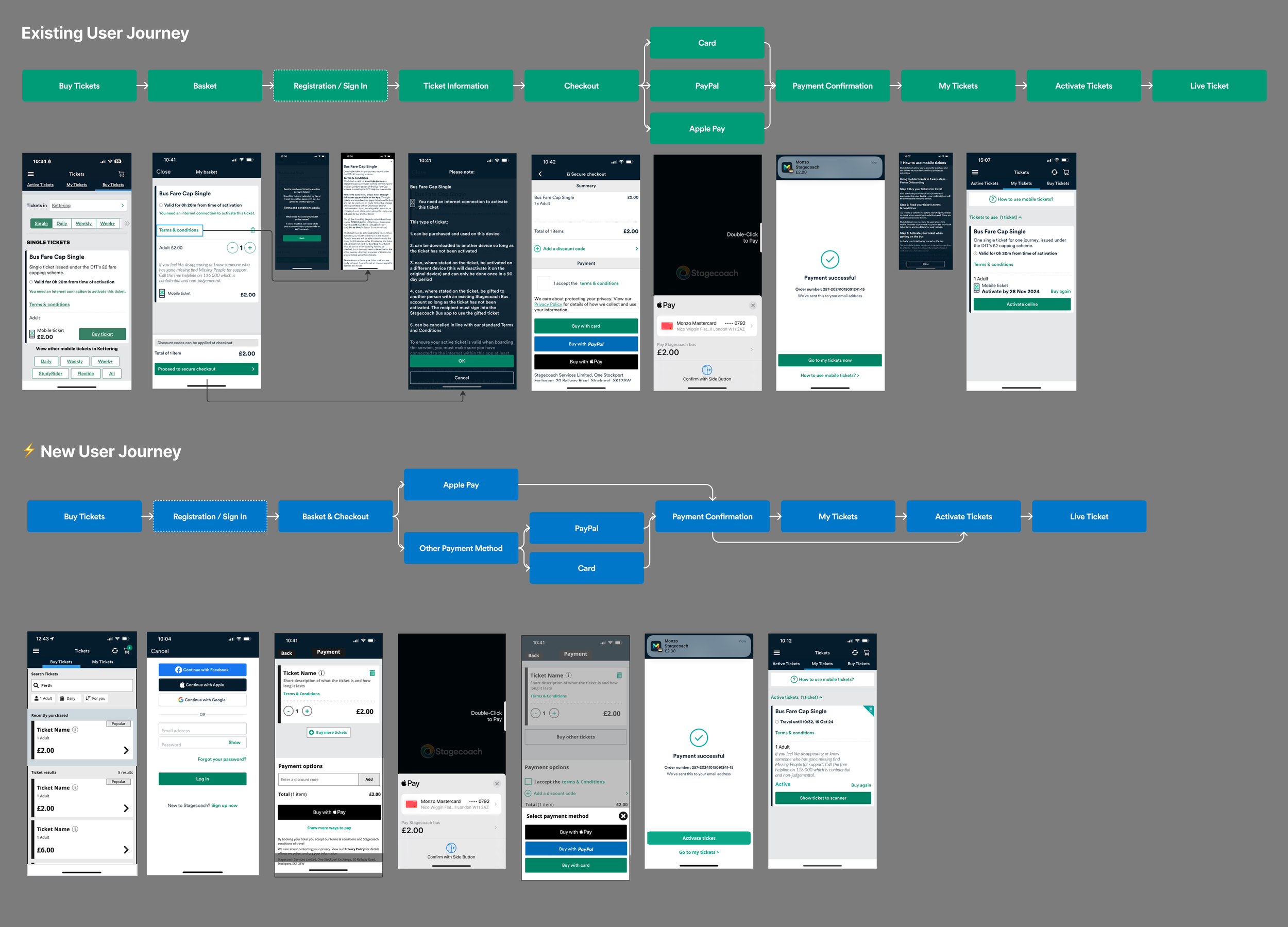
The old ticket flow felt clunky and had too many steps. We simplified the experience by aligning it with familiar travel behaviours and reducing friction throughout.
Defaults – Preselect common choices
Norms – Follow established travel behaviours
Affect – Make the process smooth and stress-free
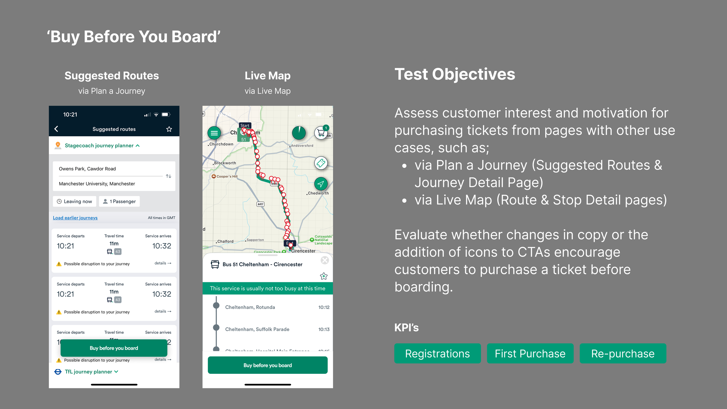
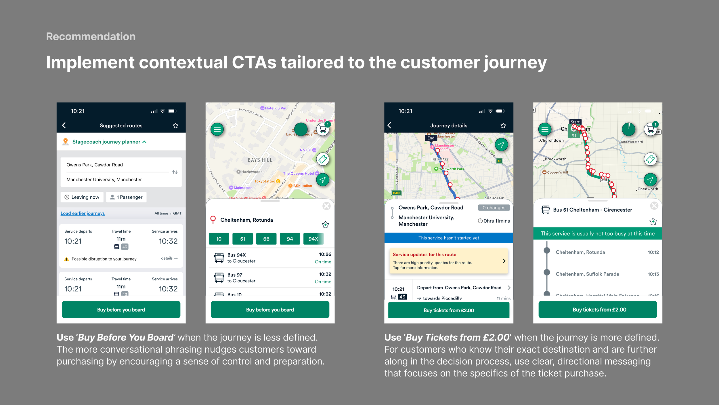
‘Buy Before You Board’
Users often didn’t make it to the ticket section, especially in the journey planner and live map, where their focus was elsewhere. We wanted to introduce a clear ‘Buy Before You Board’ button in those areas to gently nudge users at the right moment, without disrupting their flow.
Priming – Introduces the idea of buying earlier
Norms – Reinforces pre-purchase as standard behaviour
Salience – Makes ticketing more visible
Workings
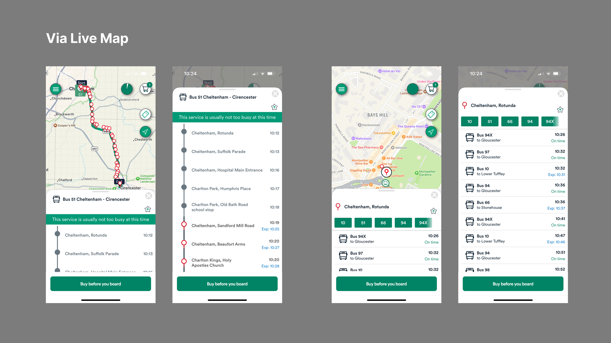
Buy Before You Board
Bringing in the ‘Buy Before You Board’ CTA was relatively straightforward. The main task was to identify the key pages that we wanted to bring in the CTA. We believed the screens to bring in the CTA were;
Via Plan a Journey + Journey Details
Via Live Map
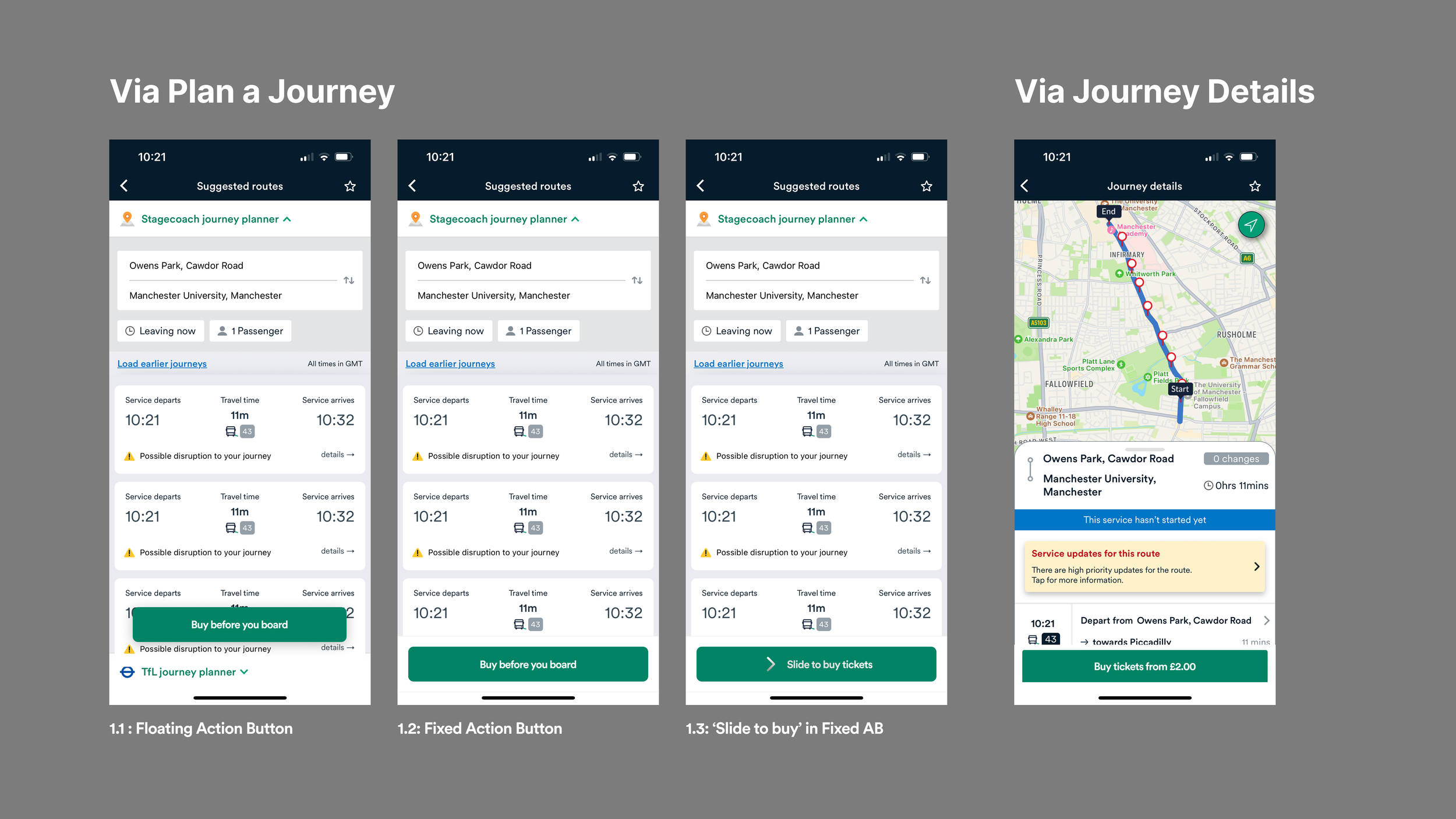
I also wanted to test the placement and interaction so I created 3 CTA interactions":
Floating action button - placing a FAB on the screen would make it ‘pop’ out more and seem more of a primary action
Fixed Action Button - This would sit at the bottom of the page for maximum visibility
Slide to Buy - having a sliding interaction might make it more fun and more engaging
Optimised Ticket Buying Journey
Task 1: Clean up the flow
We made a few key decisions to streamline the journey:
Combined basket and checkout – Less than 3% of users bought multiple tickets, so the basket felt unnecessary for most. We merged it with checkout to simplify the path.
Made Apple Pay the default – To reduce decision fatigue, we nudged users towards a single, fast payment method while still offering others.
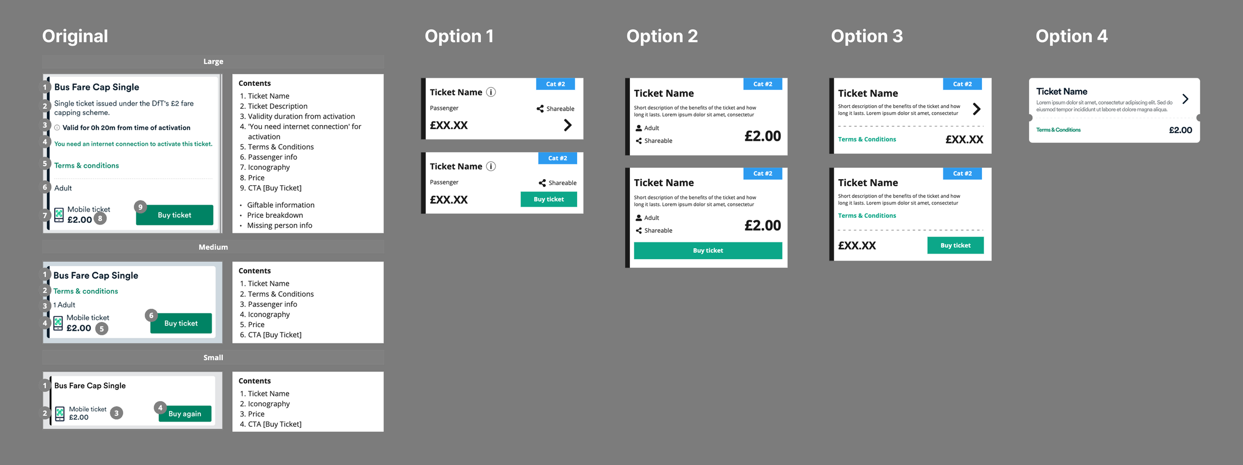
Removed the mandatory ticket info page – Instead of forcing everyone through pages of Ts & Cs, we tucked the details behind an info icon for those who needed them.
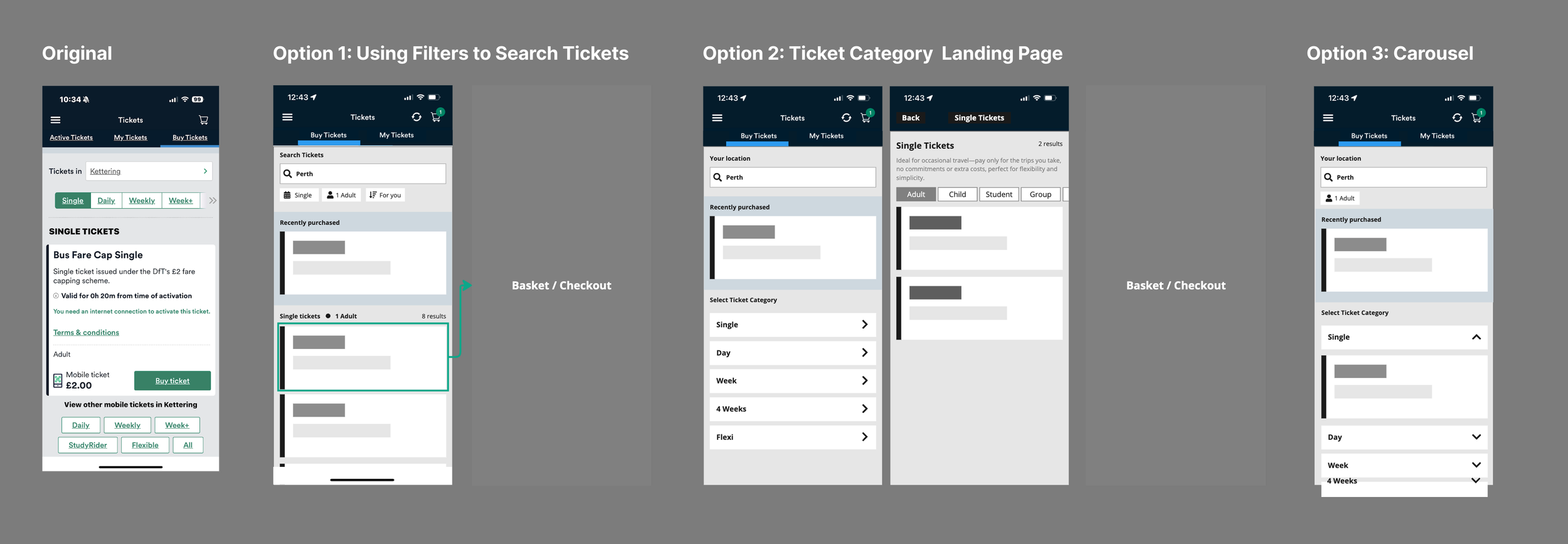
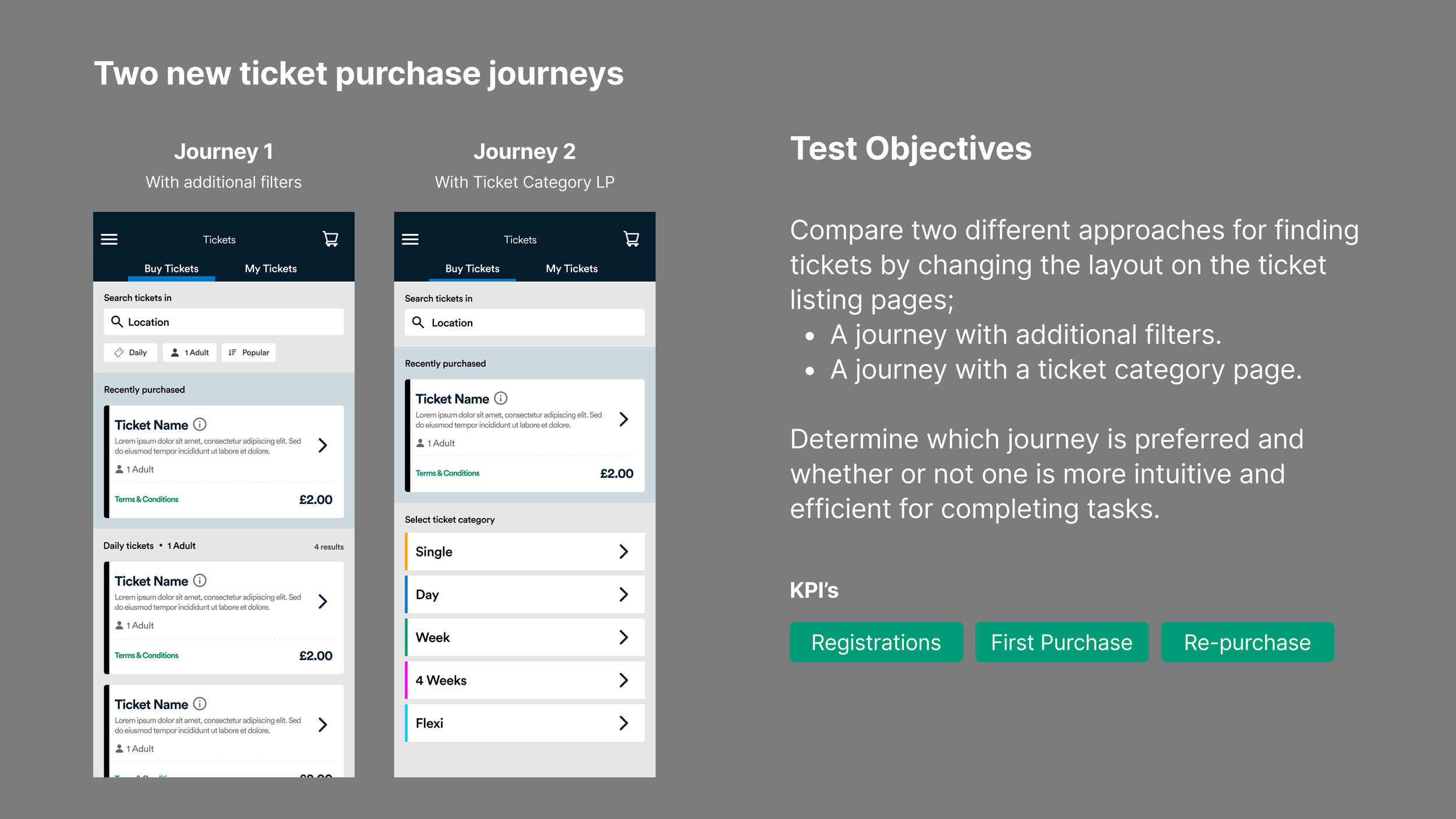
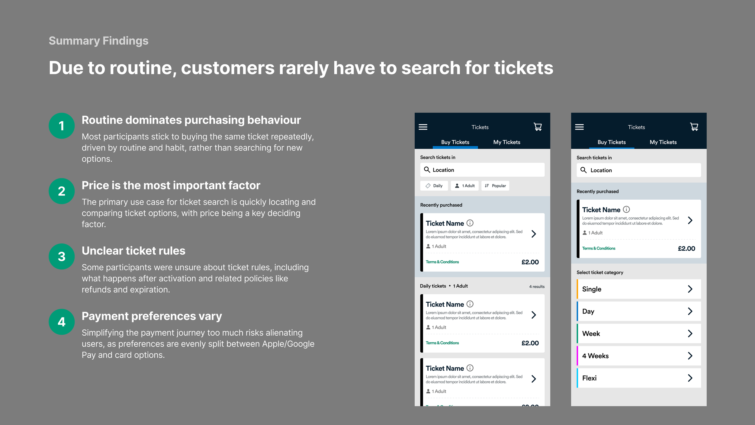
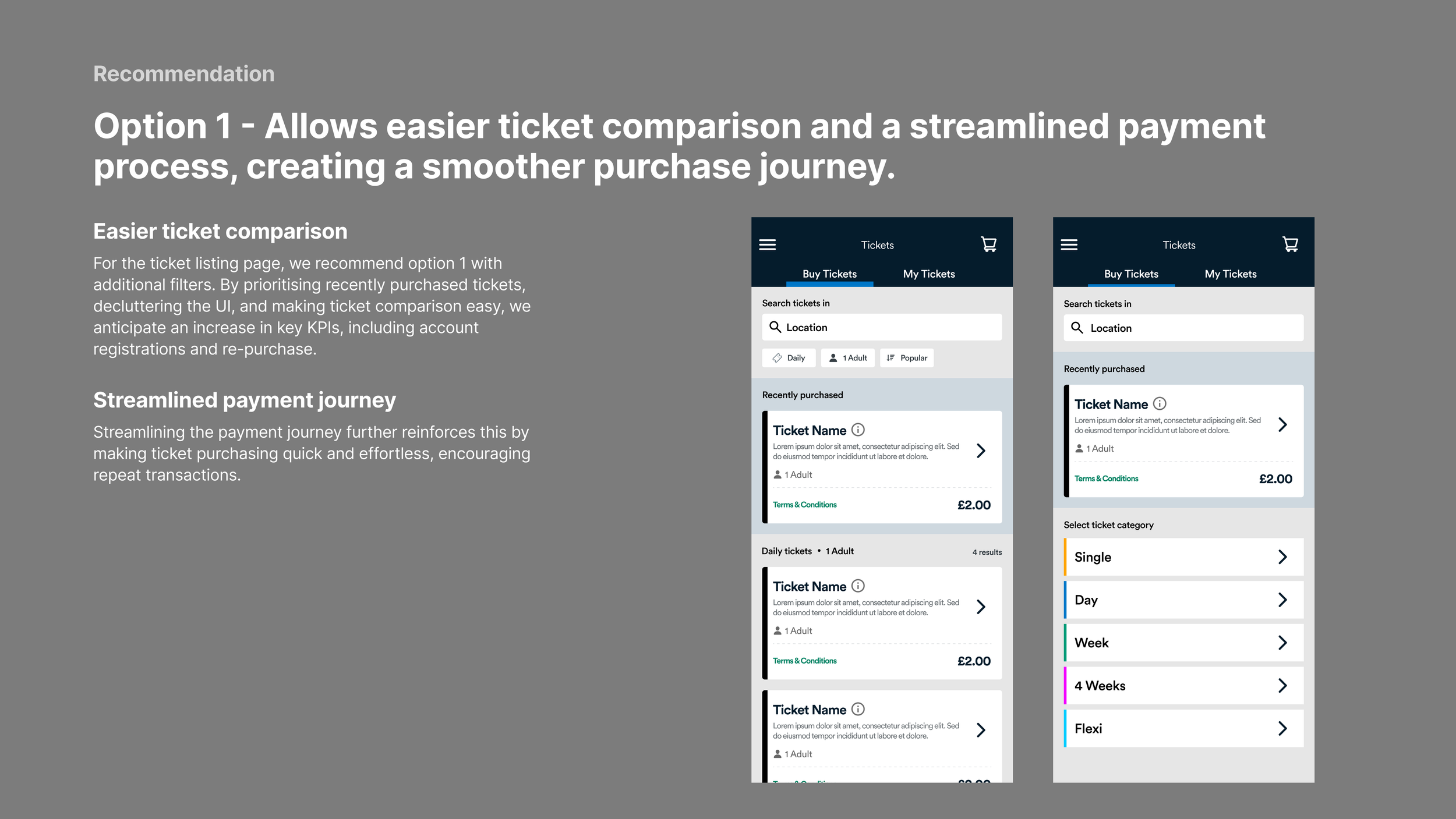
Task 2: Make ticket search easier
Originally, users had to tap through tabs (single, daily, weekly, etc). I explored three alternatives:
Filters – Let users refine by ticket type, number of passengers, and sort order
Category landing page – Start with ticket type, then show fewer, more relevant results
Carousel view – Expand/collapse layout to browse ticket types in one place