Benenden Healthcare
Defining a vision for a digital healthcare service that members would use
Client
Benenden Healthcare
Year
2024
Discipline
Product Strategy & Service Design
Platform
N/A - Strategy project
Timeline
8 weeks
My Role
Research & Strategy

THE TEAM
Product Designer (Me)
Strategist
Account Director
Project Manager
Client stakeholder
WHERE I COLLABORATED
Co-led customer discovery (6/12 interviews)
Strategic framework & 4 moves
The Moment Design experience framework
Identifying moments
WHAT I OWNED
UX audit & competitor analysis
Object Oriented UX
Service blueprint build, delivery & presentation
THE PROBLEM
The digital healthcare market is crowded and largely failing its users. By late 2022 there were 227,500 healthcare apps available, and 85% of them had fewer than 5,000 downloads in total. The pattern is consistent across the category: apps that feel disconnected from real healthcare moments, cold in tone, and quickly abandoned.
227,500
Healthcare apps in the market by late 2022
85%
Healthcare apps with fewer than 5,000 total downloads
84
Apps downloaded more than 10m times
THE TASK
Benenden Health, a UK mutual healthcare society serving a large membership on a not-for-profit basis, had an opportunity to stand apart. They tasked us with redefining their digital member experience to drive long-term engagement and member retention. Our job was to define what that could look like, grounded in what members actually needed from a healthcare service.
DISCOVERY: UNDERSTANDING HEALTH & WELLNESS
We ran 12 ethnographic interviews with a mix of Benenden and non-Benenden members, covering a range of ages, claim histories, and healthcare providers to understand how people actually think about their health, what they want from a healthcare service, and where every existing app was falling short.
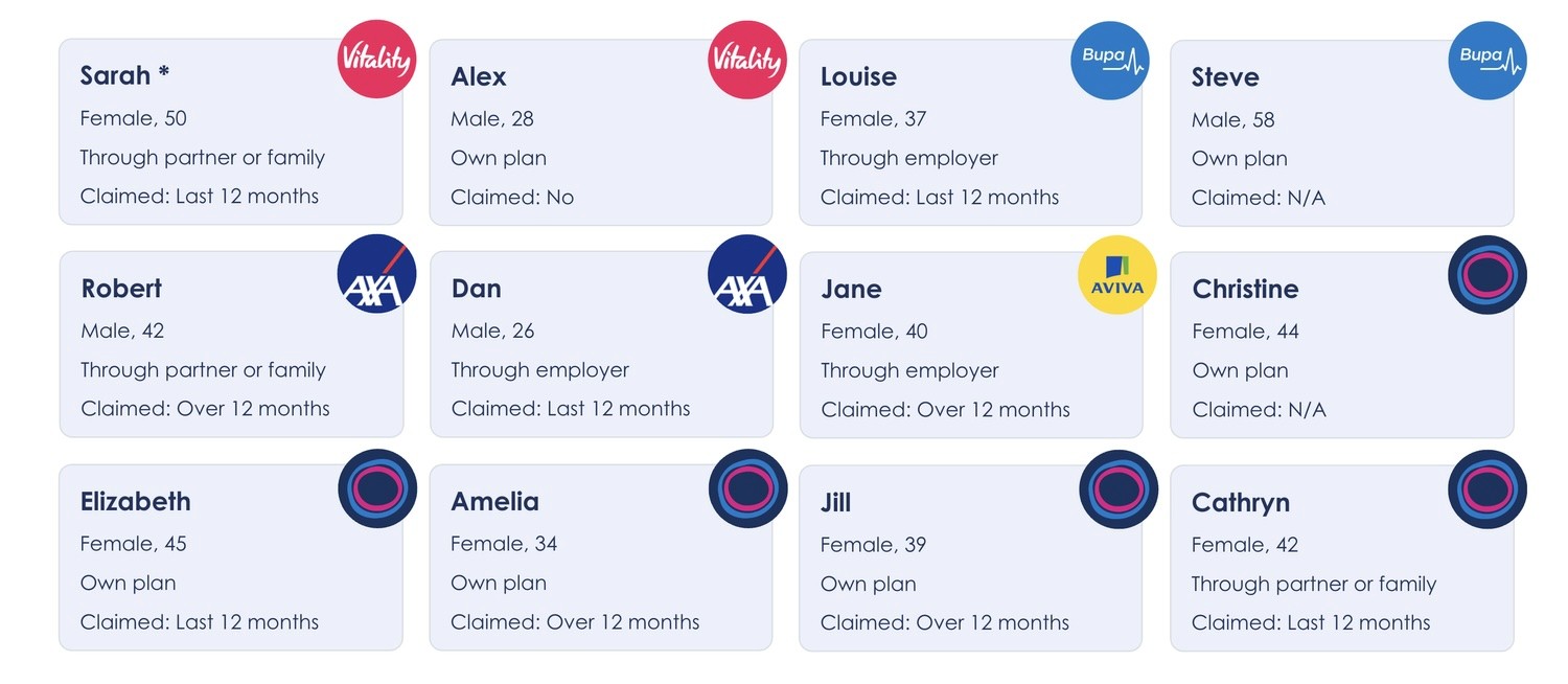
Health should feel integrated, not obsessive
Health, for most of the people we spoke to, was about moderation as opposed to obsession. That applied to everything; exercise, diet, and how much they wanted a health app involved in their daily life. Nobody wanted to be pestered. The feeling that came through consistently was that a good health service should be available when you need it and stay out of the way when you don't.
This became the foundational design principle for the whole service: digital balance. Every feature, nudge, and piece of content was evaluated against whether it was earning its place in someone's life or extracting attention they hadn't offered.
Claims are the make or break moment for the app experience
Every competitor was falling short on claims. Cold, process-driven claims experiences were the norm across the category.
For Benenden, getting empathy right was a genuine point of difference and research had handed us the evidence to make that case to the client.
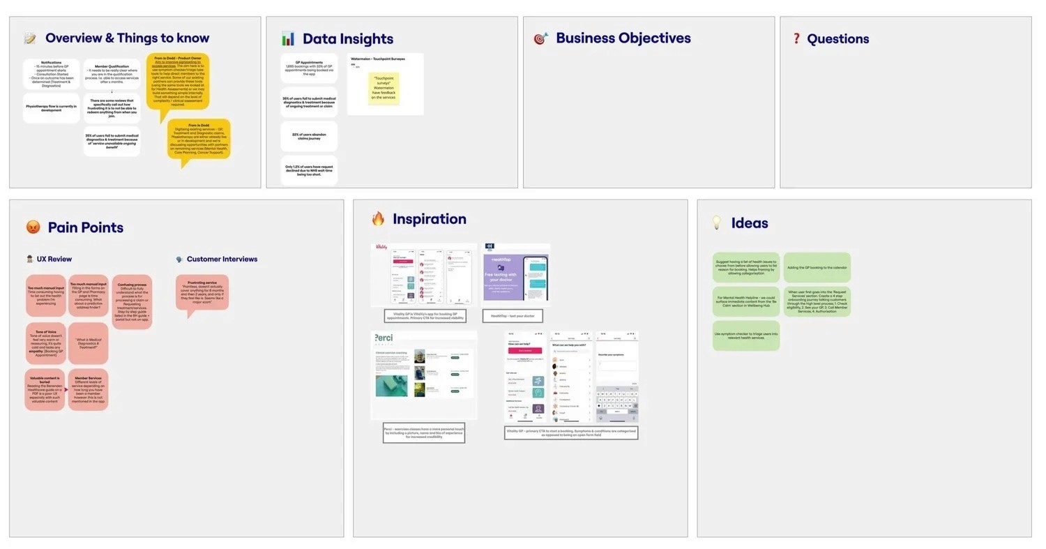
UX AUDIT
A UX audit of the existing Benenden experience ran alongside research, mapping every screen across the app and web portal. Five themes came out of it.
Key findings
No meaningful onboarding
Impersonal and irrelevant content
Inconsistent IA across platforms
Low emotional engagement in sensitive flows
Too much manual input required throughout

OBJECT ORIENTED UX (OOUX)
Alongside the UX audit, I ran an OOUX analysis on the existing Benenden experience to map the relationships between the objects that made up the service; member, claim, appointment, content, notification, and so on.
The audit told us what existed. The OOUX told us how it all connected, and where the gaps and dependencies were. It was particularly useful for identifying where the app was treating related things as separate, which explained a lot of the disconnected, cold feeling members described in research.

FOUR MOVES: OUR STRATEGIC FRAMEWORK
With research and audit complete, we synthesised the findings into a clear from → to: mapping where Benenden's digital experience currently sat against where it needed to get to. From that, we defined four strategic moves; the shifts that would need to happen to transform the service from a functional utility into something members genuinely valued.
MOVE 1
A seamless, end-to-end claims experience
From a functional hand-off to a supported, empathetic journey through the most emotionally significant moments in a member's healthcare life.
MOVE 2
Meaningful personalisation
From generic content shown to everyone to a service that adapts to who the member is, what they've accessed, and where they are in their health journey.
MOVE 3
Preventative and self-care content
From a reactive claims service to one that also shows up during good health, giving members a reason to engage when they don't need to make a claim.
MOVE 4
Inspiring nudges that build momentum
From no explicit guidance across the journey to contextual prompts that feel relevant, timely, and worth acting on, nudges that inspire rather than interrupt.

MOMENT DESIGN: TRANSLATING STRATEGY INTO EXPERIENCE
The four moves gave us the strategic direction. What we didn't have was a way to translate it into a concrete service vision. The strategist, Mattie, introduced Moment Design as the framework for this, and from there we defined the specific moment taxonomy together
What is Moment Design?
Moment Design optimises the specific interactions when a user turns to a product to act on an immediate need, make a decision, or feel a surge of emotion. Healthcare apps sit dormant for weeks at a time, people open them when something's wrong, when they need to book something, or when they're staying on top of their health. That reality demanded a shift from thinking in features to thinking in moments.
The Peak-End Rule gave us the prioritisation principle behind it: people remember the emotional high point and the ending, not the average. In a low-frequency app, that meant the highest-stakes moments deserved the most considered design treatment.
Our Moment Framework
Empathy moments
The bad times. Being unwell, making a claim, receiving a diagnosis. These needed warmth, clarity, and reassurance above everything else.
Momentum moments
The good times. Feeling healthy, setting goals, engaging with preventative content. These needed motivation, celebration, and a sense of progress.
Unmemorable moments
The admin. Logging in, updating details, managing an account. These should be fast and frictionless — done and out of the way.
Signature
The big ticket moments. GP appointments, post-treatment follow-ups. The interactions members will remember and judge the whole service by.
Elevated
Somewhere in between. Onboarding, signing up to an event, a claim completed. Not landmark, but worth getting right.
Everyday
Fast and functional. Logging in, notifications, quick account updates. The best everyday moments are the ones that go completely unnoticed.
Why this mattered for the blueprint
Categorising every moment by type meant we could deliberately calibrate the design investment at each stage. Signature empathy moments, like receiving a GP consultation result, got the most considered, emotionally led design treatment. Unmemorable moments got out of the user's way. The blueprint made those priorities explicit and defensible.
THE SERVICE BLUEPRINT
The primary deliverable was a service blueprint that structured the entire member experience around four lifestages, reflecting how Benenden's healthcare offering actually unlocks over time, based on member tenure.
First experience
Download & Discover
App download, profile setup, service orientation, and first health check.
0-6 months
Foundation
GP services and foundational wellbeing content. Building the habit of engagement.
6-24 months
Expansion
Eligibility expands to physiotherapy, mental health support, and self-care tools.
24+ months
Full access
Diagnostics, treatment and surgery requests. The highest-stakes moments in the member journey.
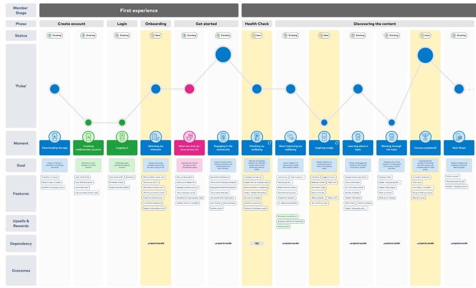
For each lifestage, the blueprint mapped the specific moments a member would experience, the emotional goal of each interaction, the features that would make it up, upsell and reward opportunities at relevant milestones, third-party dependencies, and the expected outcomes. It gave the Benenden team a single, end-to-end view of what the service needed to become, and in what order to build it.
I led the design and construction of the blueprint in Figma, working closely with the lead strategist to ensure the structure reflected both the research outputs and the operational realities of what Benenden could actually deliver.
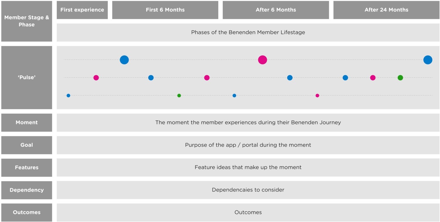

Confidentiality note
The full blueprint isn't publicly shareable, but I'm happy to walk through it in detail. Get in touch and we can set up a time.
OUTCOME
The strategy and blueprint were presented to Benenden's leadership by the Benenden product team. I wasn't in the room for that final pitch, but the recommendations were built on this work. It secured board-level funding to act on them, the clearest outcome a strategy engagement can produce. Delivery hadn't started by the time I moved on, so I can't speak to how it played out beyond that point.
This was a strategy engagement, not a delivery one. The measure of success was whether the work changed what the client did next. The board funding that followed the presentation was the answer to that question.
WHAT THIS PROJECT SHOWED ME
This was my first engagement working purely at the intersection between strategy, experience design and service design; upstream of any screen design, focused entirely on defining what the product should be before anyone started thinking about how it should look. It pushed me to think across the full arc of a customer relationship rather than a single journey or flow.
The most useful shift in thinking was moving from features to moments. Once you frame design decisions through the lens of what a member is feeling and what they need at that specific point in their life, the right product call becomes much clearer and much easier to explain to a client.