Stagecoach: Onboarding
Redesigning first impressions for 2.5 million daily bus passengers.
Client
Stagecoach
Year
2025
Discipline
UX Strategy & Product Design
Platform
iOS & Android
Timeline
8 weeks
My Role
Lead UX Designer

THE TEAM
UX Designer (Me)
Strategist
Art Director
Account Director
Project Manager
Client stakeholder
WHAT I OWNED
UX audit
Competitor analysis
Creating 3 onboarding routes
User testing
Mid-fidelity wireframes
Recommendation to pause release
THE REAL PROBLEM
Stagecoach came to us with a retention problem and a hypothesis: a slow, confusing first experience was driving users away. The client hypothesis was that if we guide users on how to use the app it would help retain customers. The brief was therefore to redesign the onboarding and increase sign-up rates.
Before designing anything, I pushed to interrogate that hypothesis. If onboarding wasn't the root cause, we'd be solving the wrong problem.
~160k
Monthly downloads
10%
Opt-out for permissions
-15 NPS
Driven by ops, not UX
Critical early decision
The data told us that there was an activation problem and that a meaningful share of churn was driven by the core product experience as opposed to the entry point. I defined the boundary of what onboarding could and couldn't fix before designing anything, and held that line with the client.
WHAT SHAPED THE DIRECTION
Four inputs shaped the direction, drawn from research, audit, and structured comparison rather than instinct alone.

Building on existing research
Discovery research from a previous project reframed the whole approach: Stagecoach users open the app when something needs to happen right now, at a bus stop, walking out the door. Time to value became the guiding principle.

The UX audit
A full audit of the existing onboarding flow mapped every friction point, dead end, and missed opportunity before I considered a new direction.

A shared framework
Mapping the eight components of an onboarding experience gave me a common language for evaluating what Stagecoach had, what it was missing, and what it didn't need.

Best-in-class review
A review of best-in-class onboarding across travel, transport, and beyond produced five clear principles, which became the criteria for evaluating every direction taken forward.
DEVELOPING THREE ONBOARDING ROUTES
I developed six onboarding directions and converged on three distinct routes, each grounded in a different hypothesis about what drives retention. I then tested these 3 routes to understand which of our hypothesis were correct.
ROUTE 1
Life benefits
Instead of listing functional benefits, lead with how the app can improve daily life. Retention through motivation and ego.

ROUTE 2
Hand-holding
Establish a clear mental model upfront and build retention through confidence and orientation.

ROUTE 3
Straight into it
Minimise upfront friction and get users to value immediately. Once in the app, layer guidance contextually.


TESTING THE THREE ROUTES
Testing across six moderated sessions made it clear: users had no appetite to be talked at. They skipped the benefit screens in Route 1 without reading them. The hand-holding in Route 2 felt patronising for a task they already understood. Every participant just wanted to get into the app.
This aligned directly with what we already knew about user context. When someone opens Stagecoach, they have somewhere to be. Optional, dismissible guidance outperformed structured tours in every session. Route 3 wasn't a surprise as it confirmed a hypothesis I already held, and gave me the evidence to align the client behind it.
THE SOLUTION
A stripped-back onboarding experience built around three principles:
Frame the experience around the core USP signal of accurate bus times being linked to location permissions and lead with value on every permissions request
Move account creation to post-checkout
Replace structured tours with optional in-app guidance users can access when they choose to.
Each permission request was paired with a clear value exchange, not mundane legal information but a reason for saying yes and how critical it is to a good experience. Location permission triggered an immediate payoff: the user's area surfaced alongside live average wait times, grounding the digital in the physical. A recovery screen for declined permissions reframed the choice rather than creating a dead end.
Account creation moved to the end of the optional guided tour; the moment when a user had already experienced the app's value and the ask had the most context of the value exchange behind it.
Handing over to a Senior Art Director
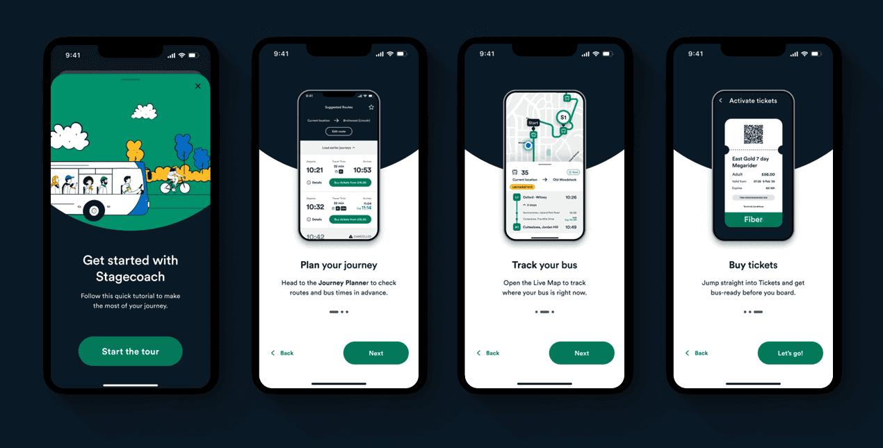
After testing and validating the three routes with customers, I iterated on the designs, then handed them to a Senior Art Director to take to high-fidelity. My expertise lies in adapting existing design systems, but this was a 0-1 project, and the Art Director was better placed to build the visual language from scratch. I directed the execution throughout, translating what I had in mind into the final screens, for example, the six-minute average wait time shown in the style of a live bus stop display.


THE DECISION THAT MATTERED THE MOST
I recommended pausing the release. Testing confirmed the new onboarding was clean, fast, and well-received. But usability sessions exposed a harder truth: once users moved past onboarding into the main app, the contrast was jarring. Too many steps, cluttered screens, unintuitive navigation. A polished entry point into a rough product would add dissonance and possibly prove to be a jarring incomplete experience.
My recommendation to the client was to treat this work as a proof of concept; evidence of what the app could feel like and prioritise fixes to the core experience first. Fix journey planning, simplify the purchase flow, reduce the noise. Then reintroduce the onboarding as a true reflection of the product behind it.
The client agreed. The designs went into the backlog, sequenced behind improvements to the three core flows: planning, buying, and tracking.
WHAT I'D MEASURE AFTER SHIPPING
Permissions opt-in rate (baseline: ~90% incline on iOS)
Account creation conversion at checkout vs. upfront
Day-7 retention cohorts comparing the new entry flow to the old.
The hypothesis that a faster path to value increases early retention remains untested, but the instrumentation plan was defined.
WHAT THIS PROJECT SHOWED ME ABOUT PRODUCT
You can't design your way around a product problem. Onboarding is a first impression, but retention is earned by everything that follows. The most valuable thing I did on this project was defining the boundary of what the design could influence, and making the case to pause rather than ship.
Resisting the pressure to ship the visible fix, in favour of fixing what's underneath, is a product call. That's the one I made.