Stagecoach
Redesigning first impressions for 2.5 million daily bus passengers
A 1-month product design project untangling retention, onboarding, and account creation for Stagecoach.
Date
Feb-March 2025
Type
Client project
Role
Research, strategy, design, testing
Platform
iOS & Android
Tools
Lookback, Askable, Figma, Miro, Claude
Problem
Stagecoach had a retention problem. Users were downloading the app, creating accounts, and not coming back. The hypothesis was that a slow, confusing first experience was to blame.
The brief was straightforward: fix onboarding and improve retention. But before we jumped to solutions, we needed to check whether that hypothesis actually held up and what we later found changed the scope of the brief.
Task
Onboarding: redesign the first-time experience so new users quickly understand how to use the app the value this brings.
Account creation: increase sign-up rates by making the case for an account clearer and the process itself less of an obstacle.
Permissions: move away from bombarding users upfront, toward a contextual approach where each ask is accompanied by a clear reason to say yes.
Three distinct problems with one clear throughline: every friction point was an opportunity to either build or break trust in that critical first session.
Solution
A new onboarding experience for the Stagecoach app, designed to reduce time to value and remove unnecessary friction from the first session.
The solution stripped onboarding to its essentials: permissions-first, led by value. No walkthroughs or feature lists, just a fast, branded entry point that gets customers using the product faster.
Account creation was moved to post-checkout, mirroring established mental models from comparable apps and ensuring the ask came at the moment the value exchange was clearest.
A Guided Tour highlighting the key features of the app sat within the app as an optional step, available once users had landed on the home screen. It follows four steps, each leading with a functional benefit and a corresponding screen showing where in the app that task lives.
Delivered as a mid-fidelity prototype with a supporting rationale deck, enabling the Senior UI Designer to move directly into high-fidelity production with full design intent documented.
My Role
I led the end-to-end UX workstream on this project; from discovery through to final recommendations.
I owned:
The discovery research into the existing onboarding experience and competitor landscape, including developing the "5 ways to win at onboarding" framework
The development of the three customer journey routes, validated in collaboration with the strategist
The mid-fidelity wireframes used in testing
The moderated usability testing across six participants via Lookback, including synthesis and recommendations
I also supported the strategist on product data analysis, and worked closely with the Senior UI Designer on the high-fidelity designs, contributing the design direction and decision making while he translated those into production ready screens.
The wider team included a project manager who handled delivery oversight and our Chief Strategy Officer provided senior direction. We also had a primary stakeholder on the Stagecoach side who acted as the client.
What I Learned
Onboarding has limits: you can't fix a retention problem caused by the product itself
Communicating boundaries of influence: defining what we could and couldn't solve was as valuable as anything we designed
Knowing when not to ship is a skill: we recommended pausing the release until the wider app was ready, dropping a polished onboarding experience into a cluttered product creates dissonance, not delight
If you want to read more and see my process, check out the full story below…
Interrogating the Brief
Before jumping in, our first step was to look under the hood. We reviewed existing data sources to understand current app performance and identify where and why users were dropping off.
Current app performance
~ 160k
Monthly app downloads
The app serves a clear functional need for 2.5 million daily passengers.
Healthy download numbers weren't the problem.
Current Retention Rates
~ 42%
Accounts that never transact
Almost half of all accounts created never make a purchase, pointing to a meaningful gap between users who sign up and users who find enough value to stay. Retention was lowest in the first few weeks, suggesting an adoption problem in that critical early period.
App store reception
-15
Digital NPS (P10 24/25)
The app's reputation was suffering, but not entirely for reasons within our control. Low star ratings frequently cited late or cancelled buses, not the digital experience, making this a harder problem to design our way out of.
Permissions opt-in rates
~ 90%
iOS users
A significant proportion of users were still declining device permissions during onboarding, leading to a degraded experience from the start and likely lower retention as a result.
The Critical Insight
A critical early insight shaped the entire project: fixing onboarding wouldn't fix retention on its own.
There were broader experience issues beyond the first session contributing to churn; clunky flows, too many steps, busy screens. Defining the boundary of what onboarding could and couldn't influence was essential before we designed anything, and kept us honest with the client about what success could realistically look like.
Discovery: Building on Existing Research
Rather than starting from scratch, we drew on discovery research conducted six months earlier. Three key insights shaped our onboarding thinking:
It’s just the bus
Simple, low cost, everyday travel. Straightforward to use and not very exciting – so it doesnʼt demand much attention and thereʼs little motivation to do more in digital. When it comes to onboarding, users are likely to skip, skip, skip because theyʼve seen it all before.
How do we break through that indifference to make a valued and memorable first impression?
Trusting us to reassure
The timetable is clear and the tripʼs been done before. But will the bus arrive on time? Weʼre here to reassure, and to do that, we need to be trusted. With known data issues and poor reviews, weʼre not in the best position to convince users that we are the most trusted, most reassuring resource.
How can onboarding prove to skeptical users that we can be trusted, or to lapsed users that weʼre worth another look?
What makes it right for them?
Some folks are more attracted to using the app than others. Those that value introversion and autonomy favour the digital over the personal. A few others are true “bus people”, proud and excited to plan and ride buses, keen to seek more engagement in digital.
How can onboarding address usersʼ unique needs when it comes to their personality, attitude, and behaviours?
Reviewing the Onboarding Landscape
We audited the current Stagecoach onboarding experience and reviewed comparators to establish best practice benchmarks across the three areas; Onboarding, Account Creation & Permission Opt-In
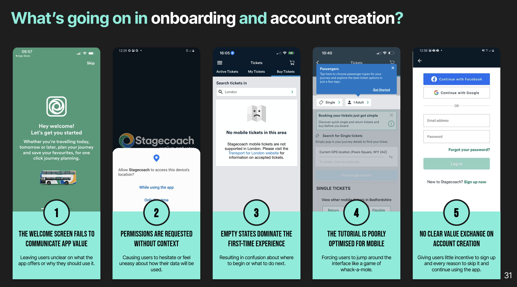
UX Audit of the Existing Experience
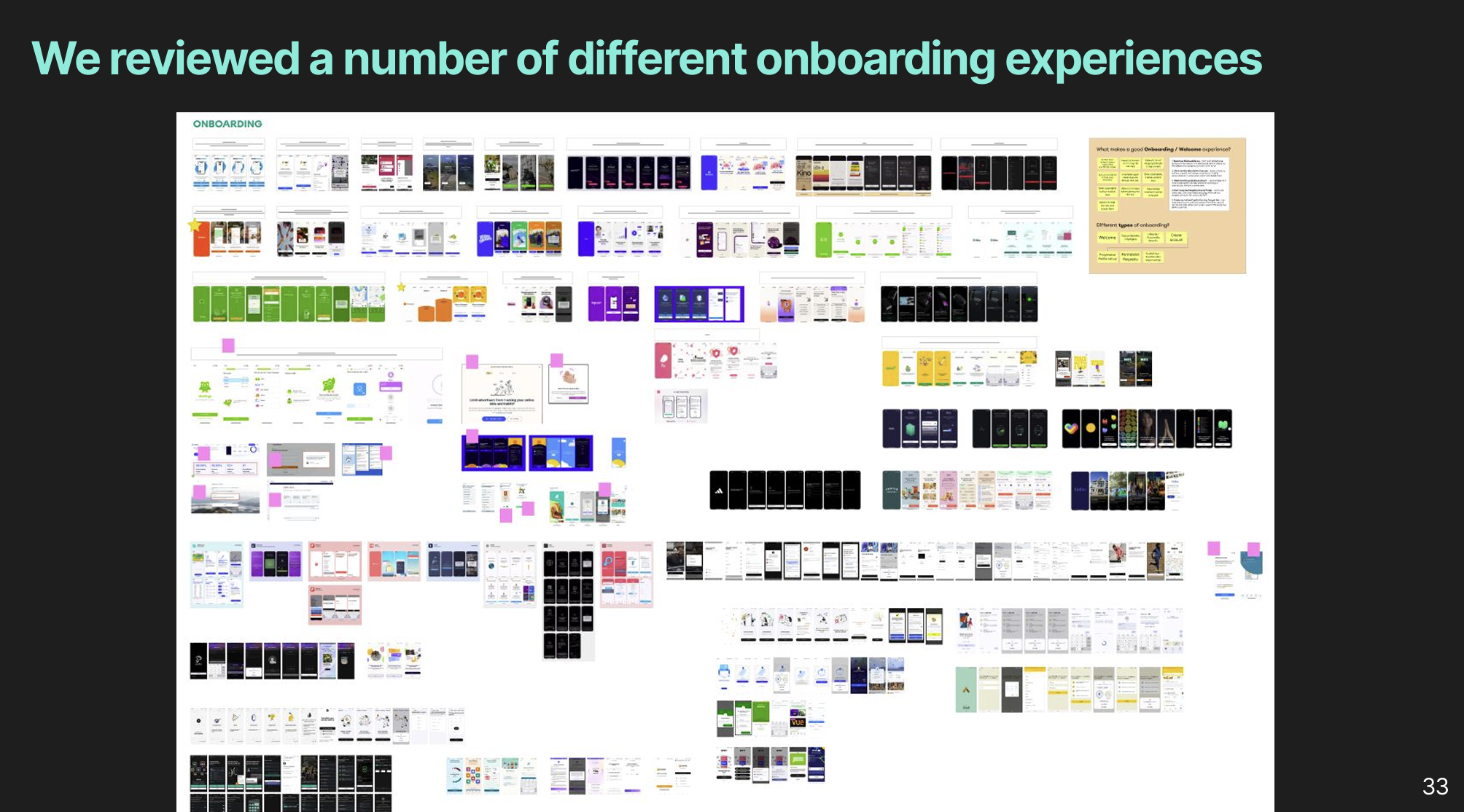
Competitor & Comparator Onboarding Audit
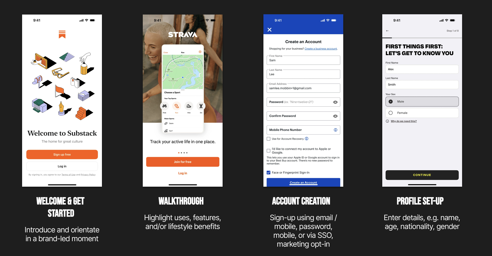
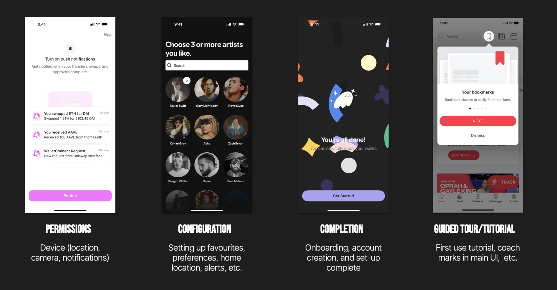
The 8 Key Components to an Onboarding Experience
Through my research, I identified eight discrete elements that can make up an onboarding experience, then evaluated the existing Stagecoach flow against five principles for winning at onboarding:
5 ways to win at onboarding
(From a user POV)
Show how this benefits me
Don't list features, tell me what problems the app solves, how it makes my life better, helps me become the person I want to be.
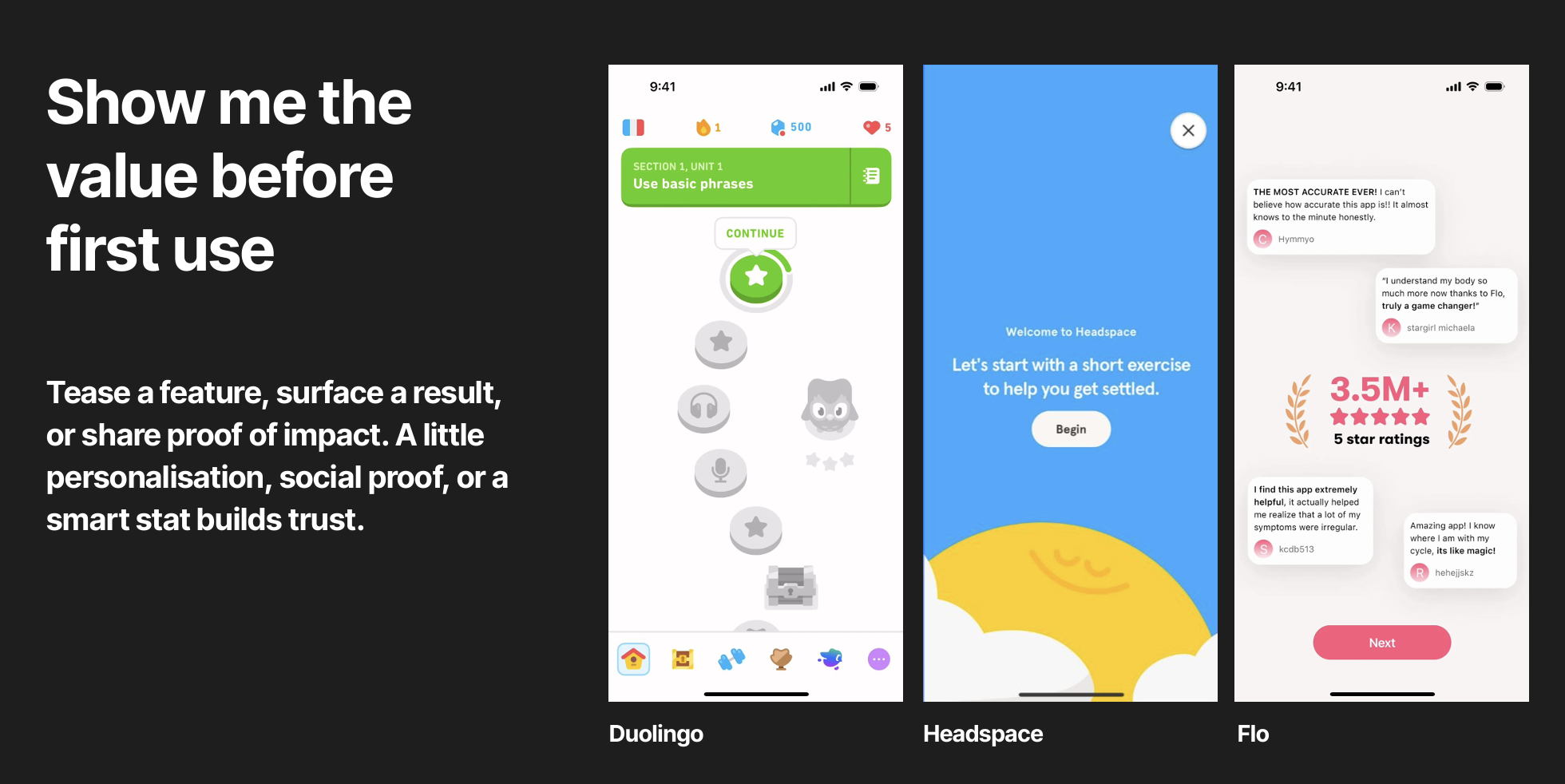
Show me the value before first use
Tease a feature, surface a result, or share proof of impact. A little personalisation, social proof, or a smart stat builds trust.
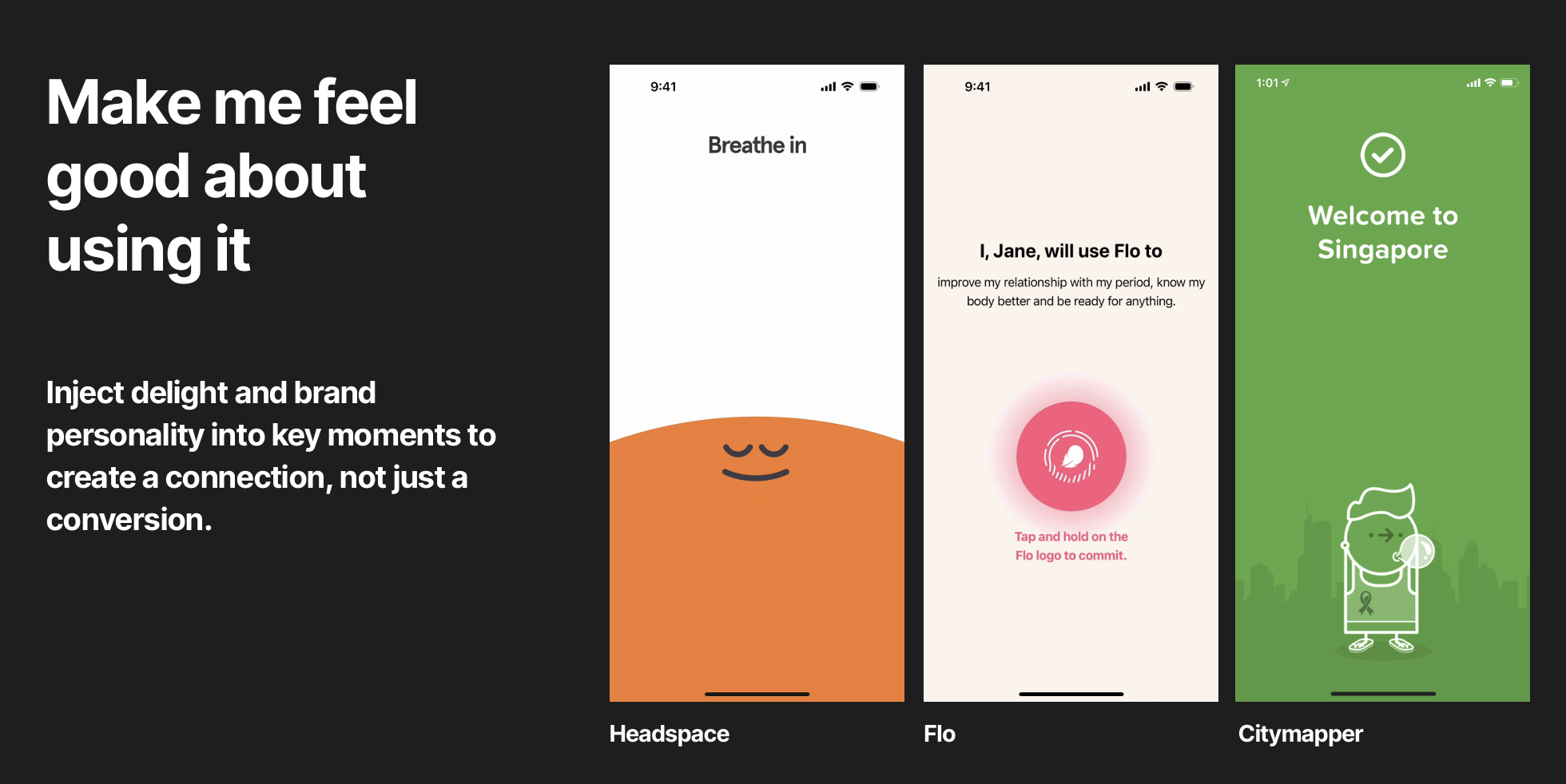
Make me feel good about using it
Inject delight and brand personality into key moments to create a connection, not just a conversion.
Don’t keep me waiting, I’ll skip
Get to the point. Use clear, scannable language that talks to people, not users. No jargon. No fluff.
Guide me, but don’t get in the way
Use consistent coachmarks to support first-time use, but let me skip and come back when I need it. Let me learn it my way.
Zooming in on a few of the ways to win…
Now onto Account Creation & Permissions
Account Creation
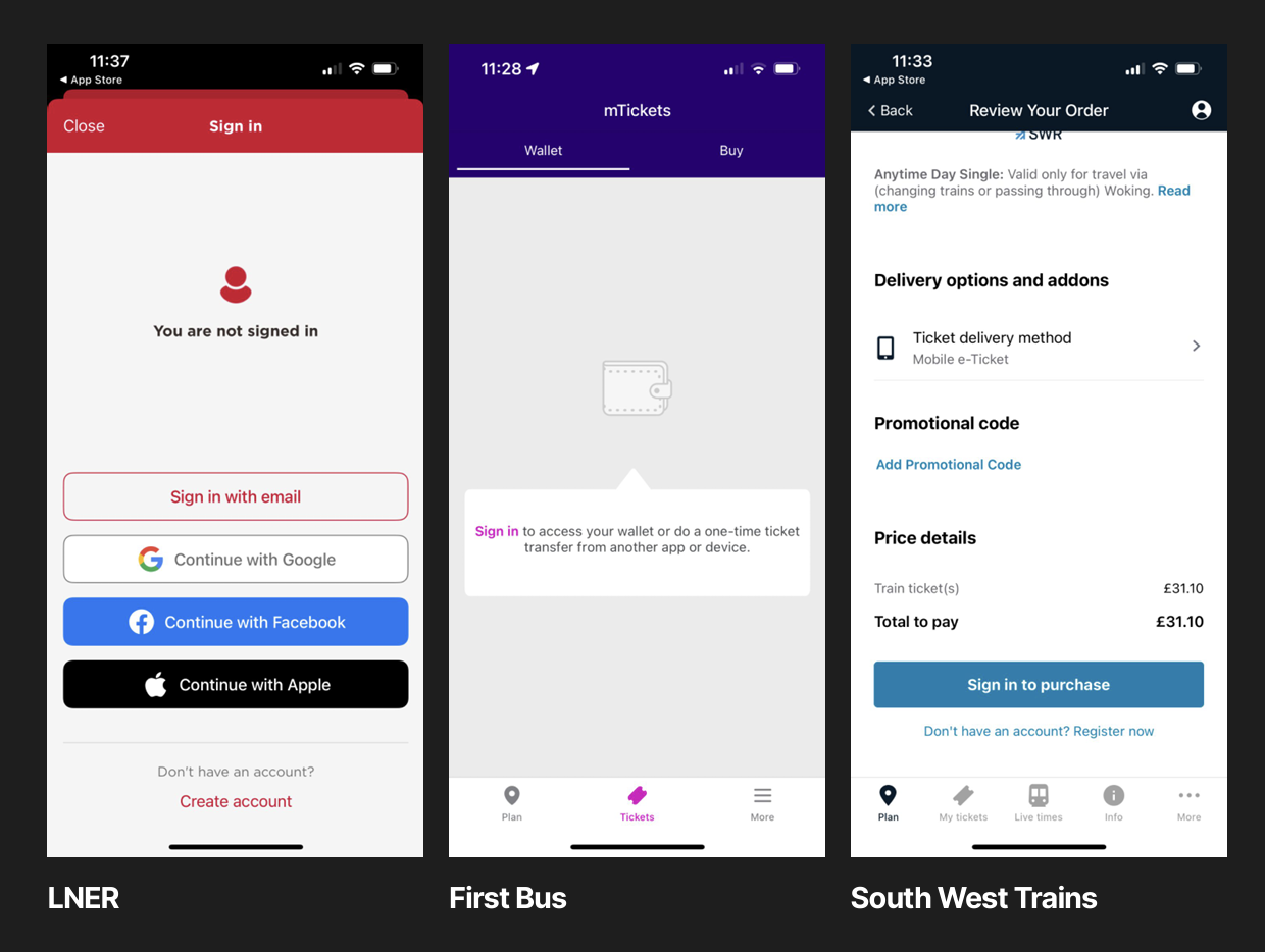
Travel apps only require account creation at checkout
A key finding from the competitor review: travel apps that perform well typically only require account creation at the point of purchase, not upfront. This directly challenged existing convention and became a cornerstone of our recommendations.
Permissions
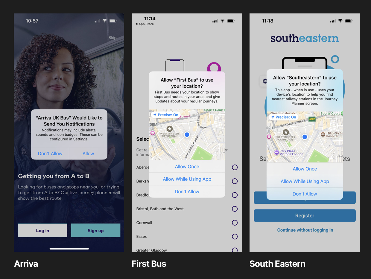
Competitors bombard users all at once with permission set-ups
Most comparator apps bombard users with permission requests in one go during onboarding. More progressive apps take a staged approach; asking for permissions contextually, when the value of granting them is immediately obvious to the user. This became a direct design principle.
Developing the New Onboarding Routes
We ideated across six possible onboarding directions before converging on three distinct routes, each grounded in a different hypothesis about what drives retention.
Some inital workings in Miro…

Our 3 Routes for Onboarding
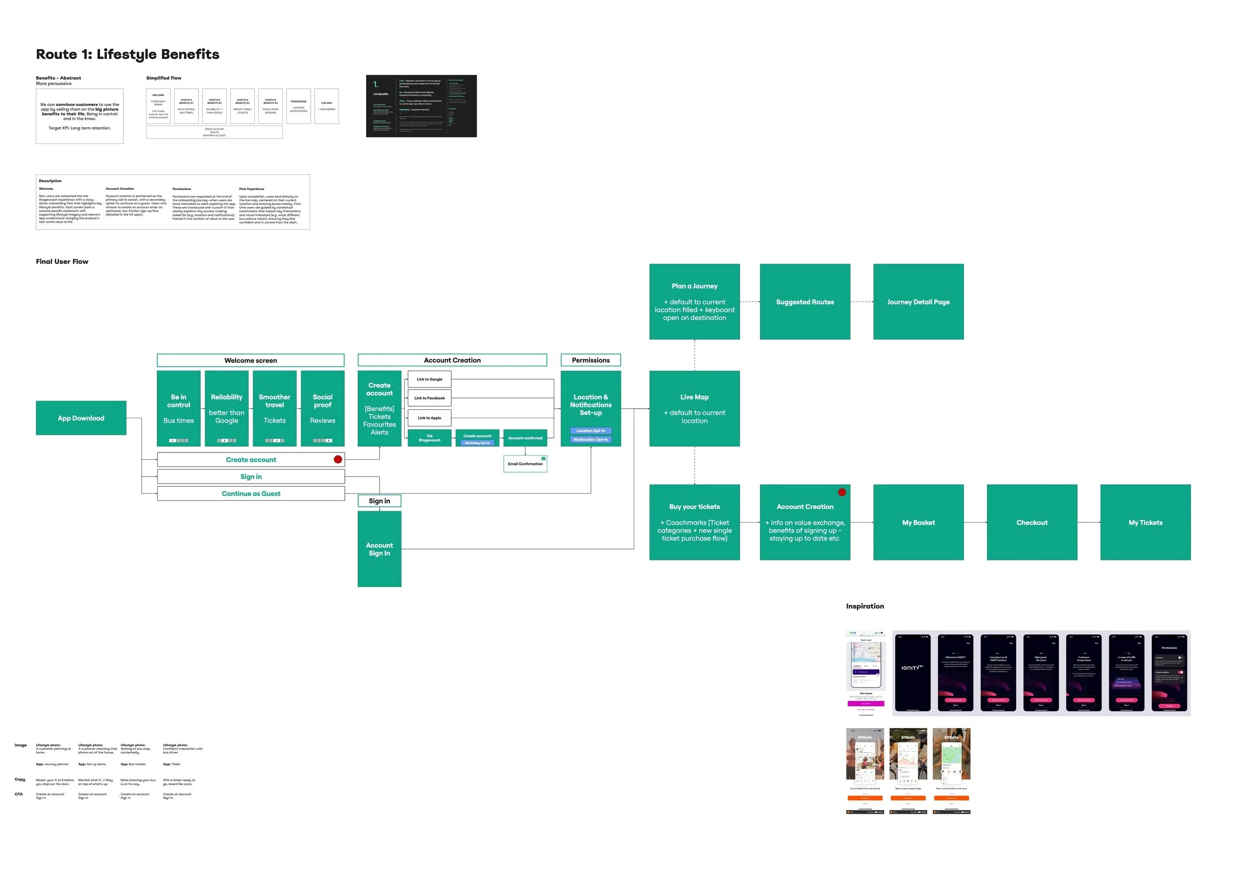
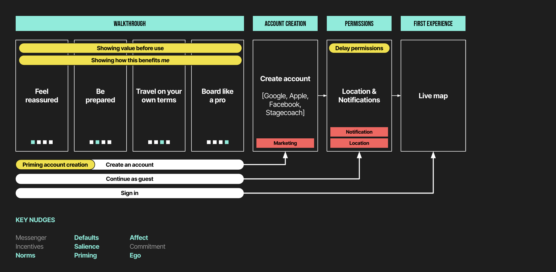
Route 1: Life Benefits
Overview
The app is straightforward but forgettable. Its real value isn't in what it does, it's the autonomy and control it gives people. Listing features won't increase retention, but demonstrating how the app improves someone's daily life might.
Hypothesis
If we motivate customers by showing how the app helps them live the life they want — focusing on benefits over features — then they'll be more inclined to use it immediately and return more often.
→ Impact: first-use activation, engagement, long-term retention.
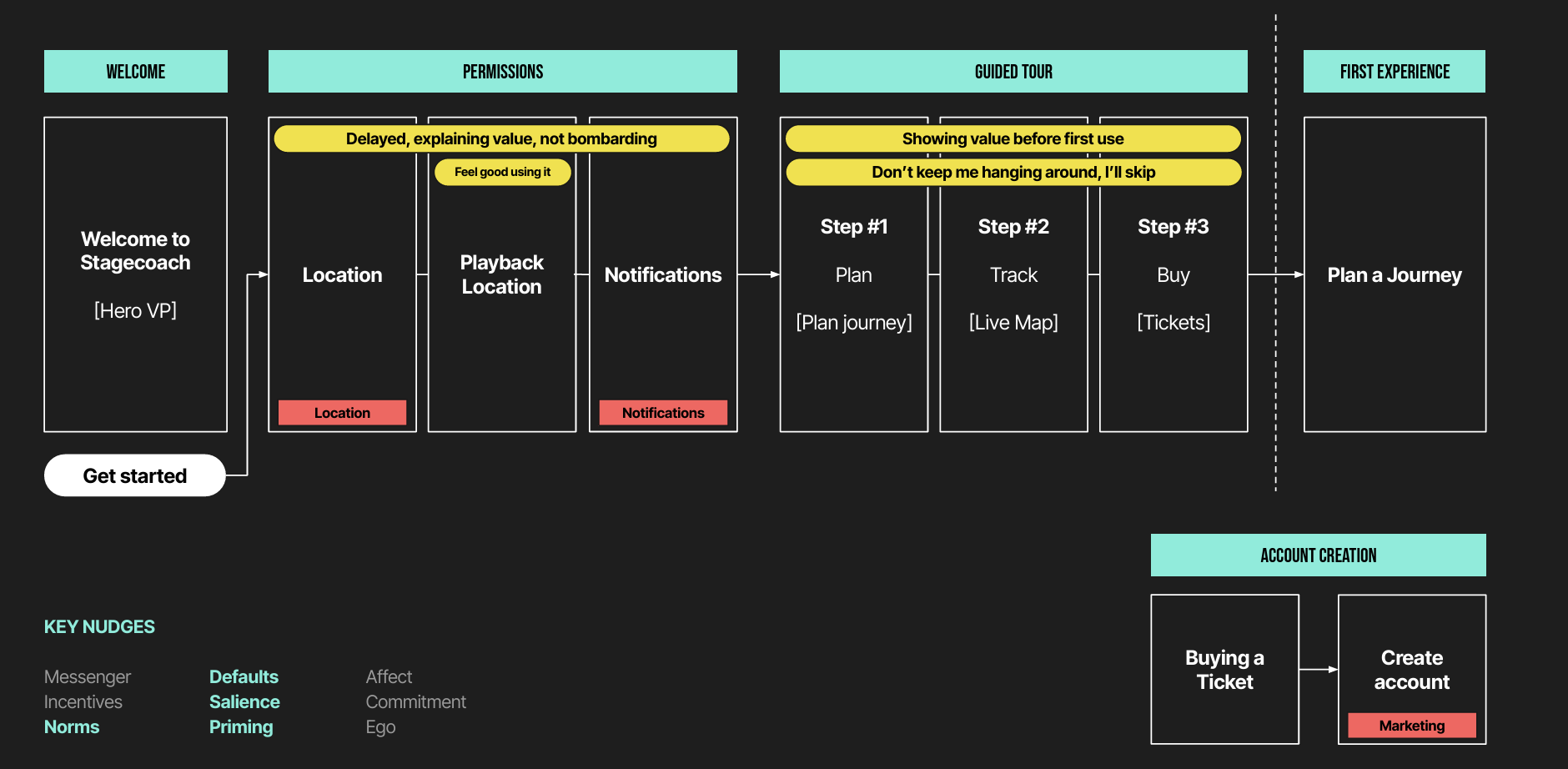
Route 2: Hand-Holding
Overview
Users' mental models of the app are imperfect. They get by, but initial confusion may be causing early drop-off. Educating users in onboarding helps orientate them and builds confidence.
Hypothesis
If we help customers understand the right place to do the right thing at the right time — by establishing a clear mental model early — then they'll feel less confused in the first few weeks.
→ Impact: first-month adoption, longer-term retention.
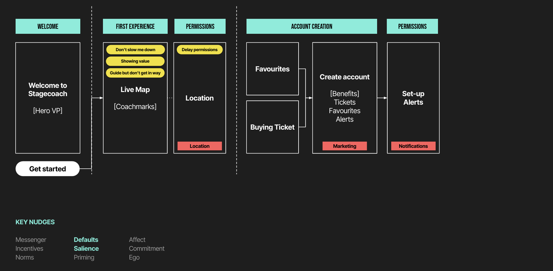
Route 3: Straight Into It
Overview
Users don't need upfront explanation for a straightforward app. When they download it, they likely just want to check if their bus is on time. Show them the value by letting them experience it immediately, then layer in contextual guidance.
Hypothesis
If we minimise upfront onboarding in favour of progressive, in-use guidance — then customers will reach value faster.
→ Impact: time to first value, time to activation, first-month adoption, retention.
Testing
Method
Six moderated usability sessions conducted via Lookback. Participants were asked to complete each onboarding flow & account creation setup and explain their thoughts and emotions as they went through. We were looking at the speed at which they were completed and what they interacted with.
Objective
Understand the optimal route for bringing new users into the Stagecoach app, and identify which elements felt most intuitive and efficient in getting users to value quickly.
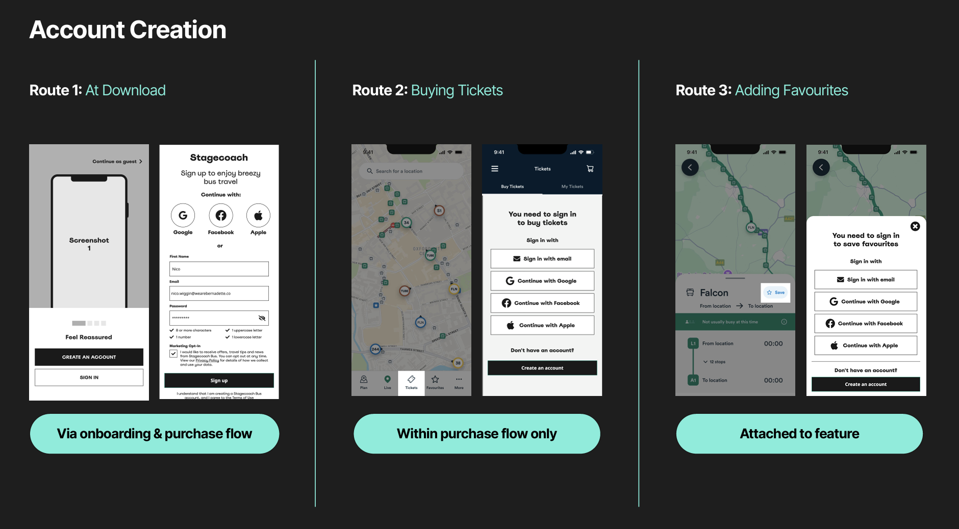
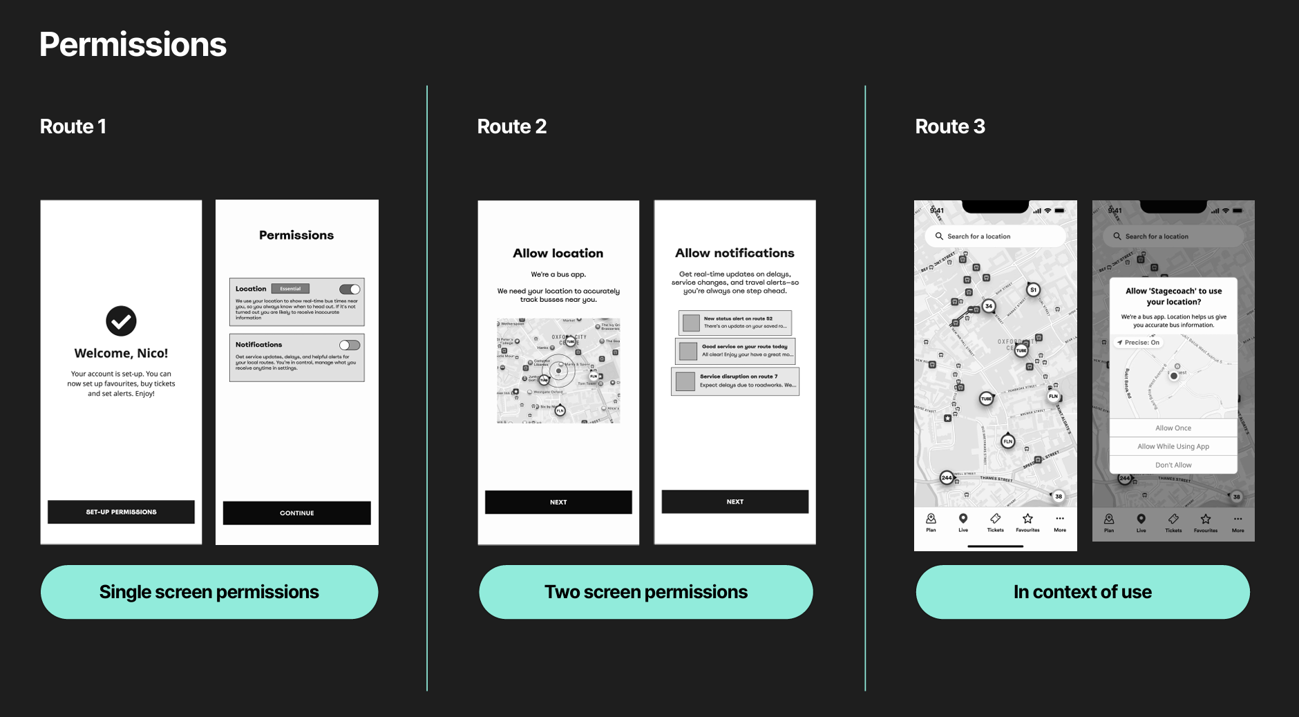
How the 3 Onboarding Routes Differed
Task
Type of Journey
Onboarding Style
Permissions
Account Creation
Route 1: Life Benefits
Benefits Oriented
Walkthrough
Switches on custom UI
Via onboarding + in purchase flow
Route 2: Hand-Holding
Function Oriented
Guided Tour
Custom UI per permission
Within purchase flow
Route 3: Straight Into It
Progressive
Contextual Coachmarks
In context of use
Attached to feature
What we found: Two findings stood out above everything else.
Second, and more significant, was a finding that reframed the whole project: telling users how to use a clunky app doesn't fix the clunkiness.
A better onboarding flow wasn’t going to fix the problem of retention but fixing the underlying experience would; the too-many-steps flows, the busy screens, the unintuitive navigation.
Onboarding could smooth the entry point, but it couldn't paper over what came after it.
First, users wanted to get in and go. They had no appetite for being talked at, they wanted to skip through it to get their hands on the app and figure it out themselves.
Reducing time to value critical for first time users. Optional, dismissible guidance outperformed structured tours in every session.
Recommendations
Keep it simple and remove barriers to entry
Remove account creation from onboarding
Showing how permissions are used increases trust and shows the value. This in turn encourages uptake of permissions for a better overall app experience.
Show the value of app permissions & acct. creation
Showing how permissions & account creation are used increases trust and shows the value. This in turn encourages uptake of both for a better overall app experience.
Nudge rather than prompt direct guidance
All participants want to start using the app quickly. Getting into the app swiftly and effortlessly is seen as more valuable than accessing detailed guidance.
Location, location, location is key
Location playback and service information related to this was highly valued. This is seen as especially useful when using the app in new or unfamiliar locations.
Final UI
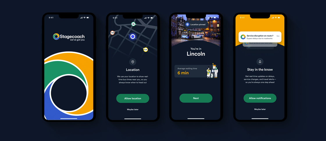
Onboarding: Setting up the experience with just permissions
Get users through permissions quickly by leading with value, each permission request is preceded by a screen explaining exactly how it will improve their experience. Don't over-explain upfront; lean into the "It's just the bus" insight and keep it simple.
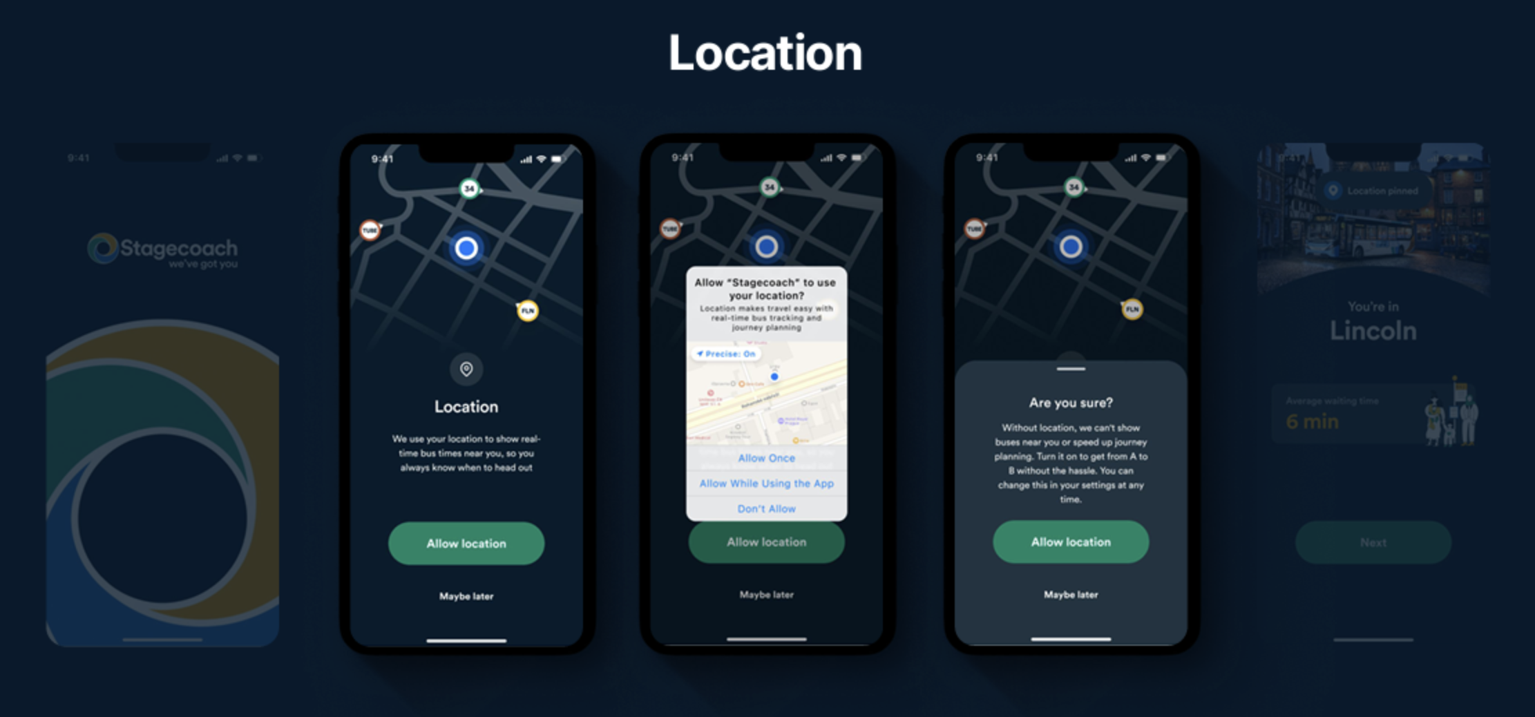
We opened the experience with a branded permissions flow, pairing each request with a clear value exchange for accepting.
Previously the flow was dominated by native Apple UI, creating a jarring clash between two competing design languages. By leading in Stagecoach's own UI, the first experience felt unmistakably theirs from the moment it started.
We also introduced a recovery moment for users who declined. If a customer denied location permissions, a follow-up screen surfaced what they'd be missing, framing the decline as an informed choice, not a dead end.
Our hypothesis: giving users a second, more considered moment to reconsider would meaningfully reduce opt-outs and increase the number of customers accessing the full app experience.
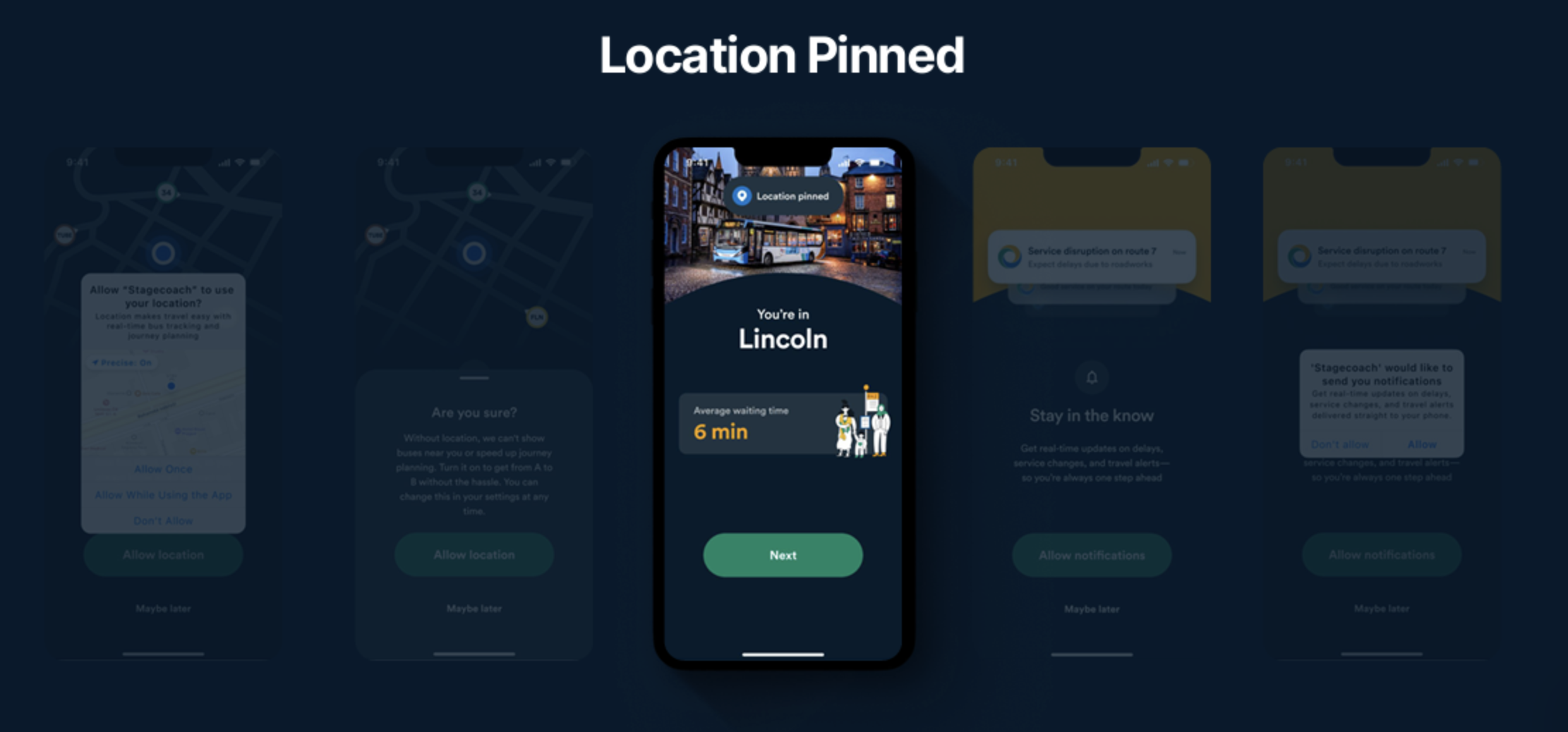
We introduced a moment of delight by applying the Make me feel good about using it principle, responding to a user's location permission with an immediate payoff. Once granted, the app surfaced the area they were in alongside live average waiting time data, grounding the digital experience in the physical reality of using the bus in their area.
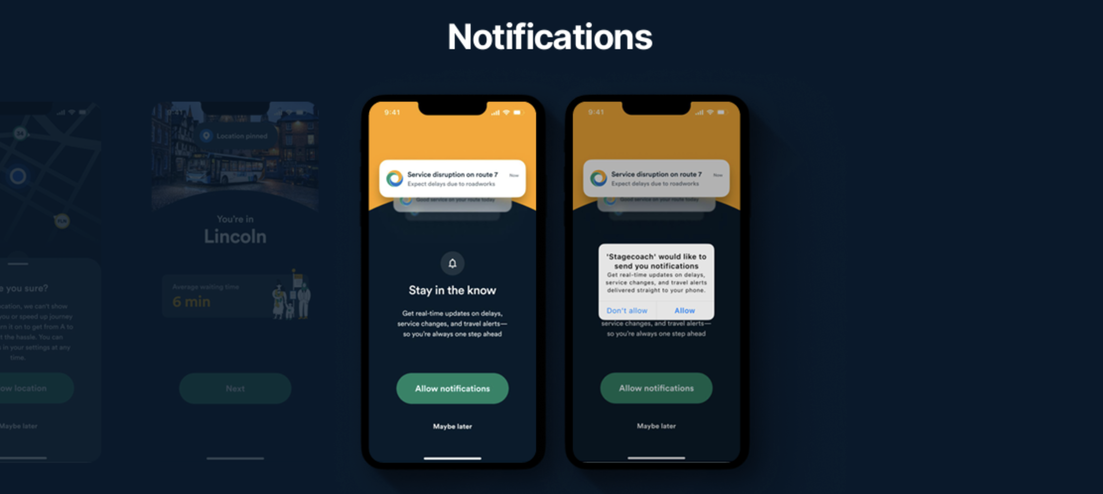
The same logic applied to notifications. A clear value exchange upfront, supported by visuals of the types of messages users would actually receive, was designed to increase opt-in rates. Not marketing noise, but genuinely useful information: service disruptions, live bus times, and travel alerts.
The message to users was simple: we'll only notify you when it matters.
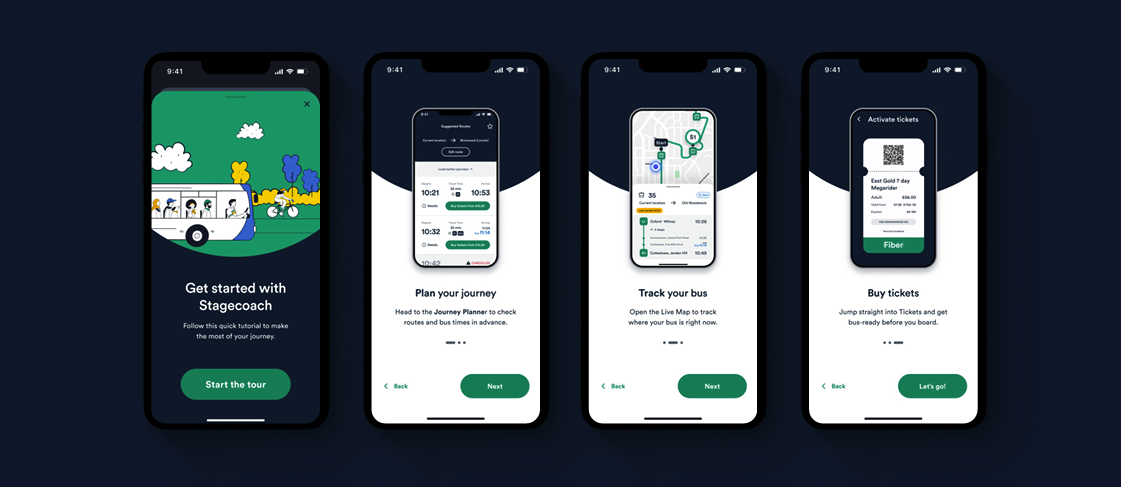
‘Take the Tour’ is now an optional step within the experience
Once through permissions, users land in the planner with a non-blocking prompt to take the tour. It's a nudge, not a mandate; dismissible, low-friction, and respectful of the user's desire to get moving.
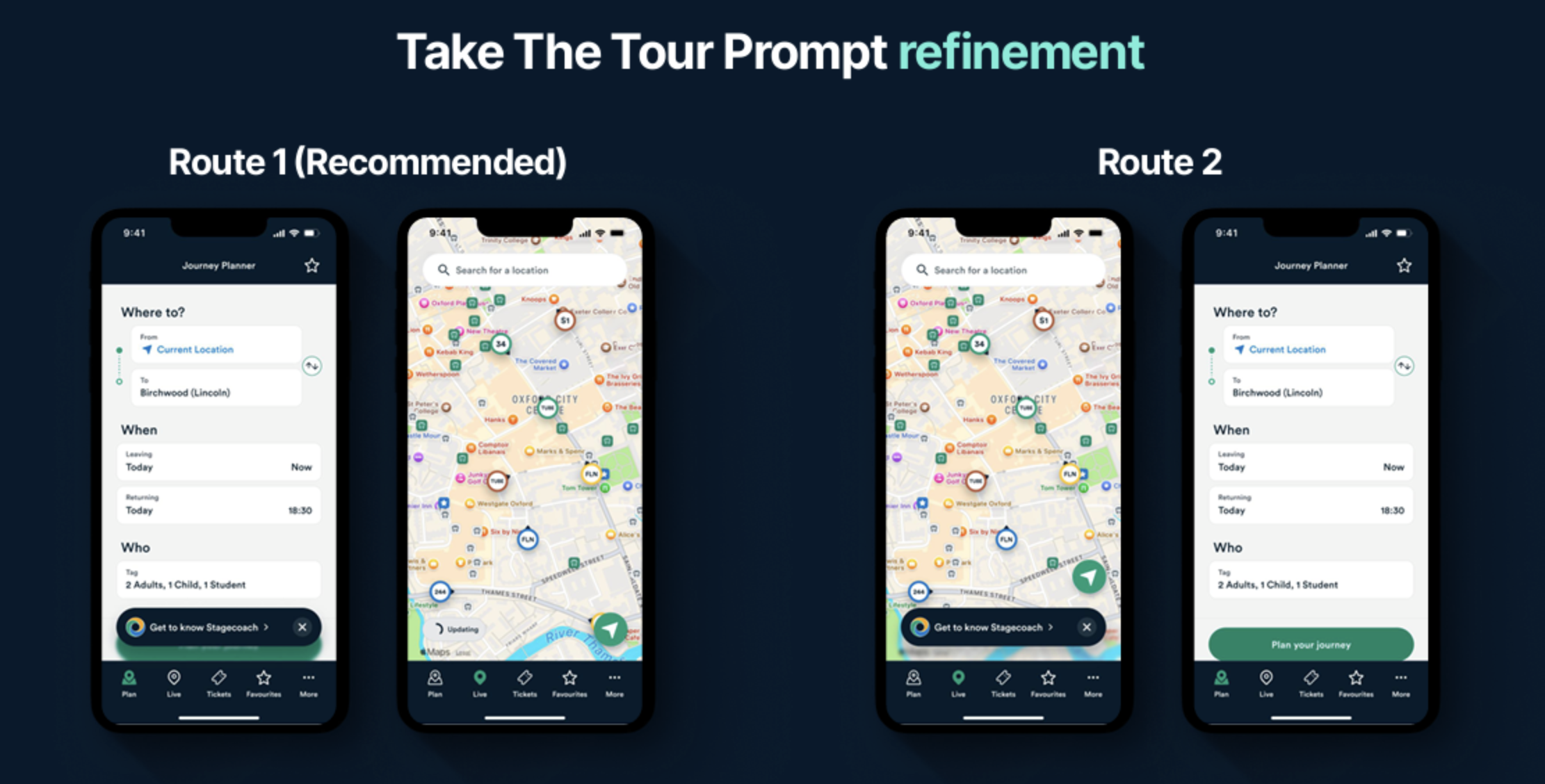
We experimented with where to position the 'Take the Tour' prompt, testing two options: the journey planner and the live map.
Both worked. So the real question became: where do we want customers to land first?
We landed on the journey planner. It's a softer entry point, less visually overwhelming than the live map, and more consistent with the mental models users bring from comparable services like Trainline. A familiar starting point felt like the right place to begin.
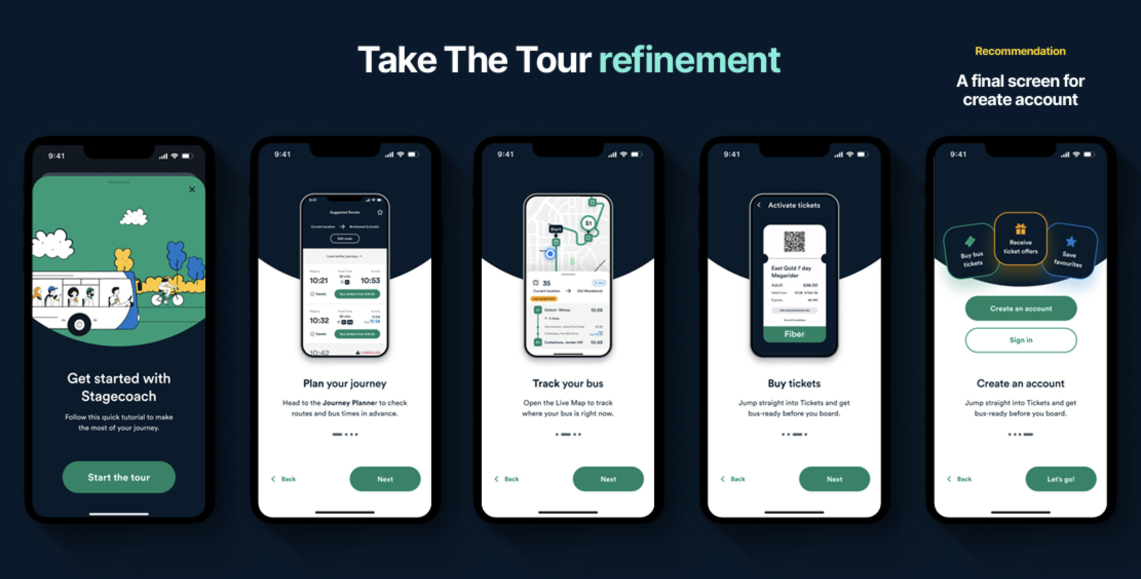
The tour itself didn't change significantly from testing; the structure was largely validated. It follows four steps, each leading with a functional benefit and a corresponding screen showing where in the app that task lives.
The meaningful addition came at the end: on completion, users are prompted to create an account, with the benefits shown as a supporting visual. A natural moment to ask, backed by context and another considered entry point into account creation.
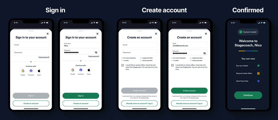
Account creation sits, rightly, at checkout
A simplified, step-by-step flow with reduced visual clutter. The post-creation confirmation screen does the work of showing users what they've unlocked, making the value of having registered immediately tangible.
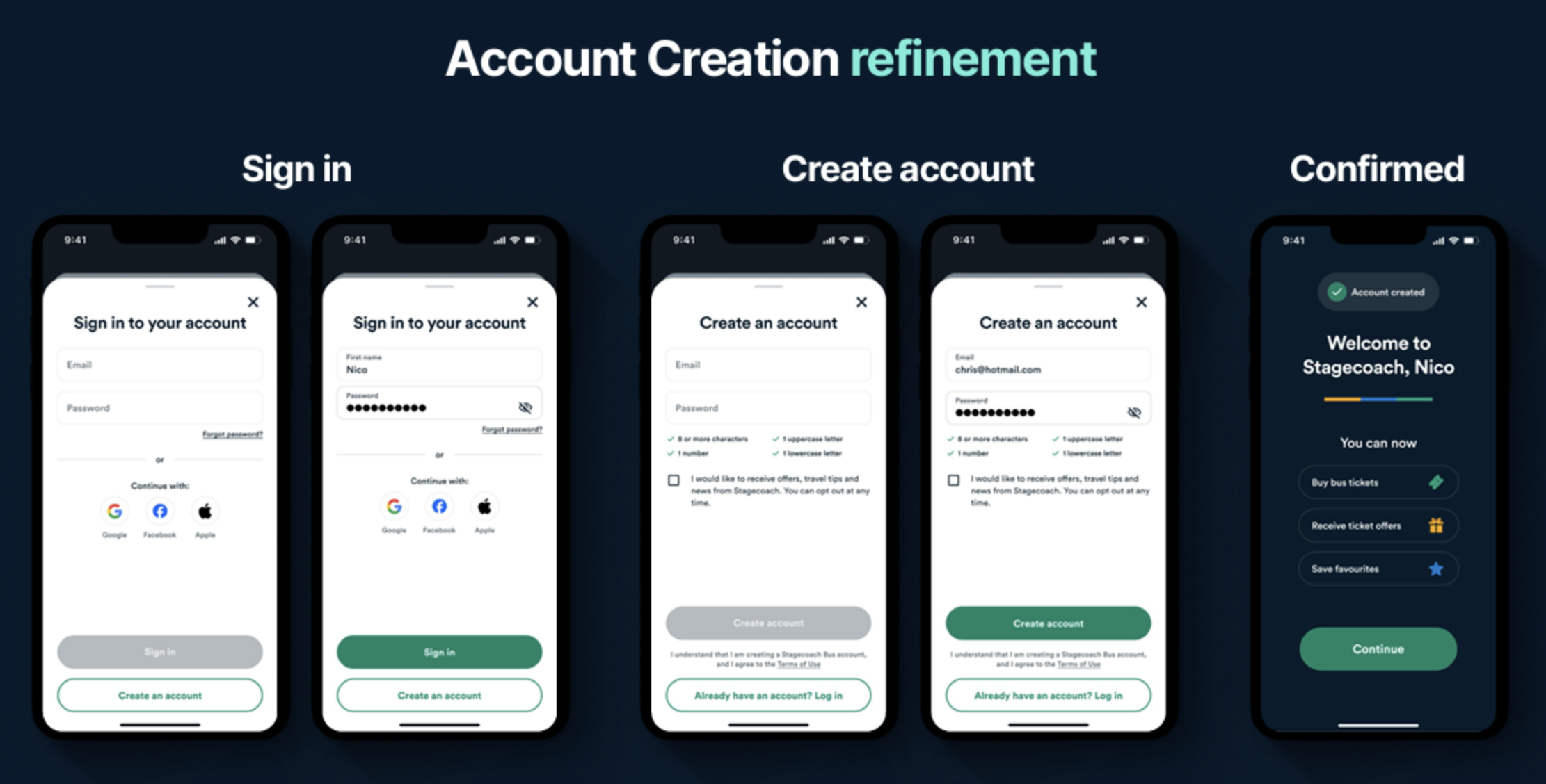
Account creation is a tried and tested component of any app experience so we weren’t looking to reinvent it. The goal was to lean on existing mental models and get customers through the process as quickly as possible.
The one intentional addition was a confirmation screen at the end, restating the value a customer unlocks by signing up. A small moment, but an important one closing the loop on the value exchange rather than leaving users to figure it out themselves.
What came next?
Across twelve months of work together, a number of high-value opportunities had been identified and backlogged. Agreed next steps were to prioritise these collaboratively with Stagecoach:
Utilise the backlog: Work on integrating previous solutions into the Stagecoach backlog morning digest dashboard, promote via autonomy, bus tracker focus mode, fast-track ticket buying, delightful ticket moments
Incentivisation: loyalty and rewards mechanics to give users a concrete reason to create and maintain an account
Ticket buying journey: streamline the purchase flow including card, payment, and supplemental information screens
App navigation & live map: further testing and refinement to simplify core navigation
Motion: elevate the onboarding experience with motion design to bring brand warmth to the first-use moment